

Through several rounds of mood boards and type exploration, we worked closely with the team to select a typeface that balanced traditional authority, acknowledging the fact that Anderson Harris is an established, award-winning brand, and the contemporary angle to stand out in a competitive marketplace and reach a new audience.


The chosen logotype is a typeface designed to reflect nature that balances bold, organic curves with restrained clarity that helps it stand at both small and large scales. To accompany the logotype, we created a logomarque.
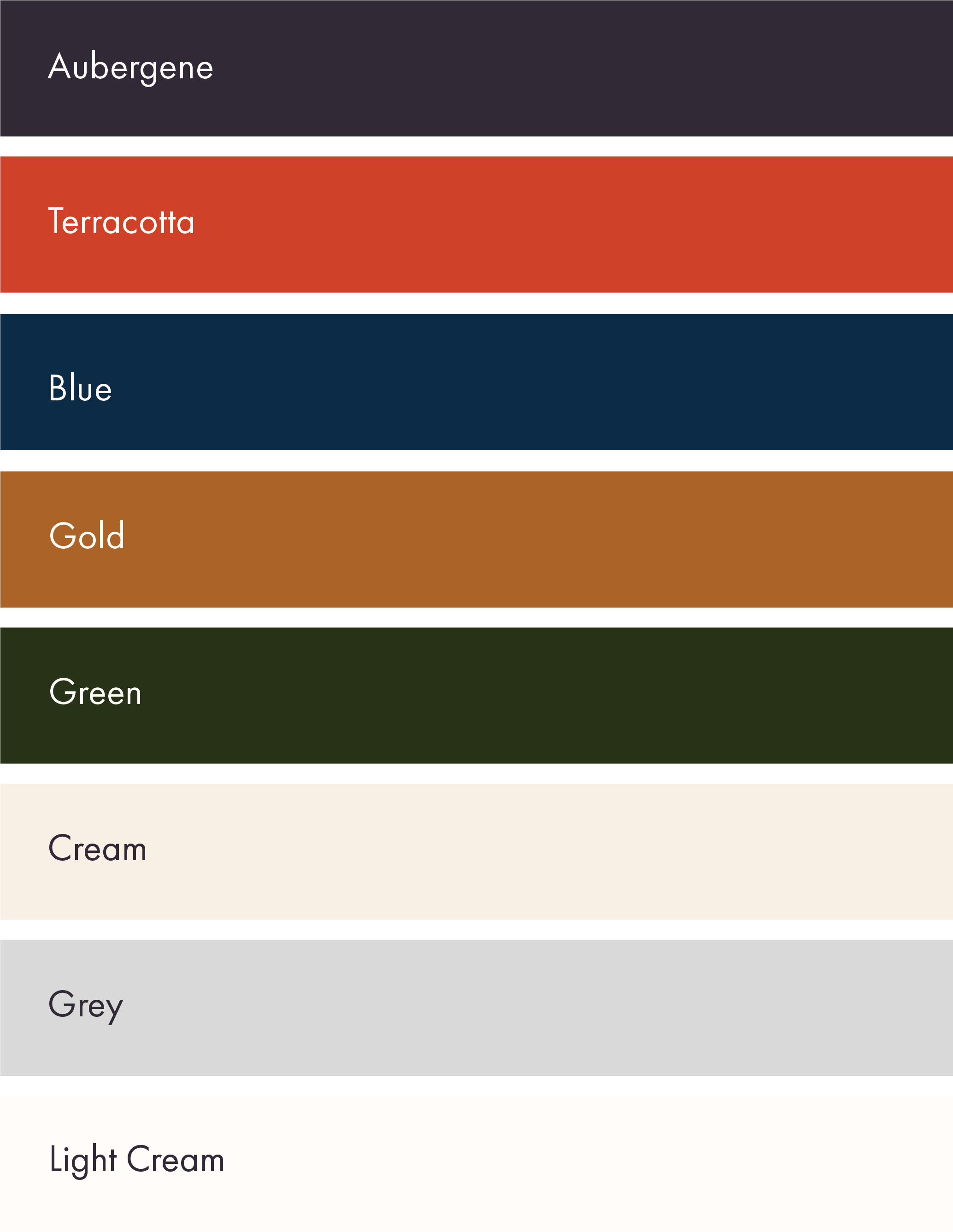
The colour palette was curated to deliberately oppose industry standards without breaking the rules entirely. Since the persona we created rebelled against the status quo by bringing plenty of warmth to conversations around mortgages, we favoured warm hues of terracotta and gold, pairing them with rich, comforting shades of green and blue. The overall effect is a colour palette that offers bursts of heavy vibrancy that breakthrough soothing washes of cream in various tints.
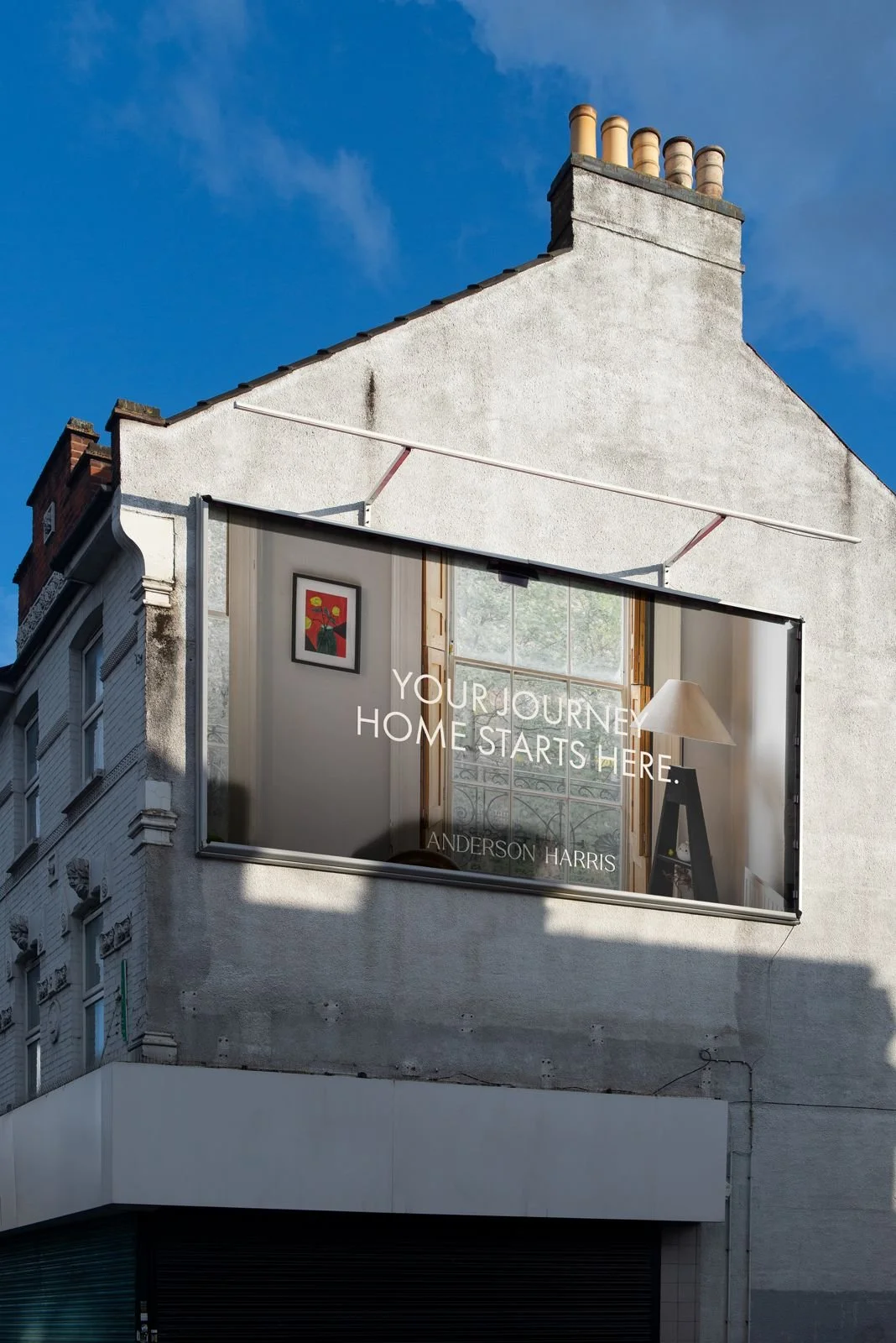
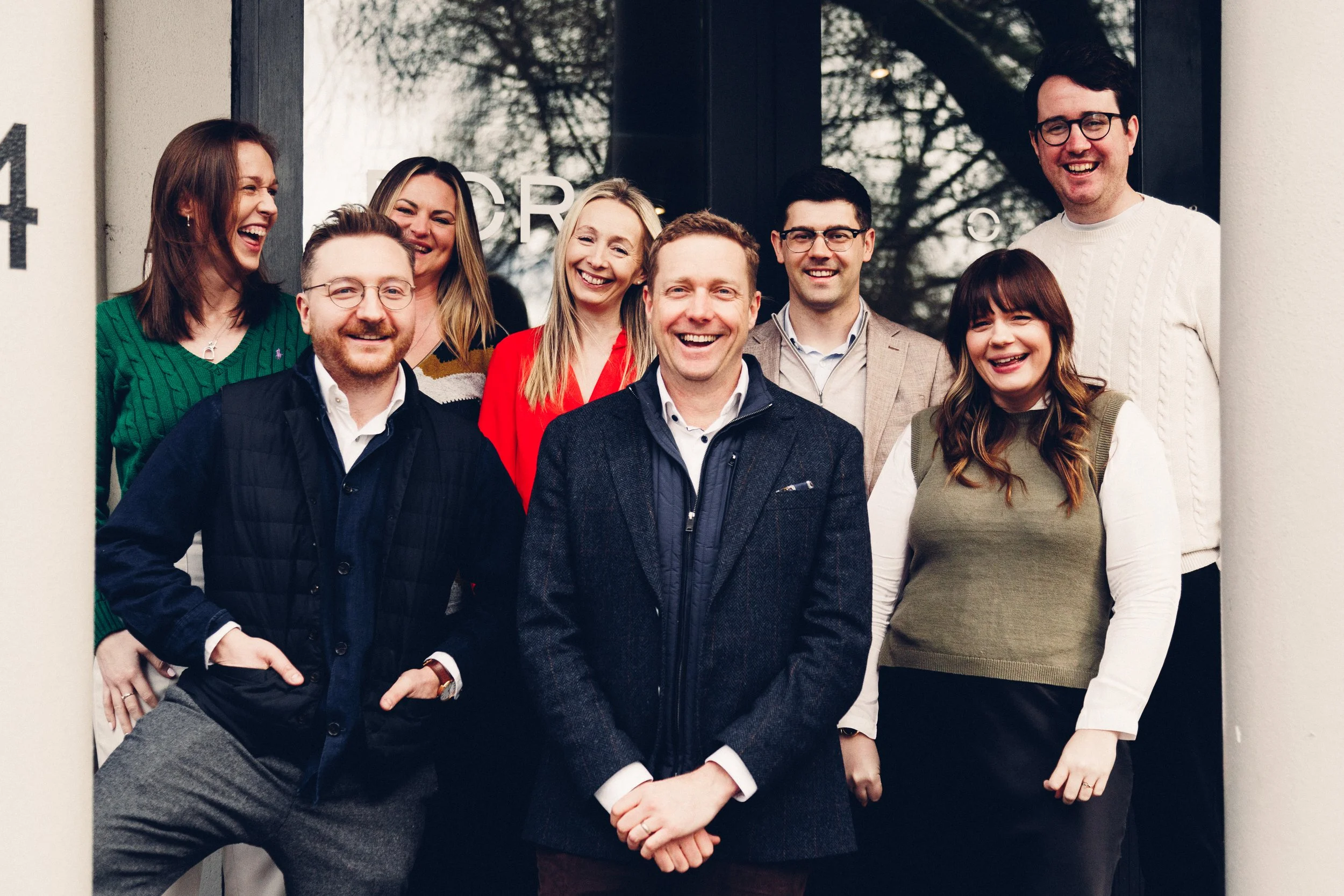
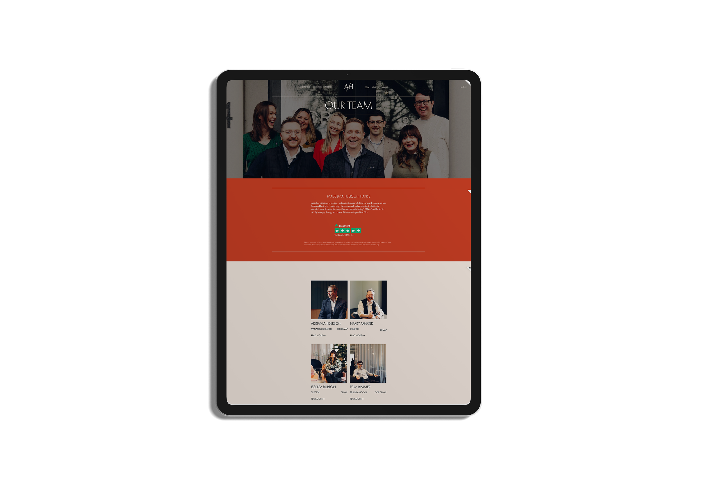
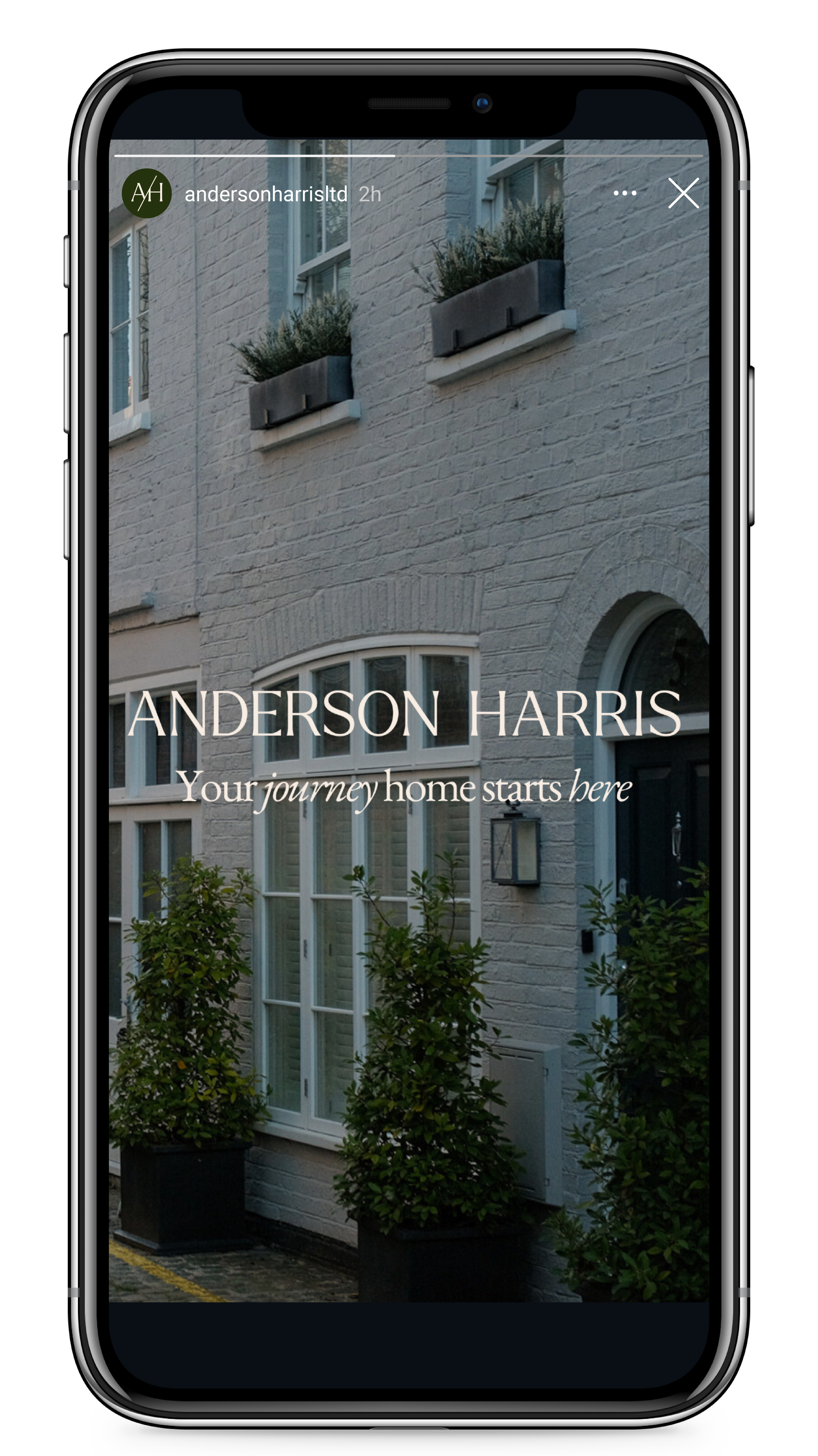
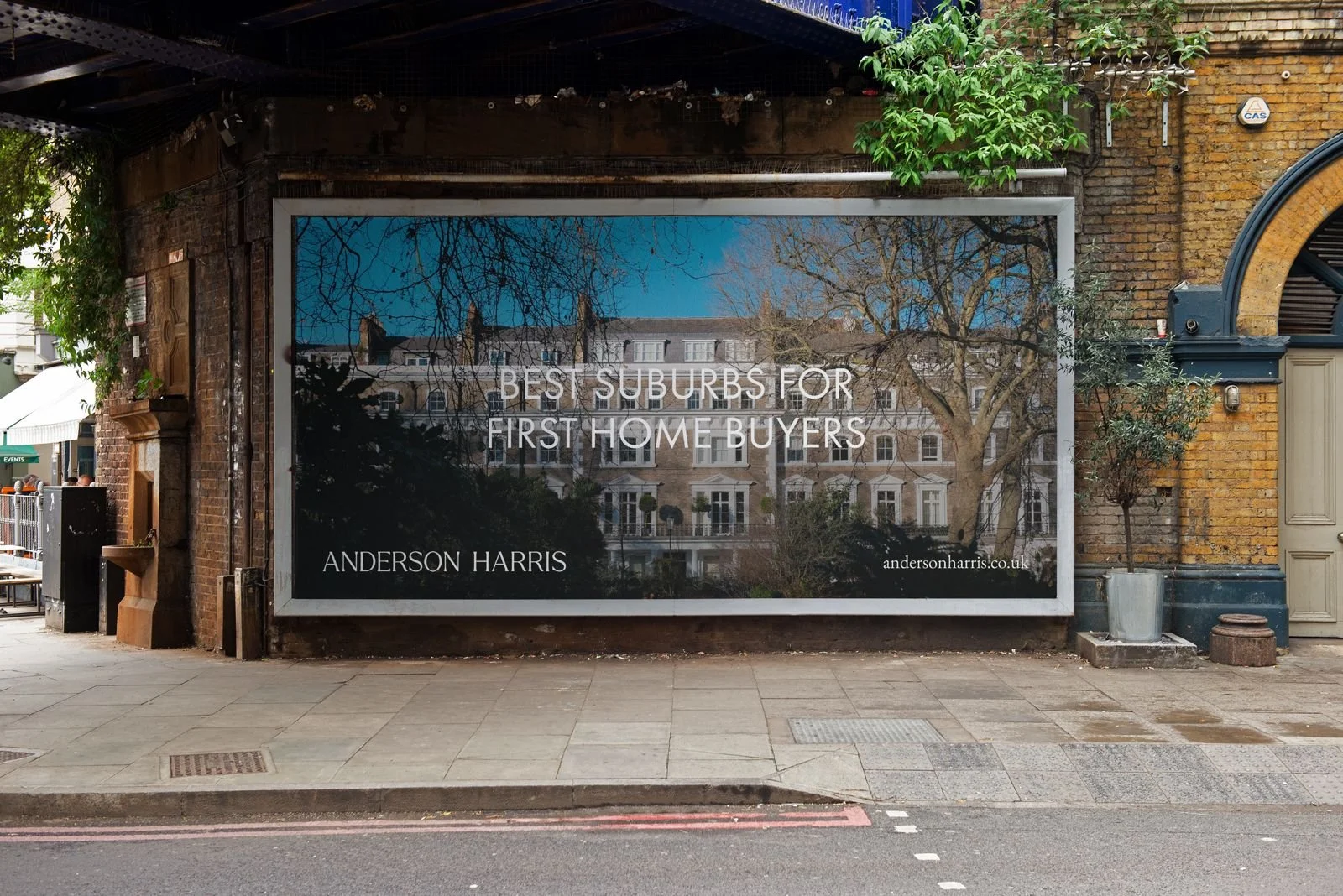
We commissioned photographer Lewis Gregory, to create an archive of architectural imagery focusing on various types of living situations - from grand manors to townhouses and studio apartments. Lewis worked closely with Anderson Harris to generate a cohesive suite of team portraits, emphasising personality and warmth to highlight the real people working with clients. We wanted to create a set of five locations which showcase how diverse different parts of London can be, and also one of a countryside setting. We wanted the images to capture the essence of the area and be recognisable as that part of London, without being too obvious.
In enhancing brand identity, consistent headshots play a pivotal role. They bring uniformity, reflecting professionalism and meticulous attention to detail, thus elevating the brand's perception. This consistency not only builds trust among audiences but also communicates the brand’s personality and values effectively. It transforms team members into recognisable faces of the brand, improving user experience by making personal interactions more relatable. Moreover, such uniformity in headshots allows the brand to evolve without losing its essence, ensuring that updates in styling don't alienate its audience but instead, strengthen the brand's connection with them. This approach is integral in making the brand memorable and trustworthy.


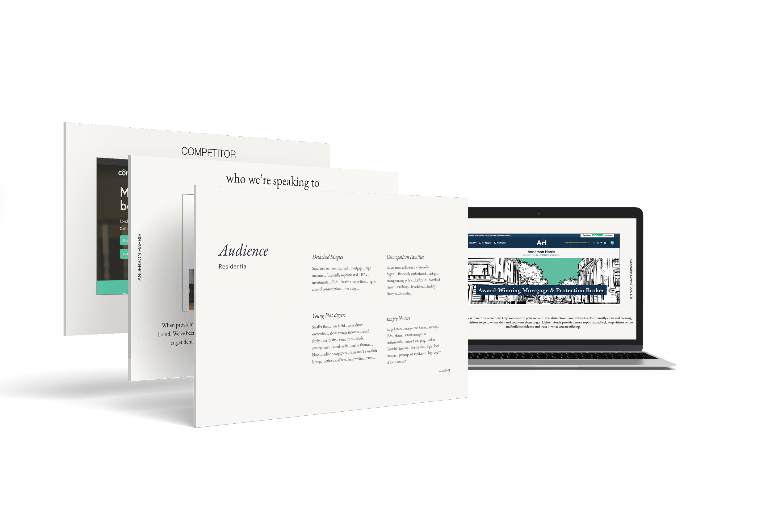
We began by examining Anderson Harris' target audience, focusing on their existing clients and identifying new opportunities to attract prospective buyers.
Our analysis of Anderson Harris's values and the broader industry landscape prompted us to adopt a design approach that breaks away from the conventional property industry aesthetic, which our competitor research revealed to be stuck in the early 2000s. Our aim was to create a visual language that not only reflects the modernity and contemporariness of Anderson Harris but also sets it apart with its unique and unmistakable identity.
BEFORE
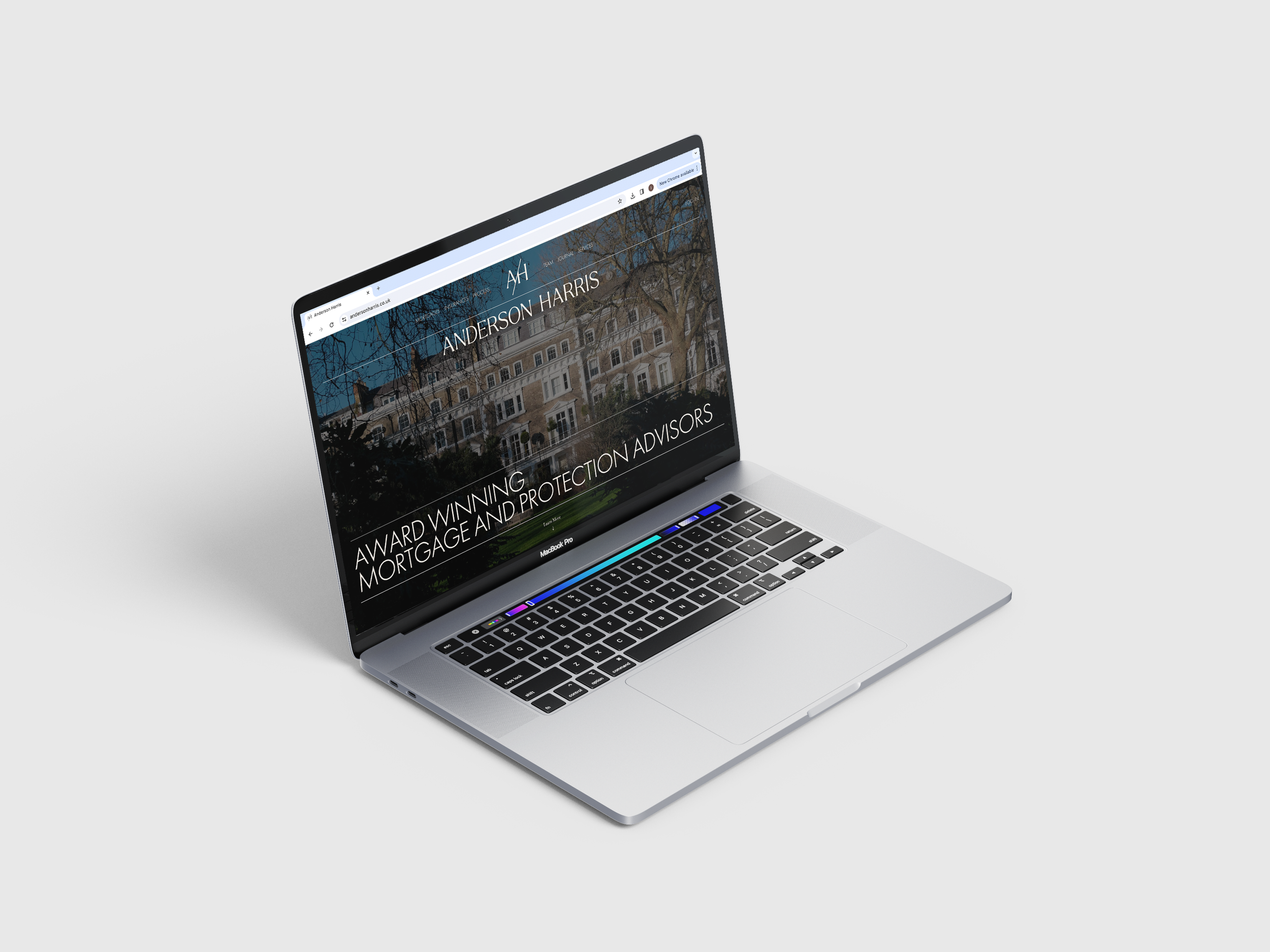
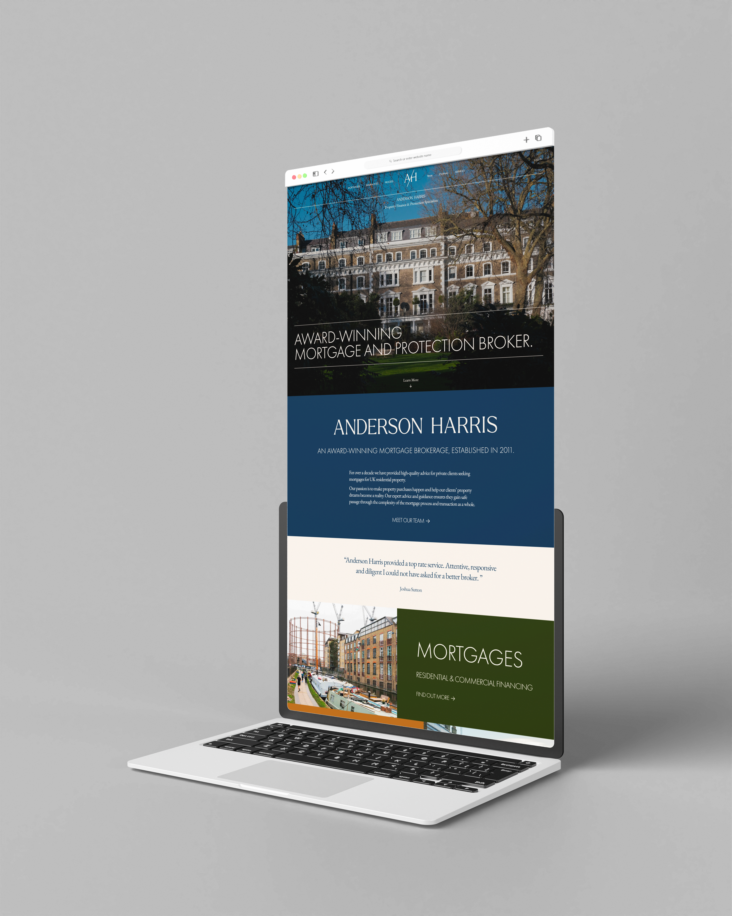
We focused on UX and UI design when redeveloping the website, collaborating with high-calibre web developers to create an aesthetically pleasing, easy-to-navigate site. Our development process was complemented by an SEO strategy, with our copywriters working alongside the developers to integrate SEO keywords into the website's copy. Once the website was approved, we provided a user guide with easy-to-follow video guidance, creating confidence in the approachability of their new website.
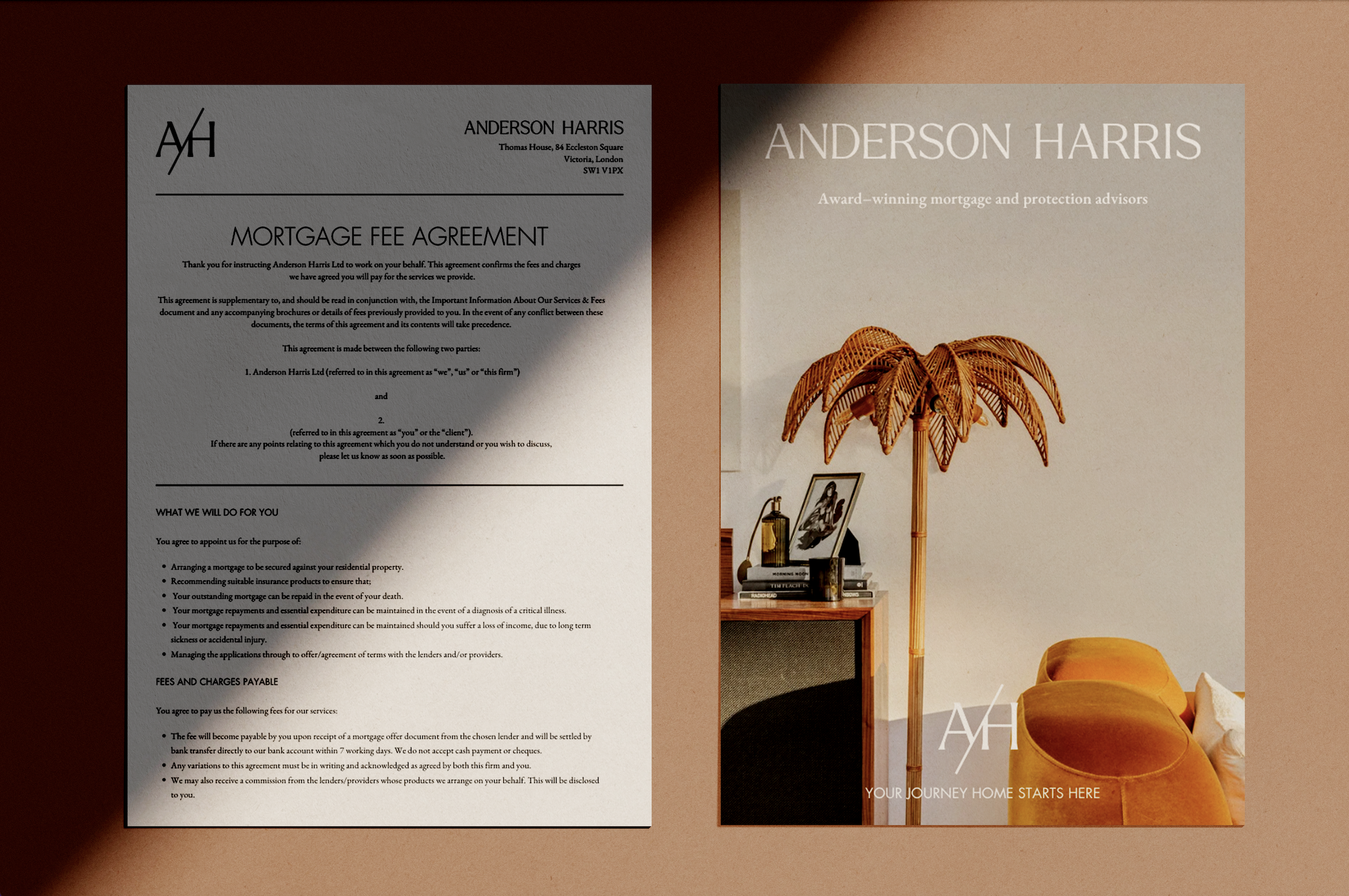
Before aligning printed marketing materials, each piece underwent further copy-editing and layout design to ensure clarity and consistency with the newly established tone of voice. We provided these assets as editable templates, allowing Anderson Harris to adapt their collateral in real time, ensuring their branding remains dynamic and responsive to evolving business needs.

Established in 2011, Anderson Harris has emerged as a distinguished mortgage brokerage, earning acclaim for offering superior guidance to private clients seeking mortgages for UK residential properties. In an industry where trust and integrity are paramount, Anderson Harris has identified the importance of differentiating itself. The firm achieves this through its service.
Since the mortgage industry is well–known for prioritising reputation over design, transparency is essential. Recognising the need for a comprehensive rebrand that would both continue to keep current customers engaged while attracting a new audience, Anderson Harris enlisted our help. Our mandate was to rejuvenate Anderson Harris’s brand identity, starting with a website revamp and extending to a comprehensive suite of printed collateral.


TONE OF VOICE
While creating Anderson Harris's visual identity, our team also established a new tone of voice aligning with the company’s values of warmth, expertise, and approachability. We held a detailed tone-of-voice workshop, resulting in a guideline document featuring a tone of voice matrix to position Anderson Harris competitively, consistency rules for all platforms, and a specific grammar and vocabulary guide.
Within the intimidating world of mortgages, we wanted to strike a tone of voice that balanced expertise with empathy and professionalism. The housing market experiences fluctuations throughout the year, mirroring the changes in seasons; with them playing a crucial role in the mortgage industry due to their influence on market dynamics, financial milestones, and client behaviour we introduced a good photographer, who could illustrate how, for instance, spring often sees a surge in activity as individuals are more inclined to explore property options, while the colder months witness a slowdown in the market as people focus on holidays and festivities.
Additionally, we refined the tone by interviewing each team member, leading to consistent and professional biographies for use across the company’s brochures, website, and digital presence. We also tailored social media guidelines to adapt the tone appropriately across platforms like LinkedIn, Instagram, and Twitter, and developed a do’s and don’ts guide for AI-assisted online brand promotion.
The theme of journeying has transformed the Anderson Harris visual identity. The advisory now has a robust brand that mirrors its core values and differentiates it within the competitive mortgage brokerage landscape. Thoughtful redesign of printed assets, development of a cohesive tone of voice, and the creation of an SEO-optimised website work to elevate Anderson Harris’s presence and importantly speak to their audience.
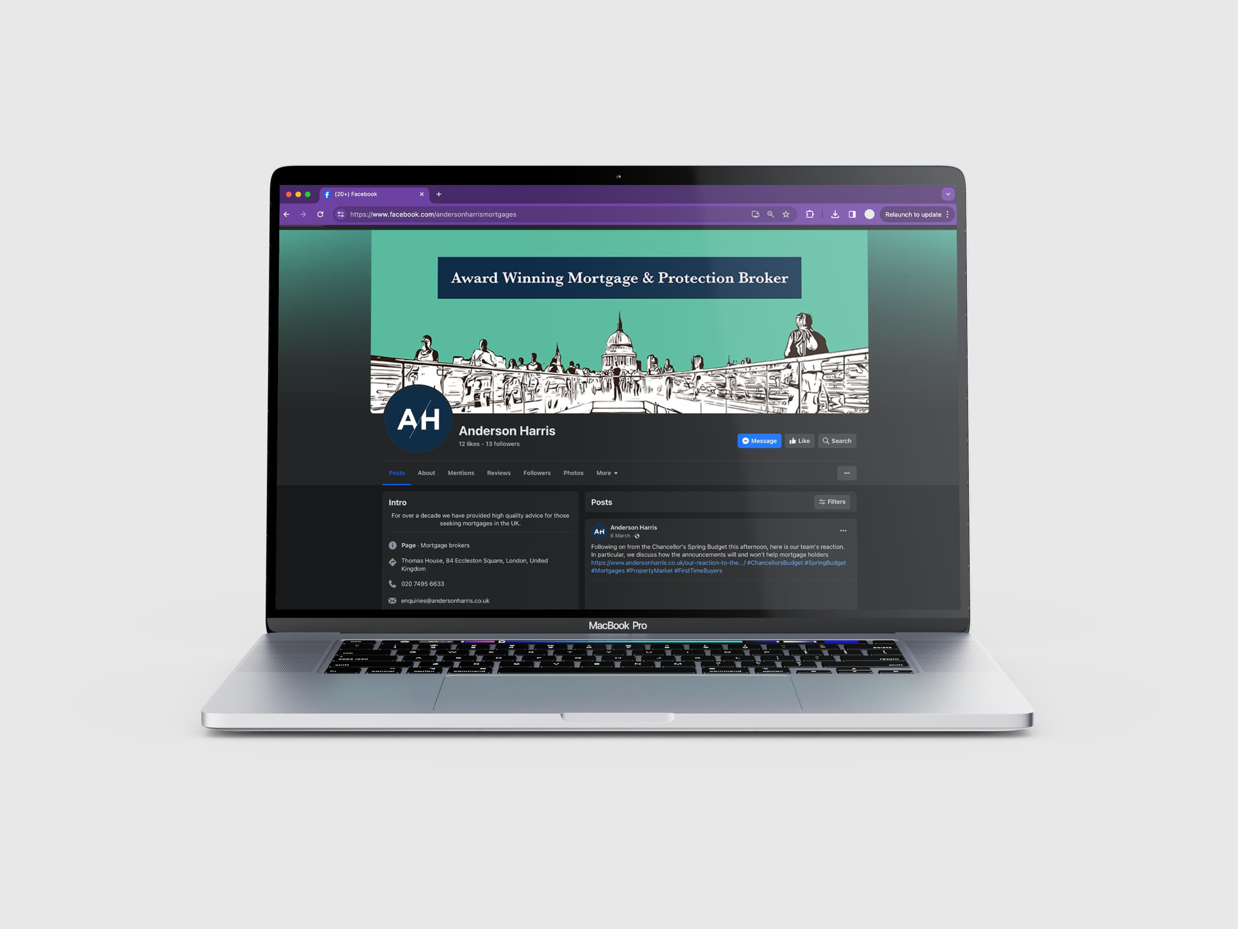
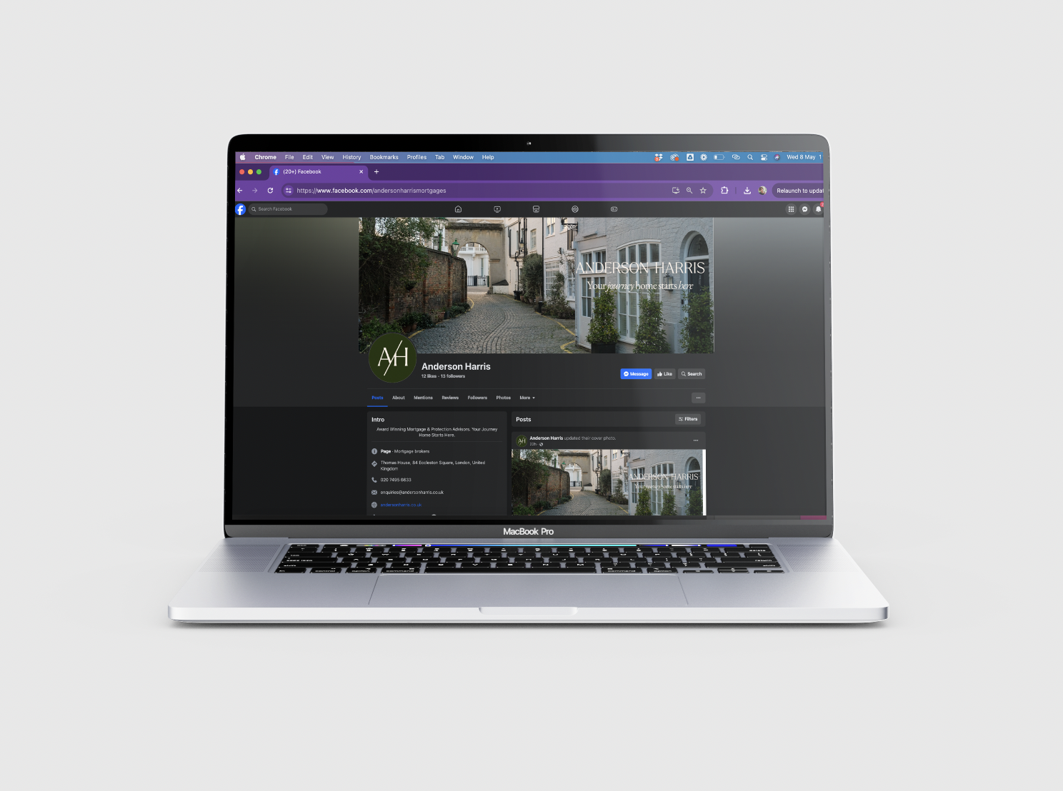
To help maintain consistency across LinkedIn, Twitter and Instagram, we created a versatile library of banners and profile pictures. Before the banners were approved, we tested different options to come to the end result.
Finally, we provided Anderson Harris with a comprehensive list of appropriate hashtags to use in order to generate attention and drive engagement, along with research into the specific accounts they should follow in order to establish an organic network of engaged followers.


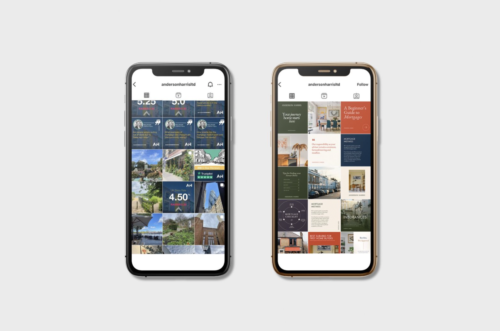
We then generated a complete collection of social media templates across a number of content pillars that we established separately. From brand heritage to community and education, these social media templates were designed to be bold and impactful, demonstrating how versatile our new visual identity can be. Alternating between gorgeous full-bleed imagery, vibrant splashes of warm colour, and crisp typographic treatments, the new look for Anderson Harris’s social media presence is surprising, informative, and most importantly - consistent.
As our designers got to work on applying the new visual identity to the existing documents, our copywriters were analysing and adjusting the copy in order to align it with the new tone of voice, working closely with the Anderson Harris team to ensure the new copy was compliant with the strict rules applicable to the mortgage industry.
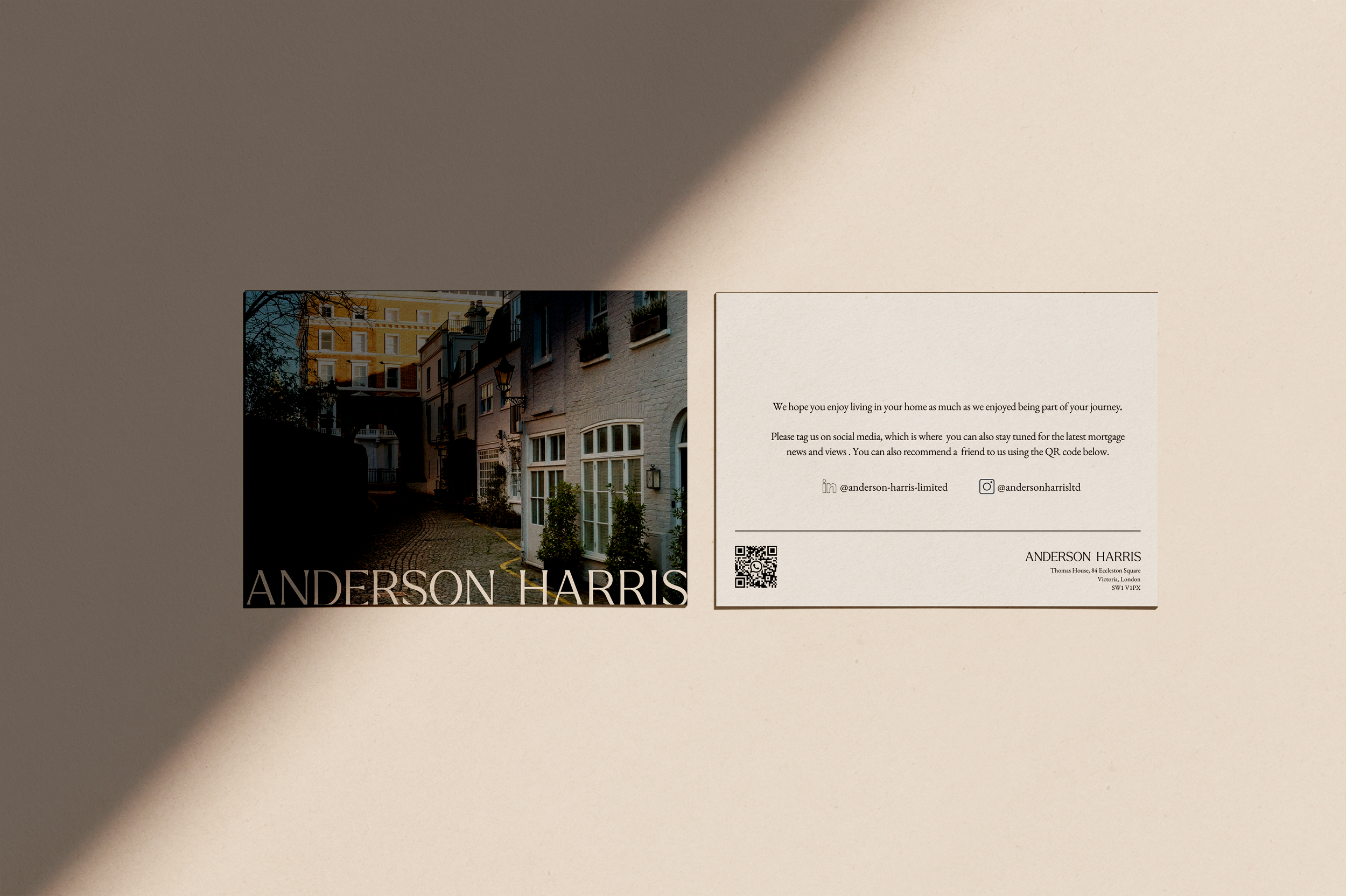
To ensure every step, and interaction between Anderson Harris and their clients would be seamless, colourful and consistent with the overall brand identity we created postcards, zoom backgrounds and email signatures.
To provide further clarity for anyone wanting to invest in a mortgage, we created a process flowchart. So the team could use everything across the board we delivered everything in design software for non–designers, and created a user guide for both the Anderson Harris website and Canva, detailing how to carry out any necessary processes to maintain their social presence. This ensures ongoing brand consistency and acts as a crutch for the clients to use when creating content in the future.
after

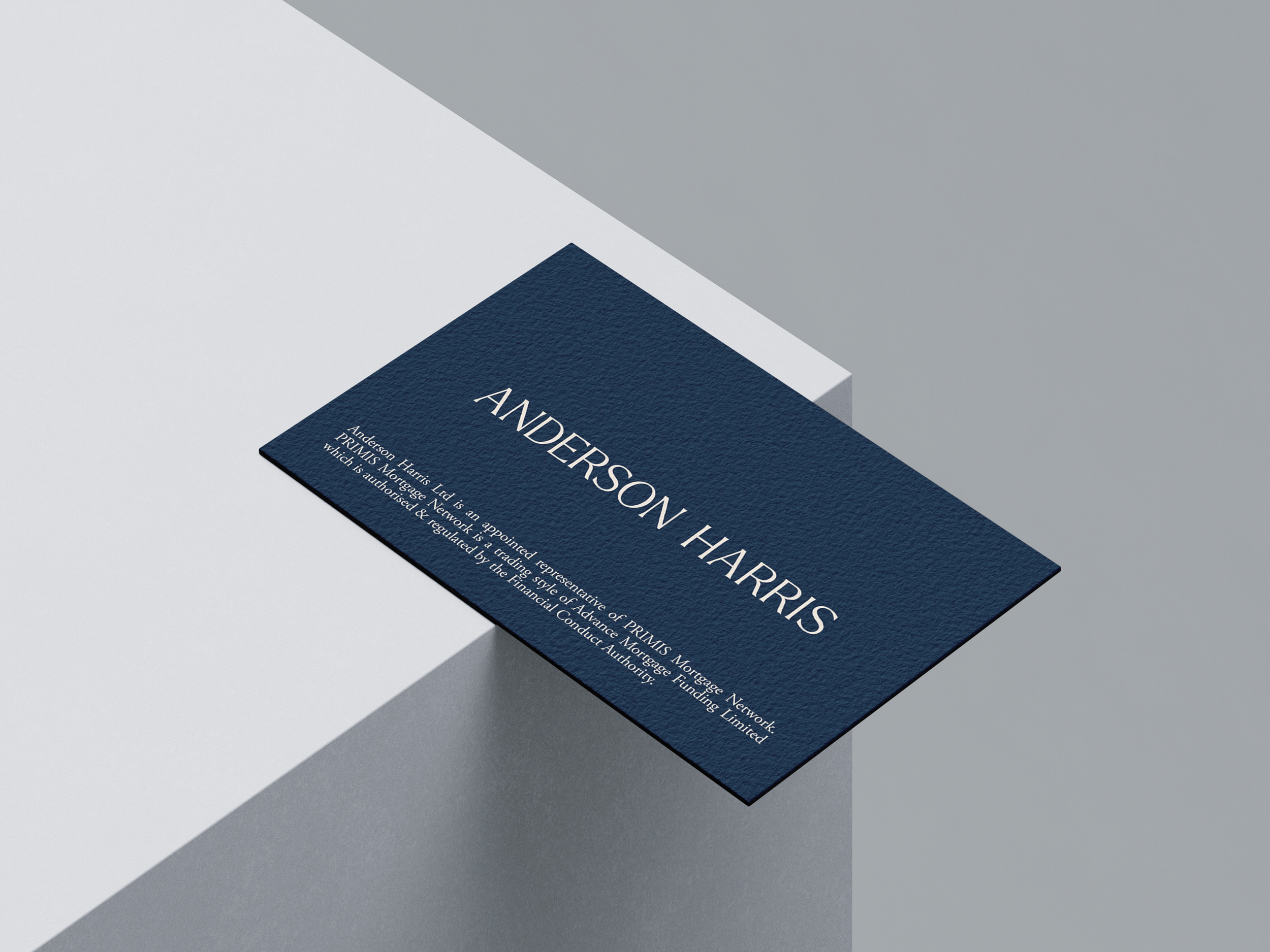
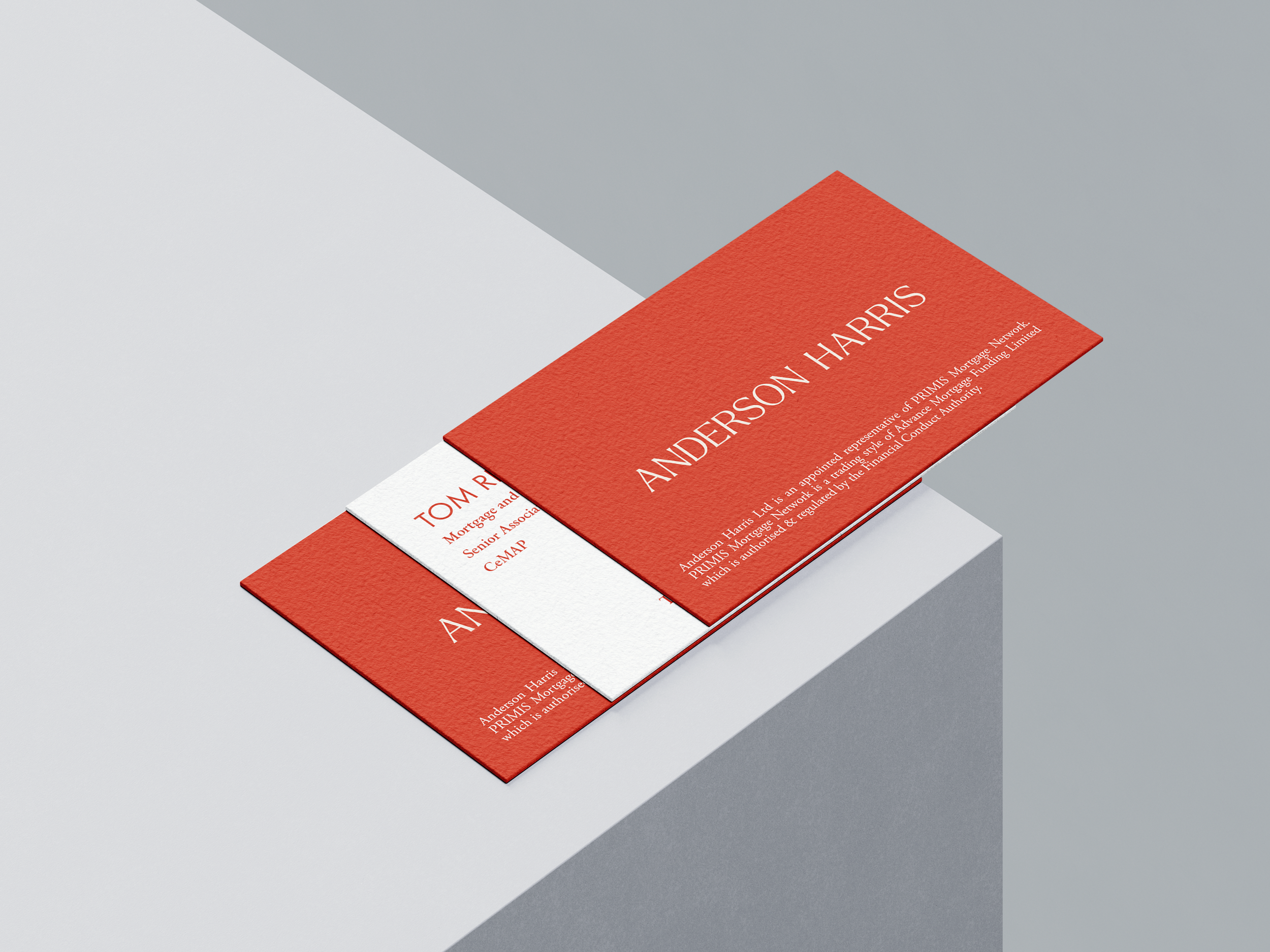
A set of new business cards was created for the team’s use, taking advantage of the expanded colour palette to step away from the industry standard of black text on cream cards. The new business cards are colourful but make use of a refined, traditional layout, balancing the warm personality of the team with the expertise they bring to the table.
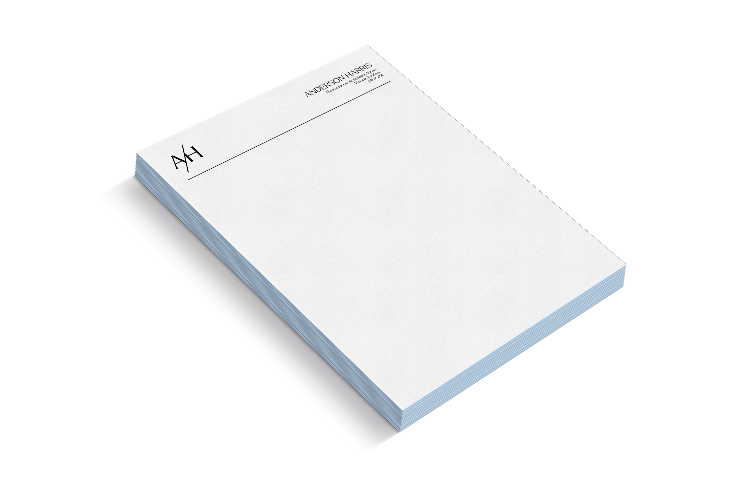
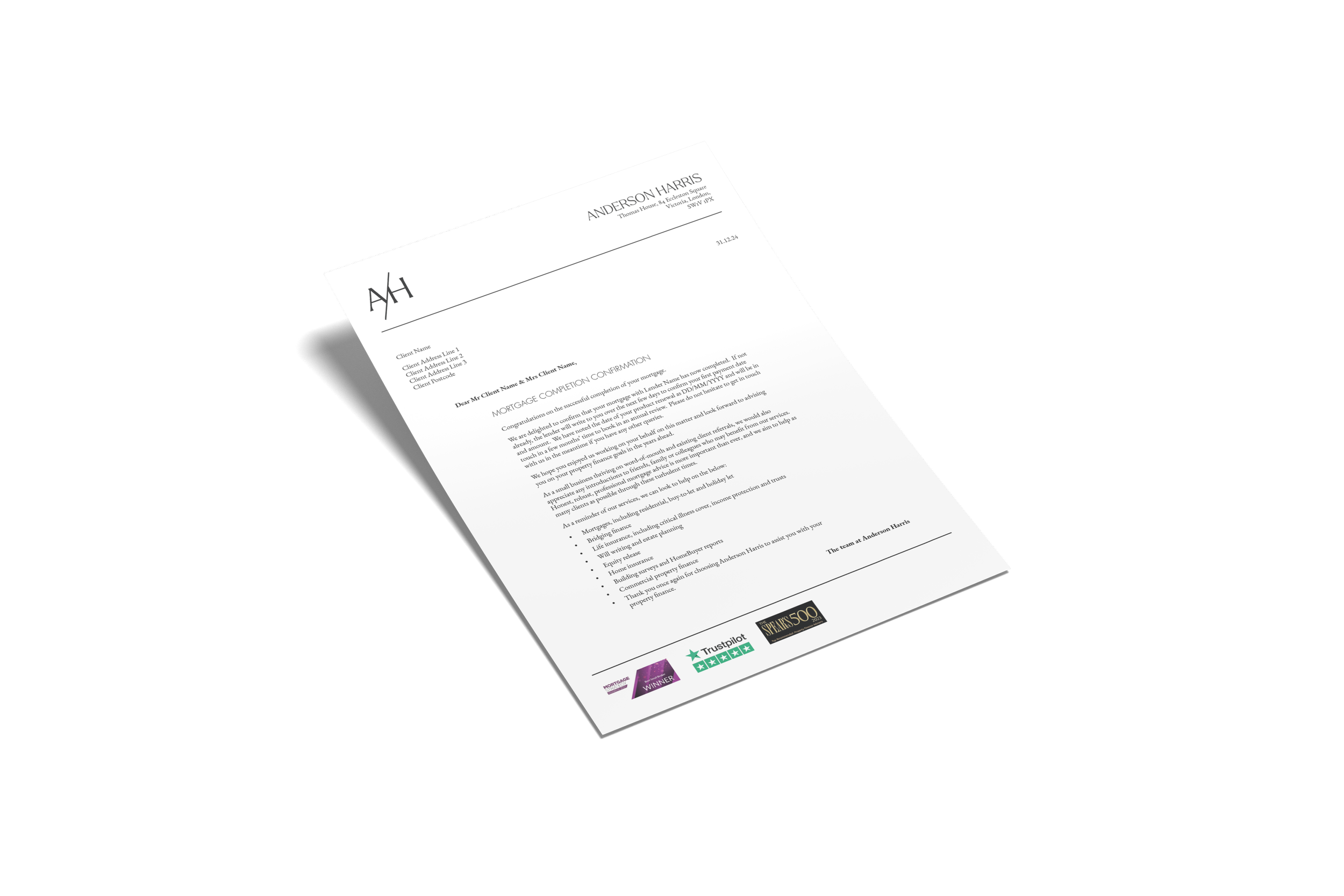
A letterhead was created to be used across all printed assets, and our designers established a set of rules to ensure the most commonly generated letters were beautifully formatted and flexible enough to support the Anderson Harris team’s needs - from signature collection to terms and conditions, the new layout is clean and spacious, with a professional, established aesthetic.
"Alexandra is extremely professional, organised and personable and delivered exactly what she said that she would. We were kept up to date all the way on the project and the project was delivered on time. The project involved a new website, branding and tone of voice piece. Her team provides a tailored service and we are grateful for her attention to detail throughout the process and the feedback on our launch efforts since we have announced the rebrand. If you're looking for a reliable design studio that goes the extra mile then I wouldn't hesitate to recommend you to Alexandra."
––Adrian Anderson, Founder, Anderson Harris
Services: Strategy, brand identity including logo, colour palette, printed assets, tone of voice guidelines, and social media template design. Interested in a rebrand? Get in touch for a quote!