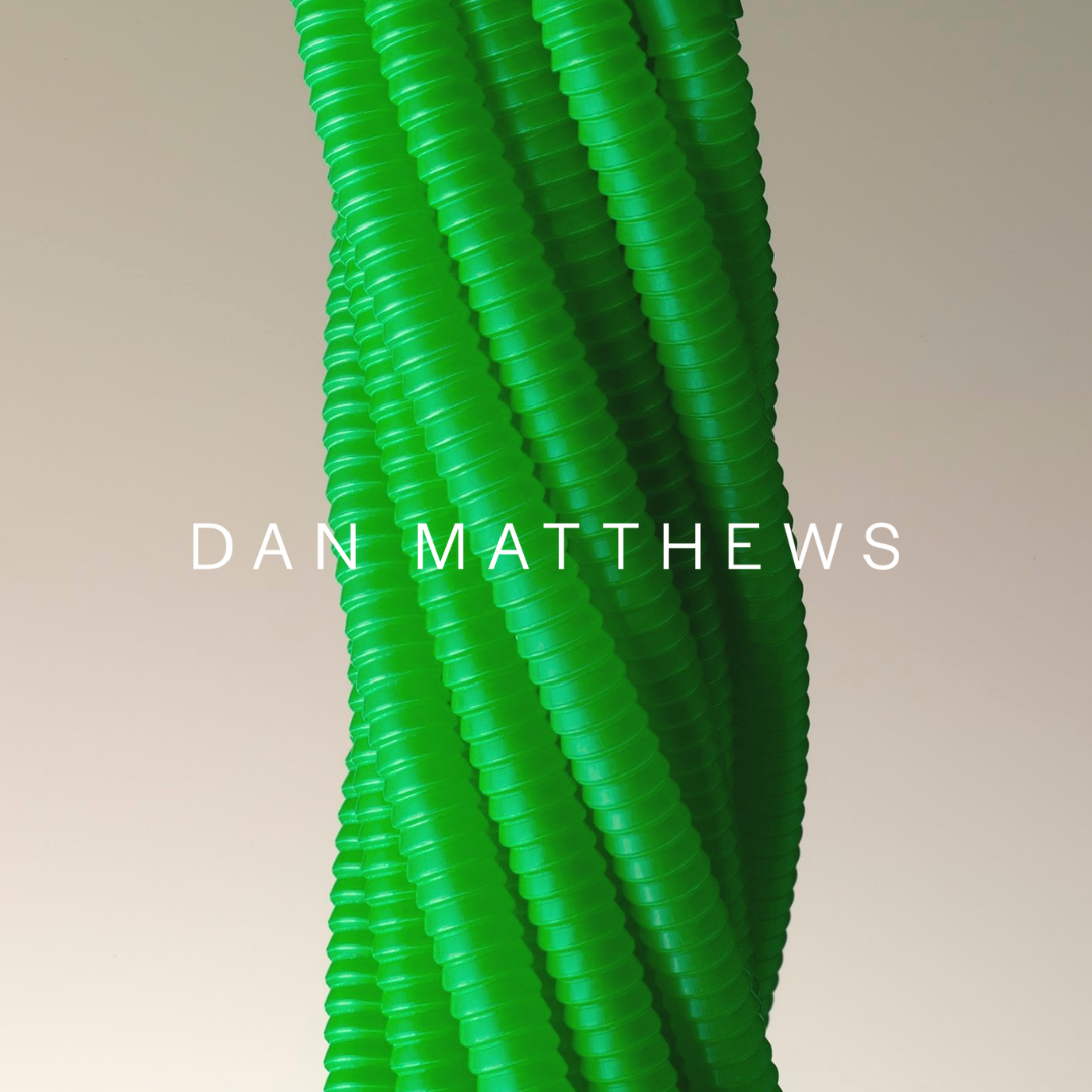
Award-winning photographer Dan Matthews has a portfolio that speaks volumes. He came to us after being introduced by a mutual friend as he wanted some advice on designing and restructuring his website and creating a marketing strategy.
His initial brand identity was created in the early 2000s, and it was the zeitgeist of that era – minimal and clean (something we thought essential to keep to let Dan's work stand out) but lacking cohesiveness. Although his work came solely through happy clients and word-of-mouth referrals, he knew it was time to invest in a subtle evolution of the branding he already had––and to invest in a positioning piece since things had shifted since he had started out.
As a service provider who champions other brands, it felt counter-intuitive for Dan to apply the same polishing to his brand identity; he has been getting good, direct leads for decades without investing in strategic work. Further, it felt almost–phoney to position himself as a personal brand. But, understanding that this shift was essential within a crowded marketplace, we started the creative process by evaluating what was working and what wasn't.
We had an initial conversation with Dan from our studio at 180 The Strand to understand what kind of visual language he was aiming for. Again, working on a personal brand for someone who genuinely enjoys creating work because of their craft can feel counterintuitive. But, to get ahead in the world today it is essential. So first and foremost we worked on a positioning piece where we looked to the past, present and future contexts. This helped in positioning Dan Matthews Photography uniquely and in a way that felt right to him.
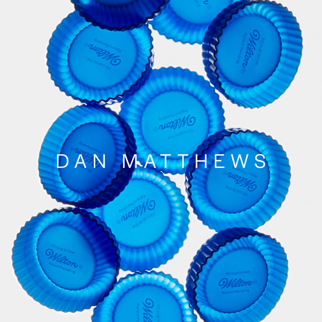
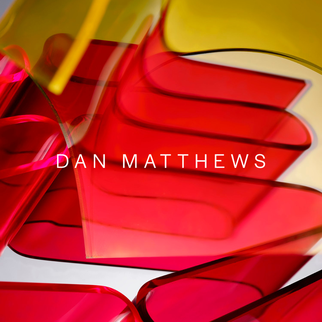
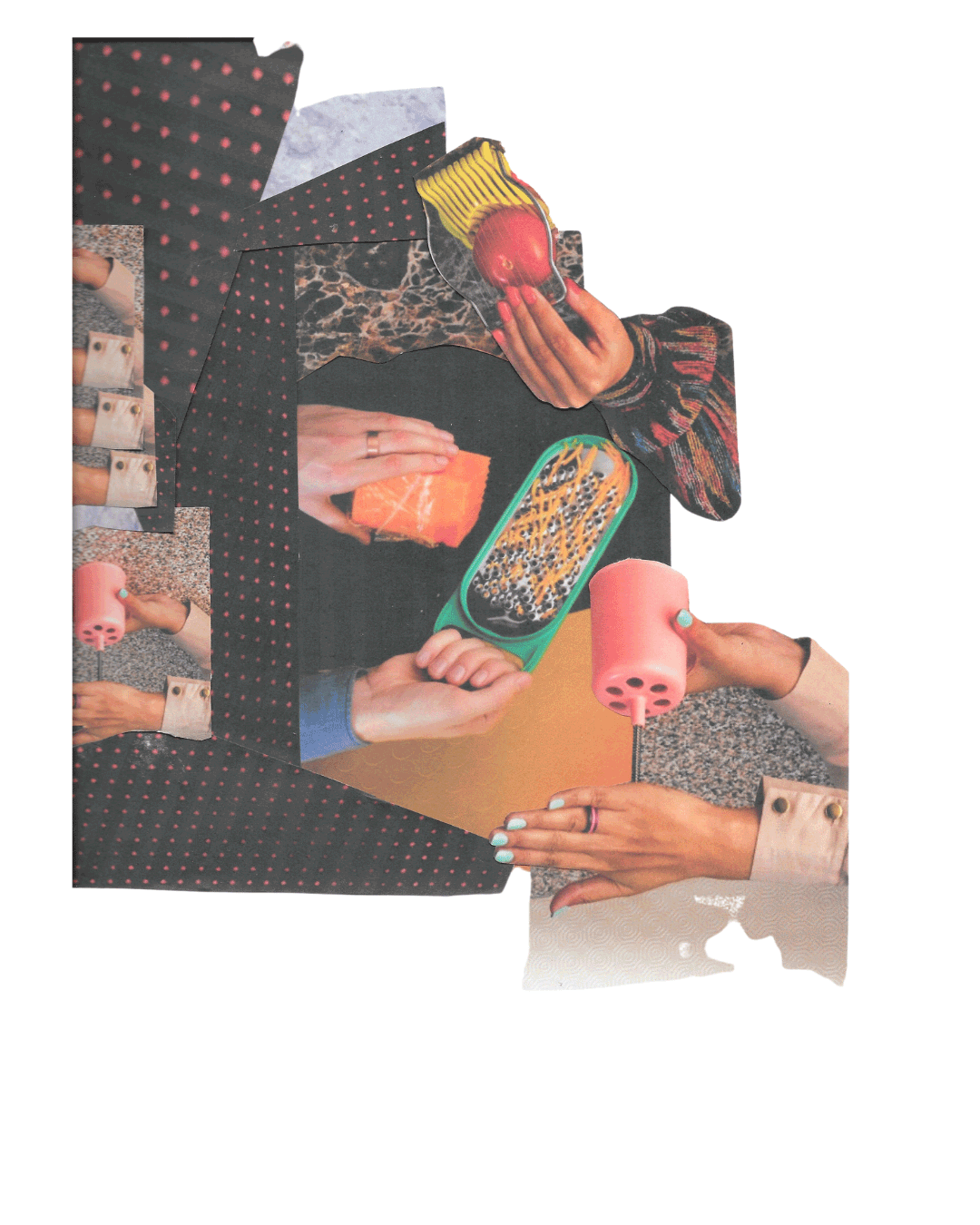
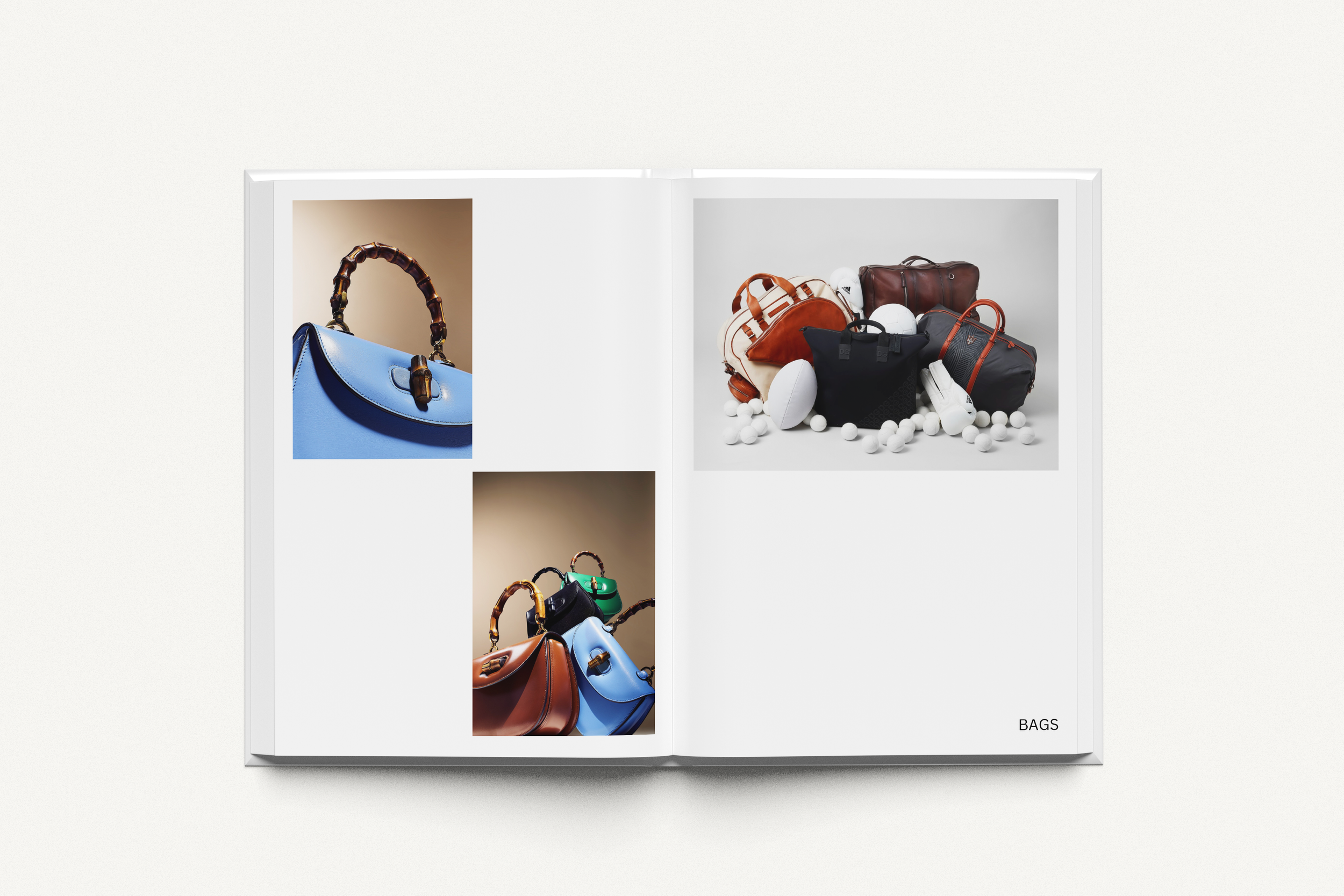
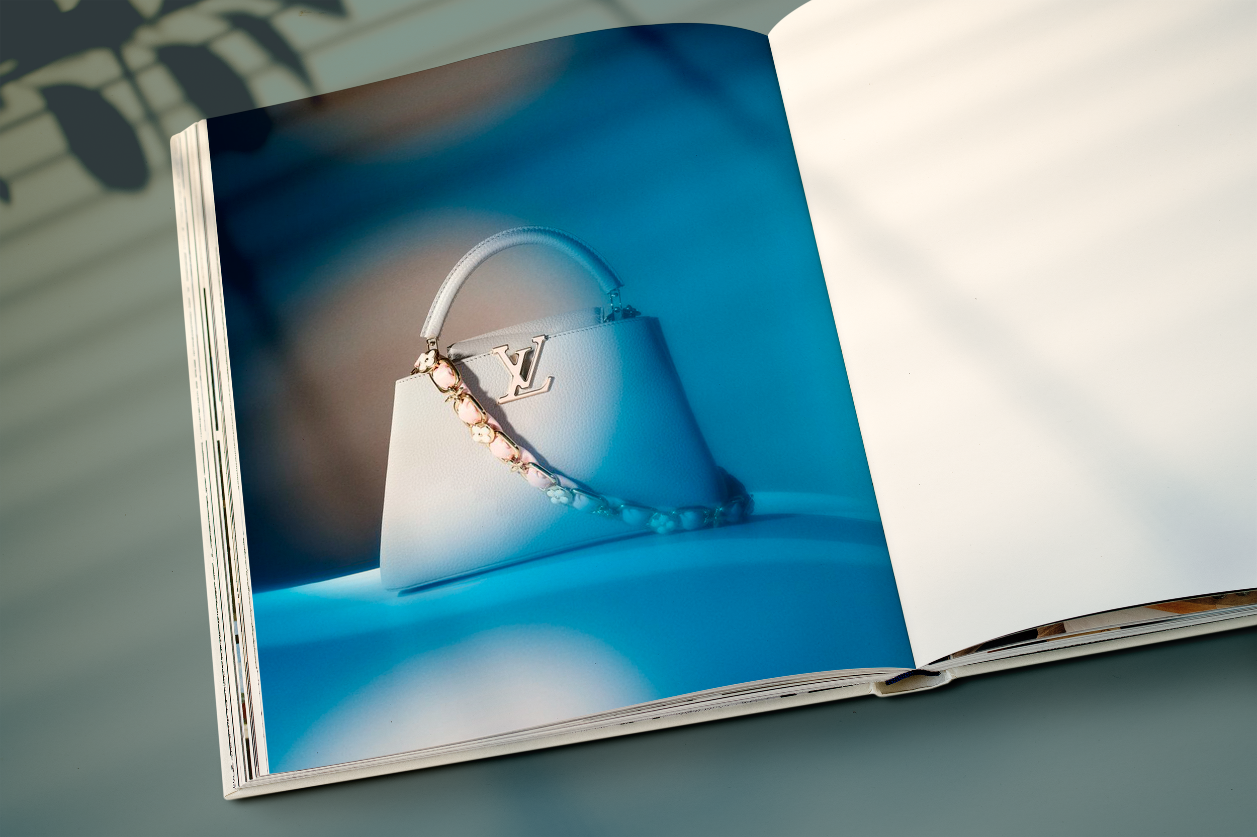
Our approach was multidimensional, starting with an in-depth exploration of Dan's body of work, his values, and his aspirations. We evaluated the current brand identity of Dan Matthews Photography, including the work he had already done; he was open to us playing around with his images and potentially working with them in a collage style.
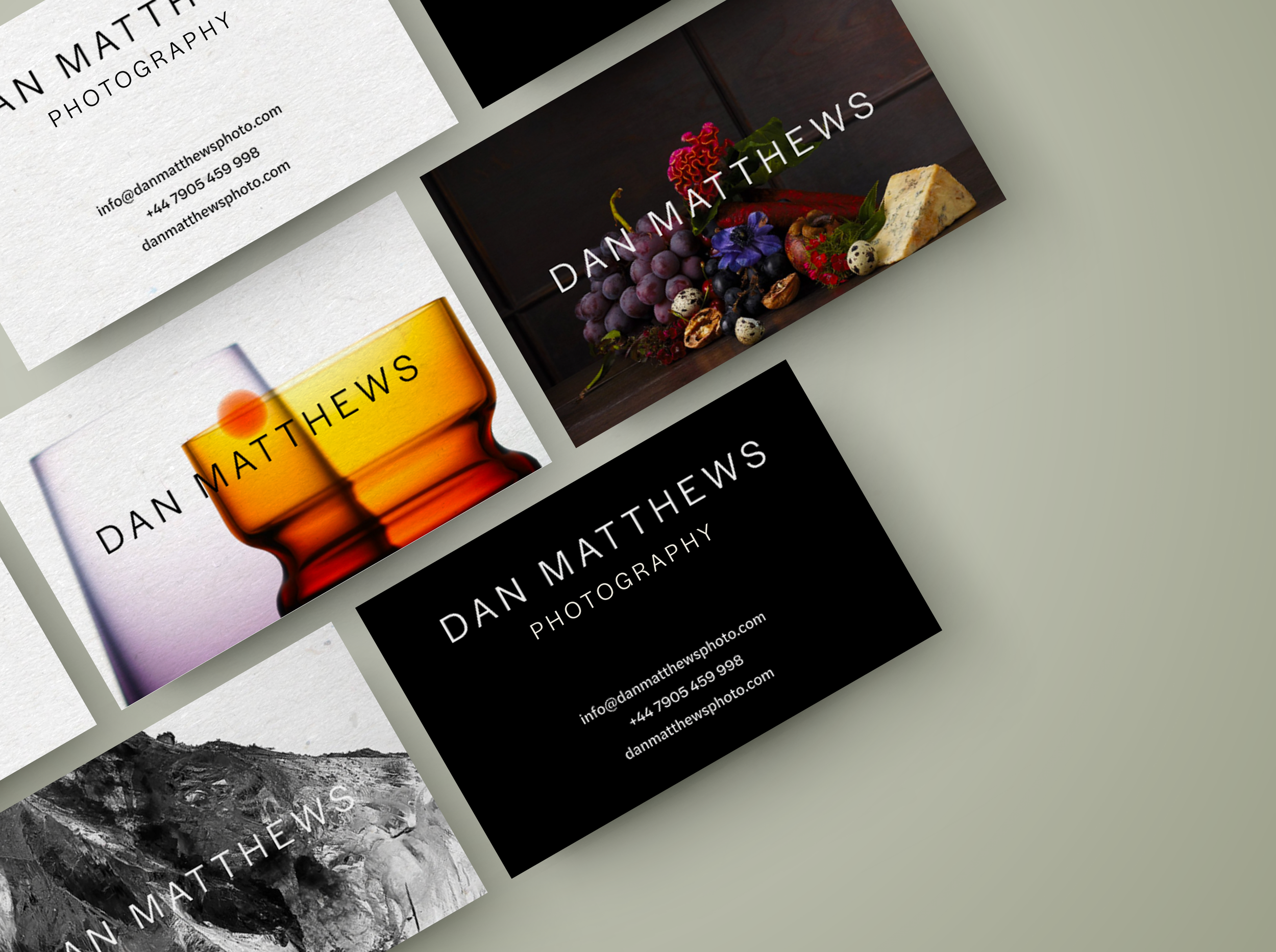
To the left are some collages that we played with before integrating the idea of collage into some social media template designs. This first–hand research and experimentation influenced his templates for social media.
“Alexandra and her team listened and totally understood my set of requirements. They pushed me to embrace a clearer and well explained process and plan that is now getting the results I had hoped for. From looking at type, language, structure of marketing principles and tailoring a website to my needs (Calmly and efficiently helping whilst I performed a massive U Turn halfway through the project) the result is an expansive yet clean website that I’m proud to show off, as well as a marketing strategy that was well explained to my team. There is now consistency, something that definitely had been missing before!”
– Dan Matthews
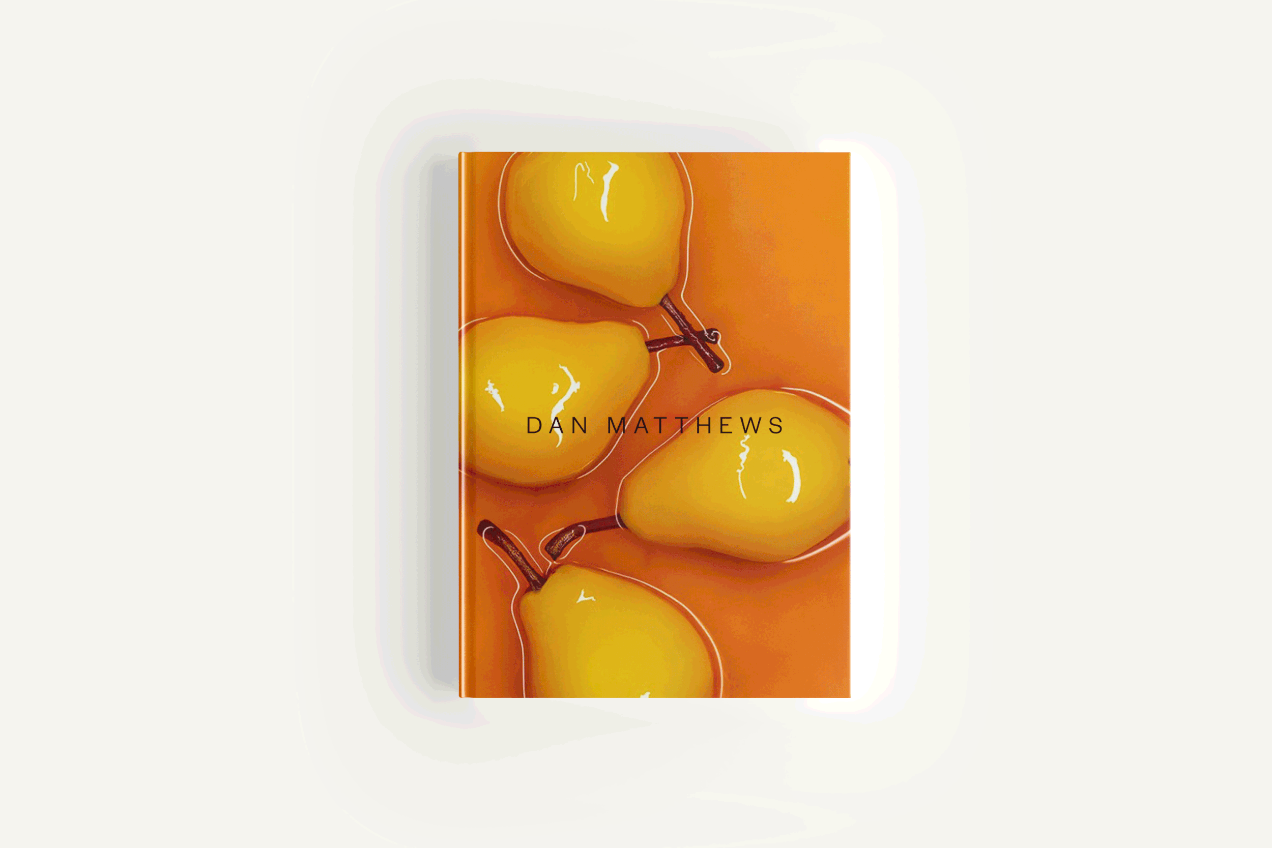
Dan wanted to keep things black and white to let his work stand out. No frills.
We considered different font pairings, visual styles, messaging approaches, and mediums (e.g., print, digital, social media) to communicate the new positioning effectively.
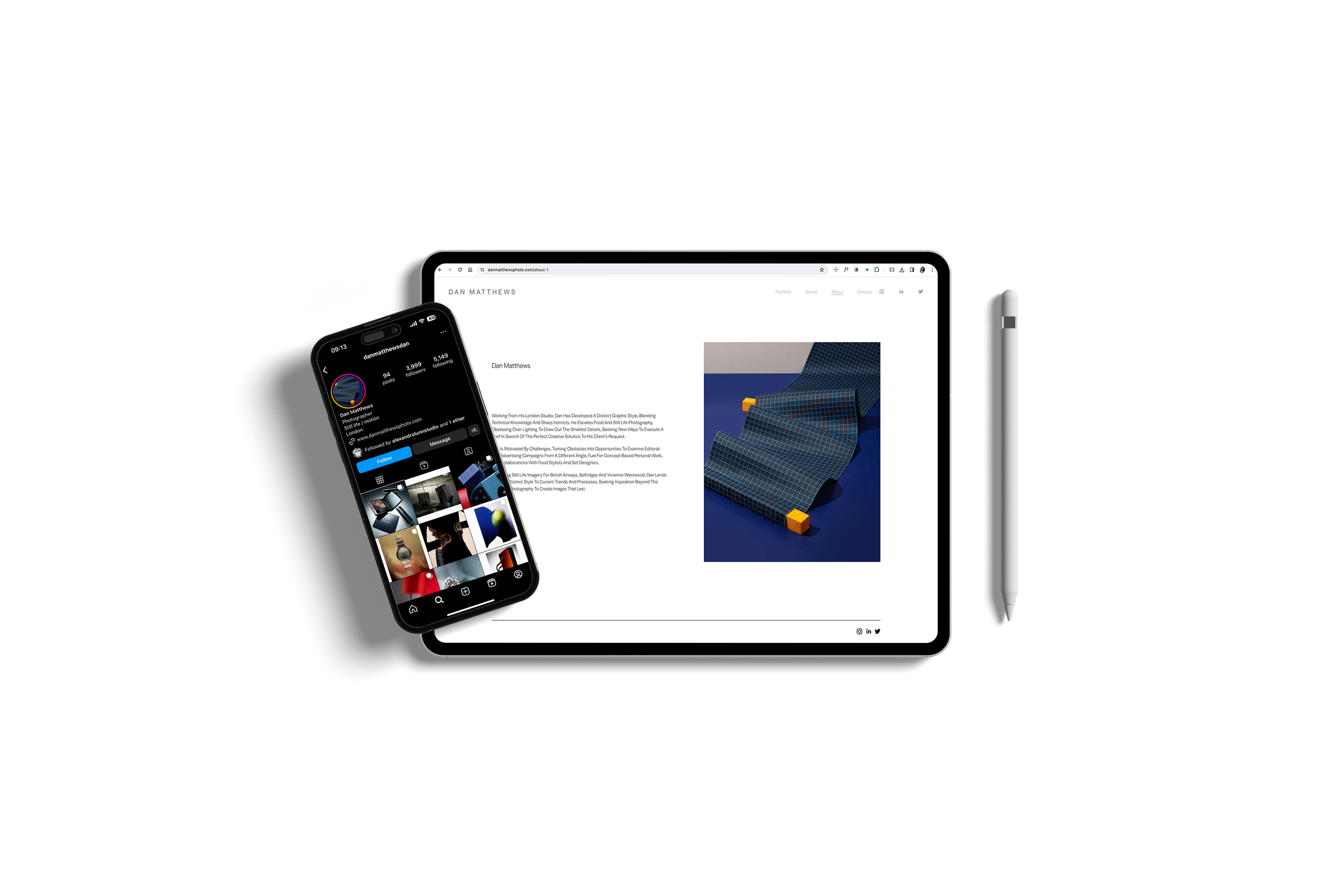
Once the style was selected we began to design his website which involved creating visual elements such as graphics, layouts, and other design elements.
Once Dan had provided feedback on what he liked and didn’t like, we iterated on the designs based the style guide––a simple set of rules and best practices; what to post and when to do it. Once we were clear on the visual language (a simple typeface and colour palette) we coupled it all together with his images which really brought things to life.
On the right you can see a layout of his website; it was a clean, easy process as he knew he wanted something simple from the outset.
TONE OF VOICE
The positioning piece included a thorough discussion with Dan to understand his target audience, and the message he wanted to convey. Essentially, in a sea of noise, Dan wanted a tone of voice that felt––much like him––friendly and informal whilst credible and to-the-point . We established how we should speak about Dan: should it be in the third person; referring to himself as 'I'? Or would ‘we’ be more appropriate, since as a studio as he has worked on several collaborations too. Anything is fine but consistency is crucial. Thanks to this, we were able to look into Dan's target audience to better tailor the repositioning piece to resonate with his existing and potential clients.


Services: Strategy piece, brand identity including logo, colour palette and typeface design, and social media template design.