

FINER FINER
FINERFINER is a Modern British resale marketplace for works of art and design that emerged at the Sotheby's Institute of Art. They're soon to soft–launch with a lineup of seriously covetable art, furniture and home accessories. This case study looks at the process of creating a unique, vibrant and eclectic visual identity for a marketplace specialising in furniture, antiques, and art.

CONTinued research
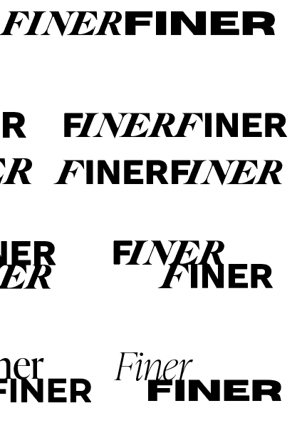
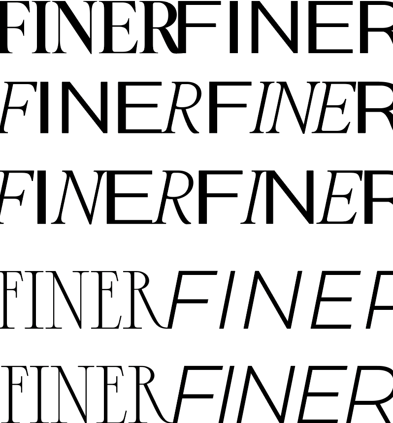
Once Lizzie had approved the desired style, to communicate trustworthiness in a modern age, we coupled a classical, serif font together with sans serif features which resulted in the look and feel Lizzie was after. Simple elegance provided a sense of class and heritage in the desirable objects that are available at FINERFINER. A serif typeface offers a feeling of crafted long-lasting value and quality that is strong, credible and dynamic.

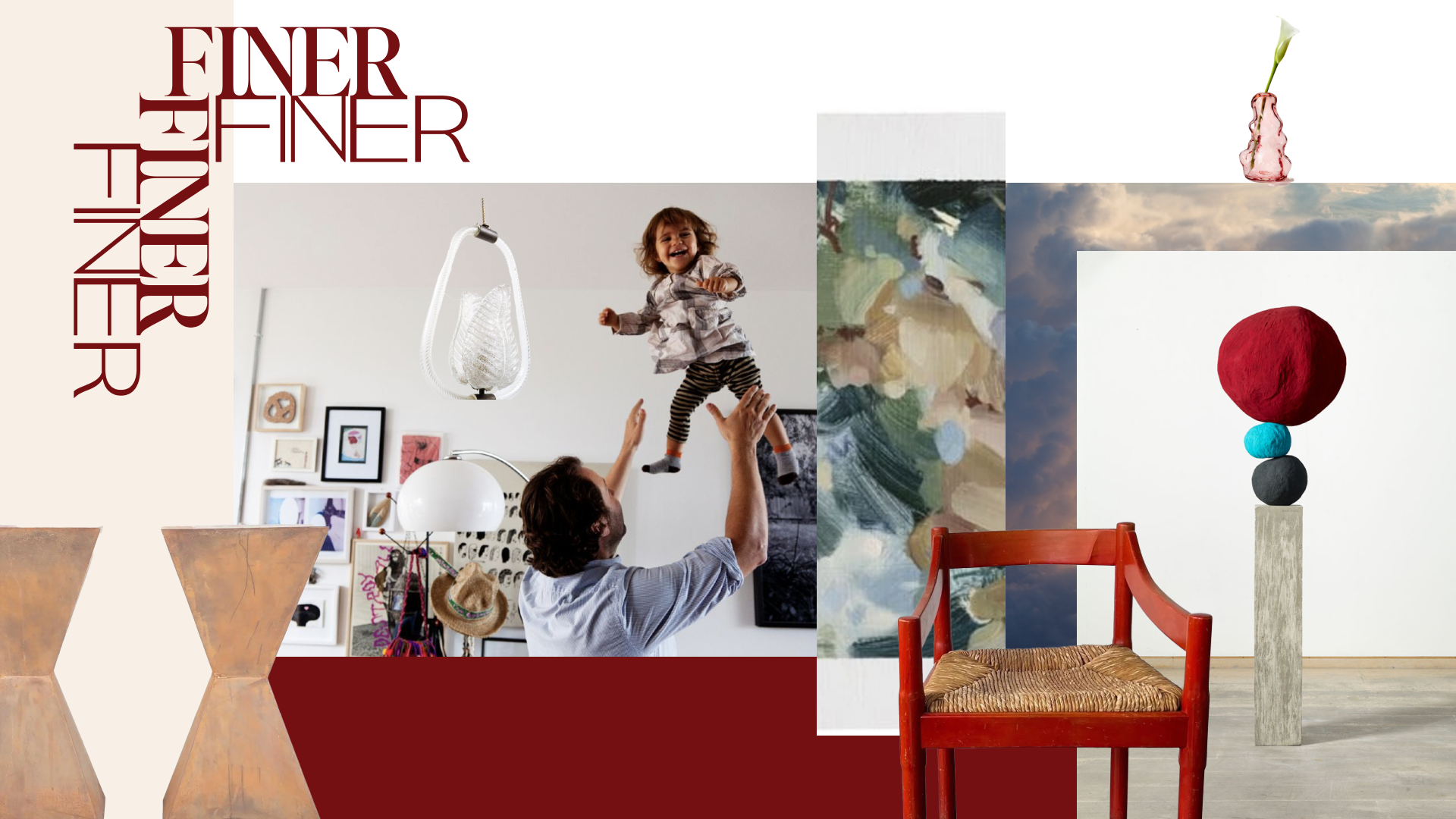
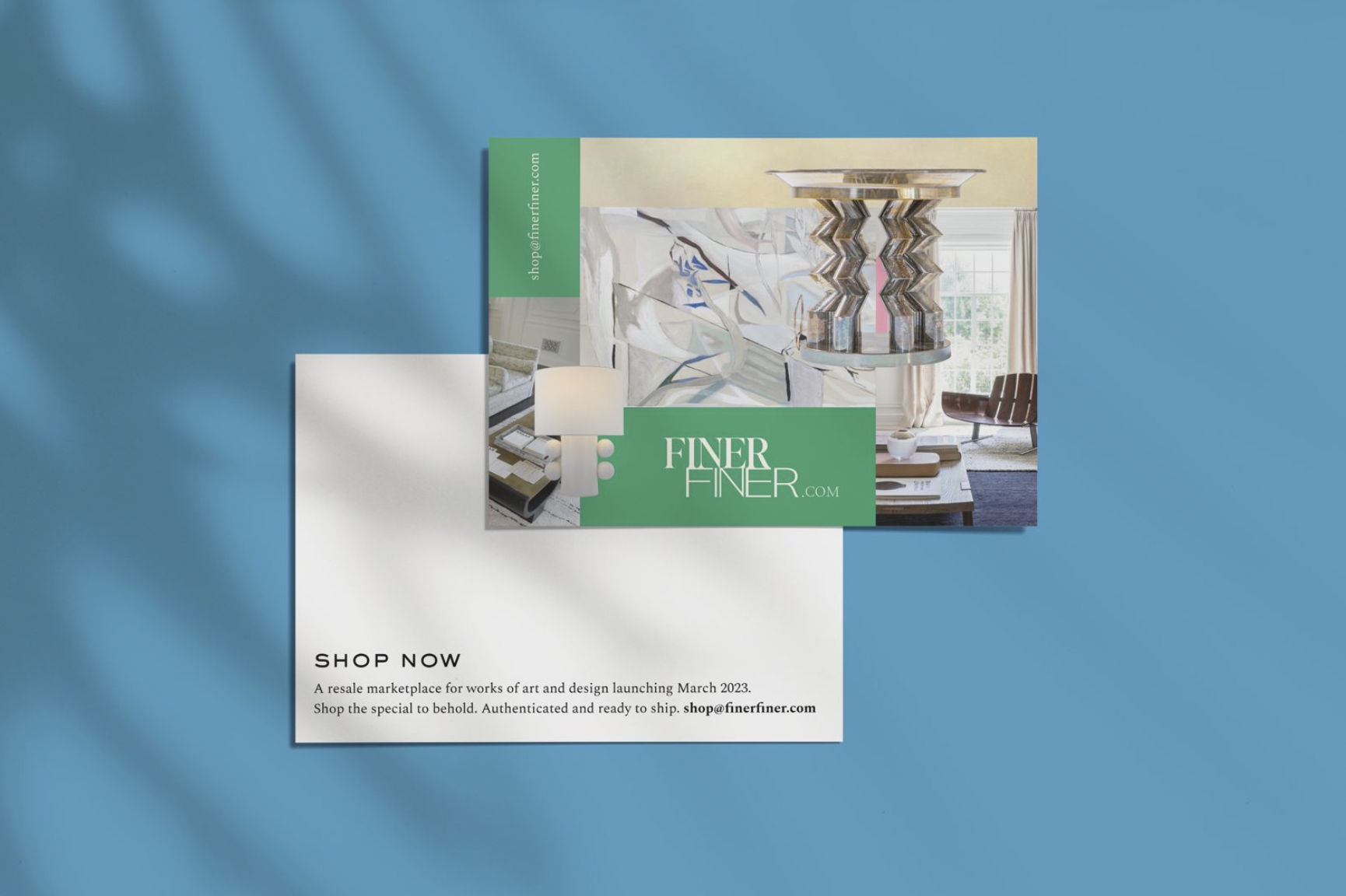
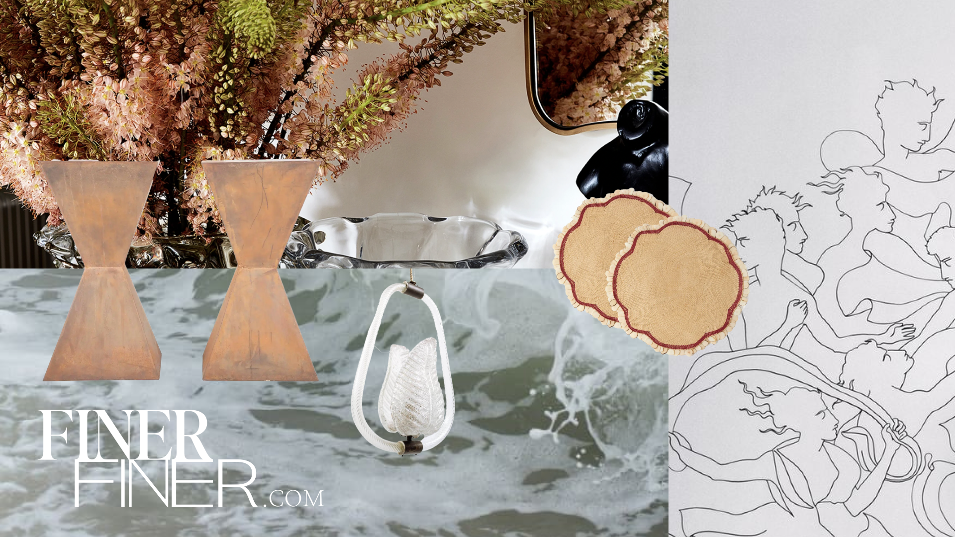
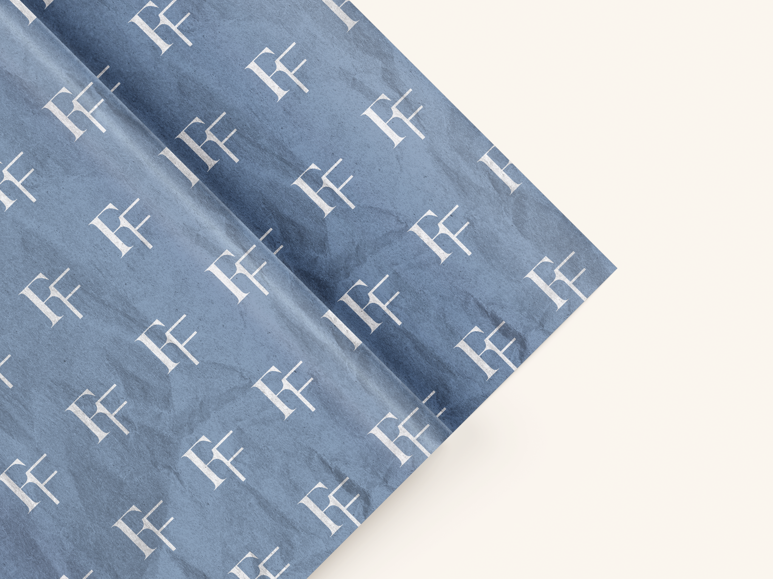
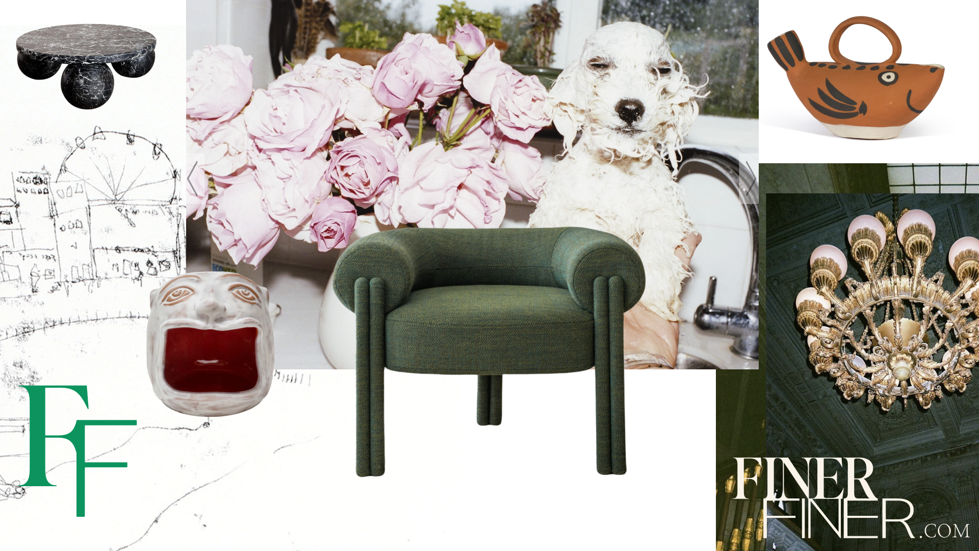
To further illustrate how the classical sits with the contemporary, we devised a collage technique to evoke the diverse and unique offerings of the platform while reflecting its creative ethos.
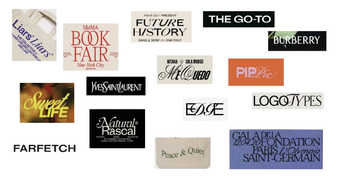
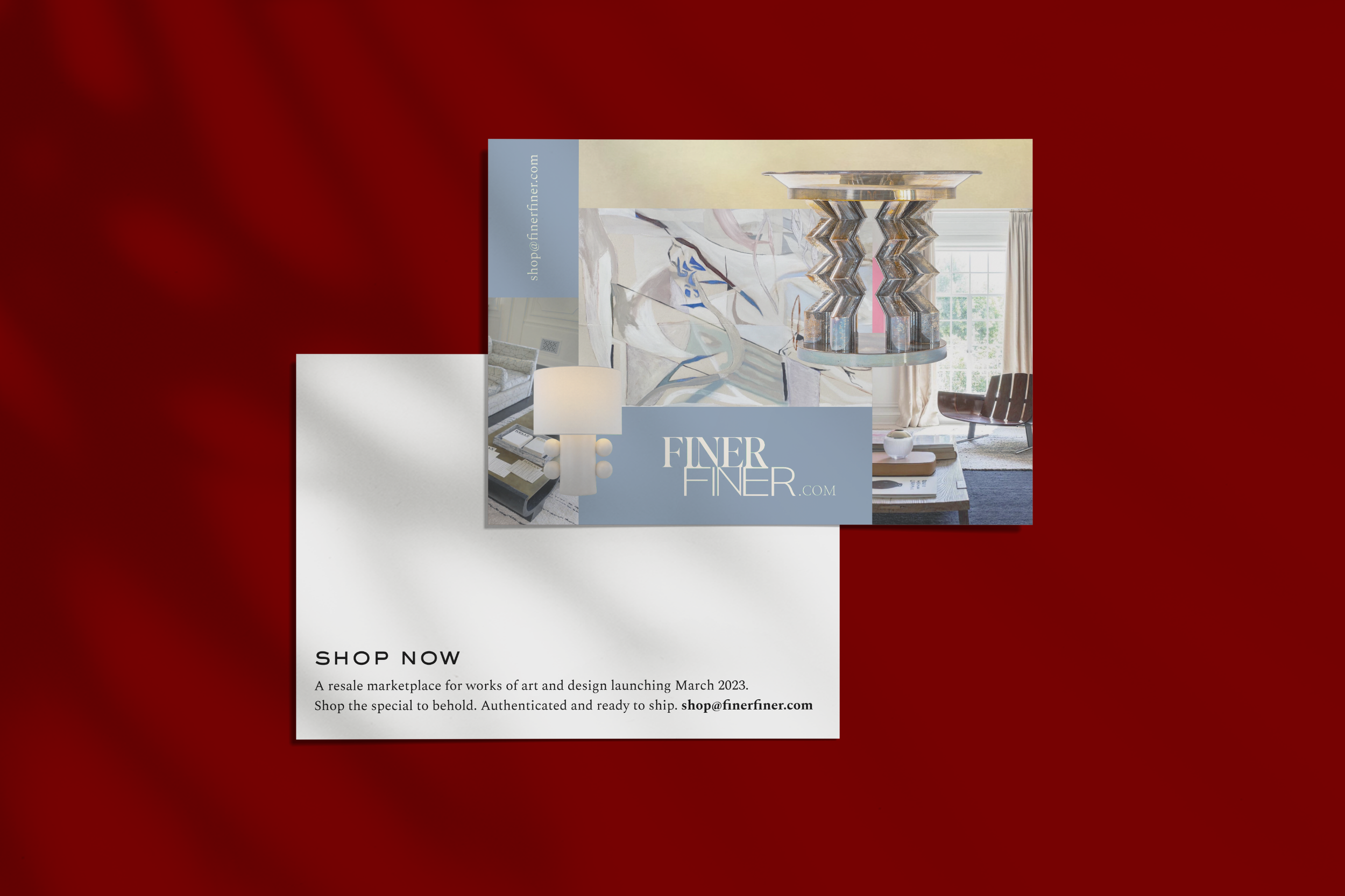
We then went on a visual safari, hunting down inspiration from all corners of the creative universe. Lizzie selected imagery representing the breadth and diversity of the marketplace's offerings. From classic art movements to the latest interior design trends, she asked for us to create playful compositions of images and textures – a perfect match for our eclectic theme.
Through careful arrangement and manipulation of these images, a series of collage-style visuals were created, each showcasing the unique charm and character of the items.

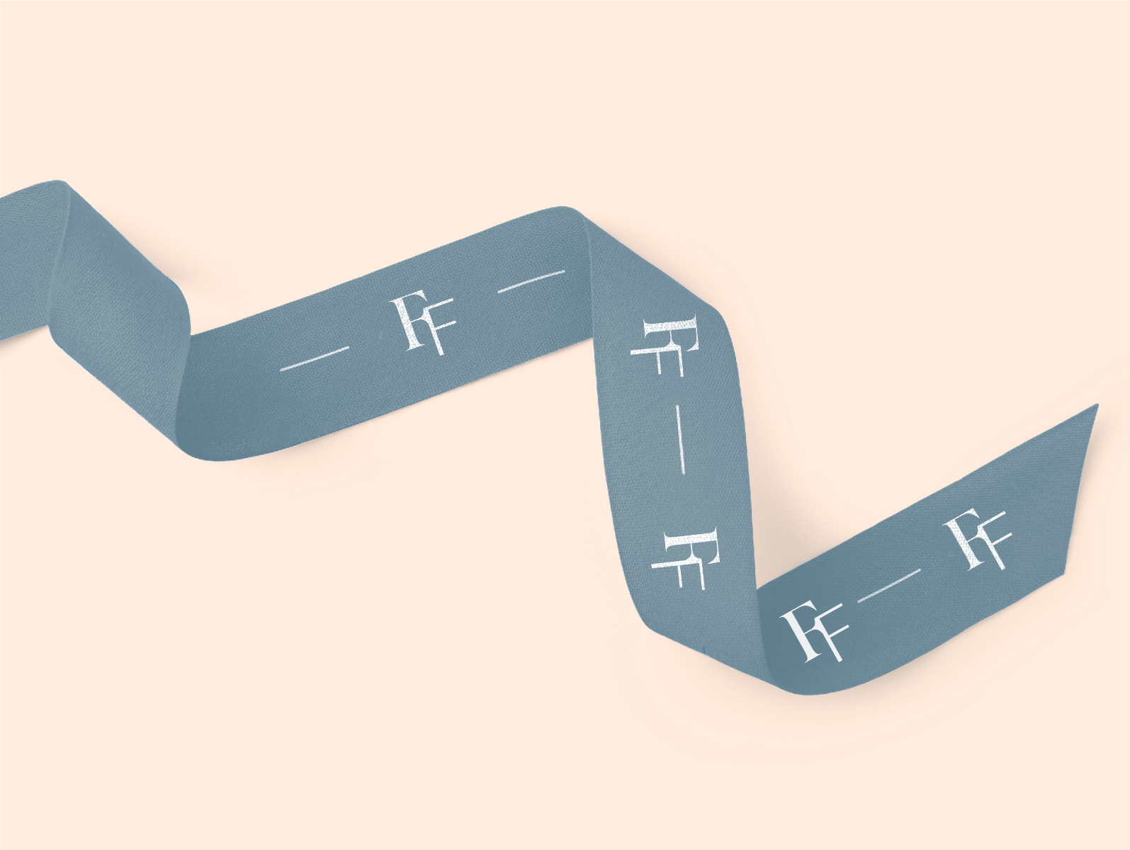
After several iterations, we found a balance, selecting refined serif fonts that exuded luxury and sophistication, perfectly encapsulating the essence of the new name. We then added a '.com' detail, as well as the logo marque and exported all of our artwork into clearly labelled folders, and compiled everything into a brand book.
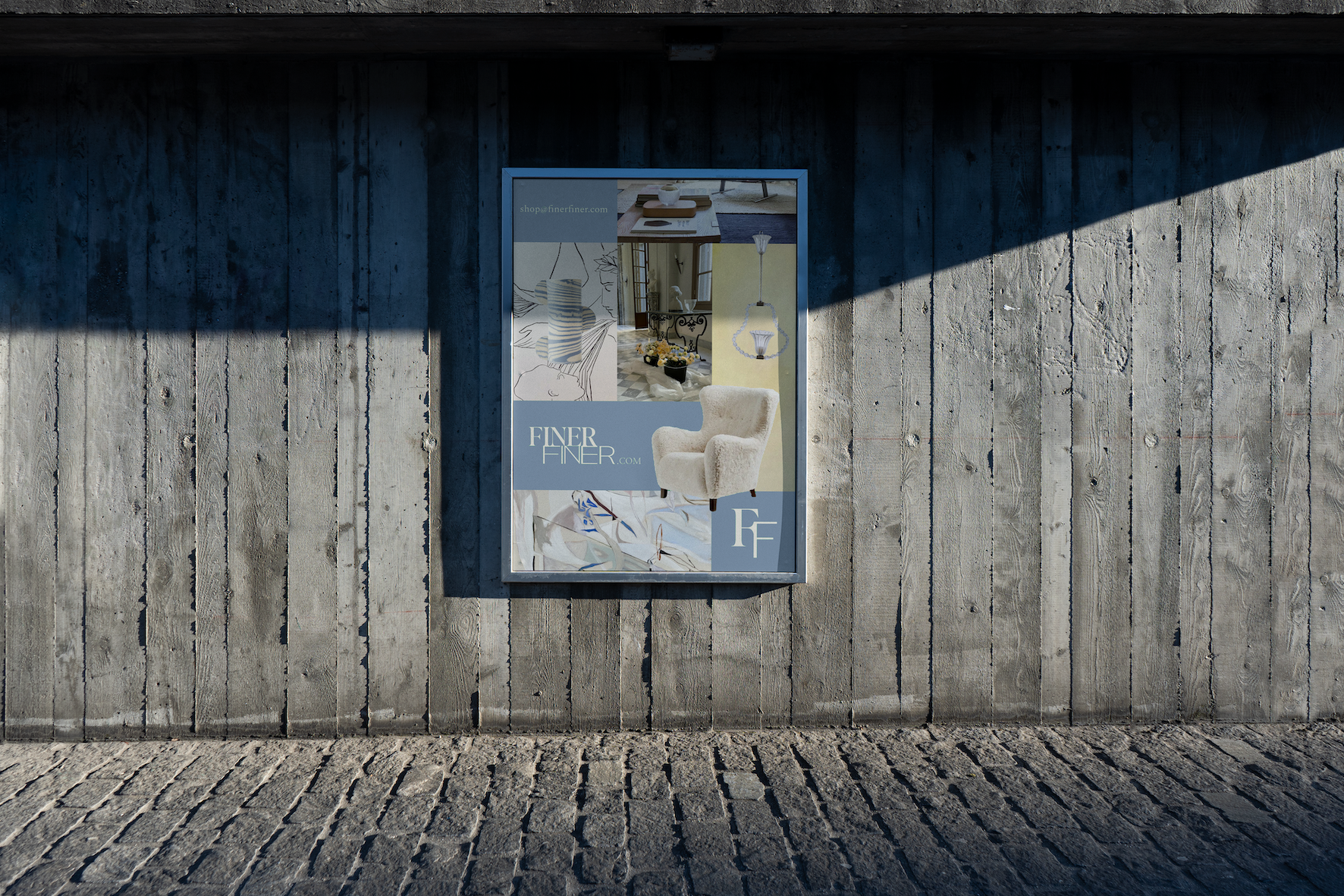
The design went through several rounds of refinement and iteration, involving fine-tuning the composition of the collages, experimenting with different colour palettes, and ensuring consistency across various touchpoints, such as the website, marketing materials, and social media assets. We then triple–checked whether imagery would be available for commercial use; once we had the green light from trademark lawyers, we finalised the collage style to establish a visual language for the brand. We then took our designs through a few fine-tuning rounds, ensuring everything was just right. Colours, composition, vibe – we wanted it all to sing in perfect harmony. We arrived at a style that worked and, after that, created rules. Isolated images are laid on top of full bleed, more photographic and textured images––allowing us to place the logo and logotypes in any variation that felt right. Rules that are there to be broken.

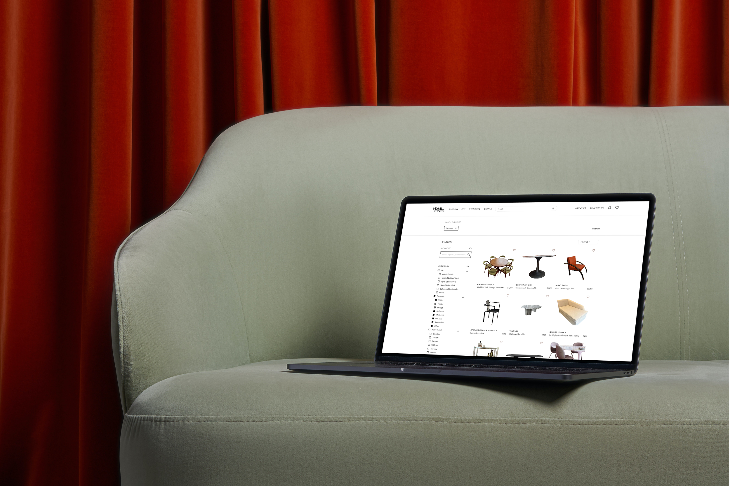
The website design process is now one year in. Where we initially focused on capturing the essence of timeless elegance and cultural richness, implementing a minimalist aesthetic with subtle vintage touches, Lizzie felt that the iterative testing and refinement, together with the website build, needed to be outsourced to a development studio in another part of the world. This has ensured seamless functionality across devices. The final result? A visually striking platform that seamlessly blends modern usability with the allure of classic art and antiques, offering users an immersive and enjoyable browsing experience.
While our standard practice involves hosting strategy sessions to ensure a thorough understanding of a client’s brand and objectives, there are instances where clients provide extensive preparation in the form of moodboards and clear direction without opting for a strategy session.
In such cases, the design project's success can be attributed to both the client and us; clients who invest time in preparing moodboards demonstrate a commitment to the design process. This collaborative approach creates a strong partnership, and an enjoyable working relationship.
From the outset, Founder of FinerFiner Lizzie let us know exactly what she wanted, allowing for clarity and a streamlined design process. To capture the essence of FINERFINER, we first looked at all the references shared and had further in–depth conversations with Lizzie about the brand.
We then presented three distinct visual routes for her to choose from. Route One was bold and impactful; Route two was classic and elegant, whereas Route Three was playful. Lizzie liked all three options, emphasising playing with the concept of how objects of the past can sit easily with the contemporary.

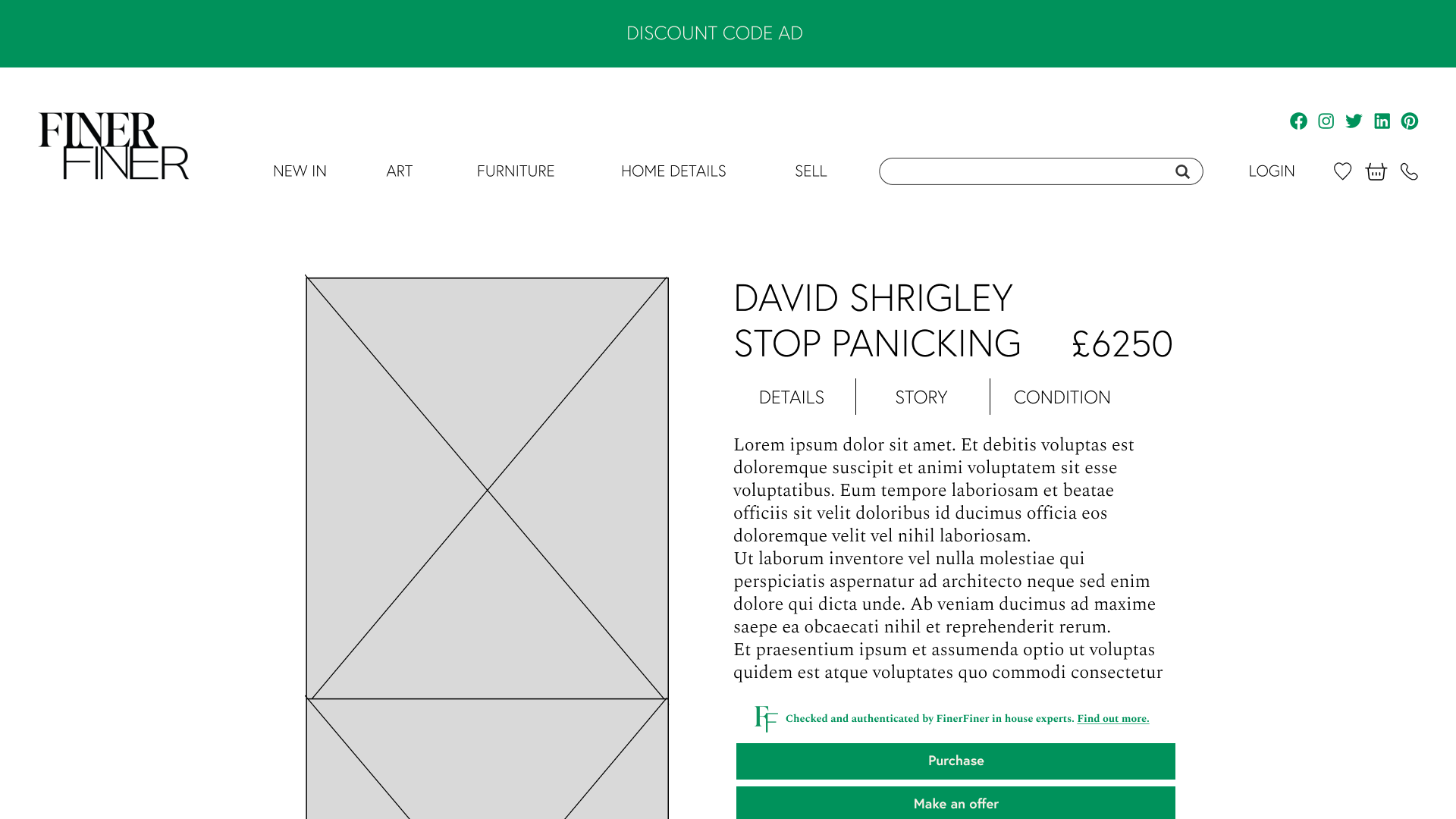
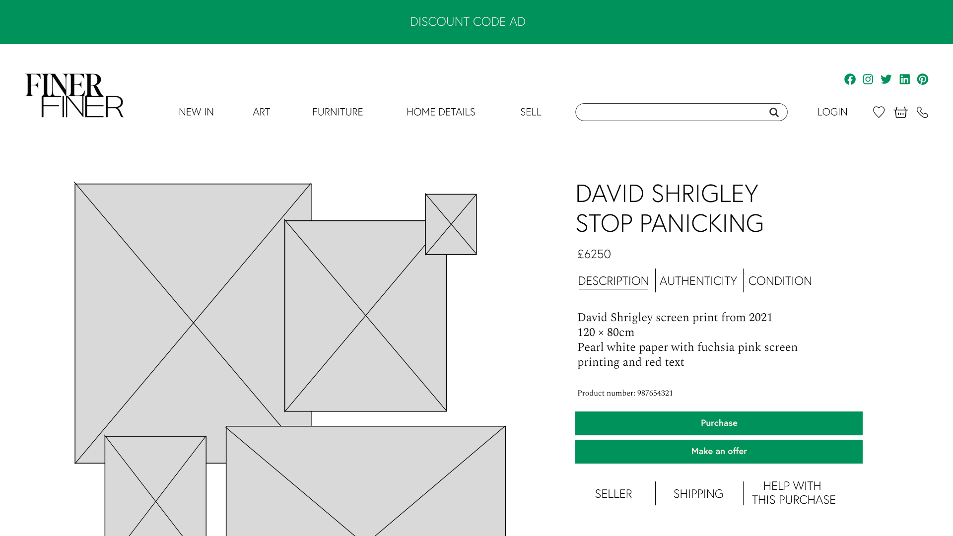
Continuing to work with the keywords of classical, elegant, covetable and playful, we moved onto creating website wireframes with lots of breathing space. We first of all introduced Lizzie to the website design software Figma, perfect for designing wireframes (how the website could look) and sharing ideas and feedback. We then built the initial frames with our design team. The below frames show the work in progress for the products’ page.


FINERFINER have launched. Follow them to stay in the know.