

PINK SALT VENTURES
Pink Salt Ventures are a pre-seed fund that help female founders get big ideas off the ground. They identify and partner with entrepreneurs to build lasting companies.
As well as being no-nonsense, serious investors, founders Samira and Saloni are also young, fun and dynamic. To communicate their personality with this wide range of audiences, we presented several options for their visual identity that aligned closely with the company’s brand values.
The process for Pink Salt Ventures began with brand discovery, where we defined the core values, vision, and voice to ensure the brand resonates with its unique audience. From there, we moved into the design concept phase, translating those values into visual elements like logos, colour palettes and typography that tell a compelling story. Read more for a full overview:
In 2021, Pink Salt Ventures came to us for a brand refresh; they wanted to stand out. We began this project by conducting in-depth research on their audience and their three core audiences — female founders with scalable companies and limited partners, the investors in the fund who contribute capital to Pink Salt Ventures; to be pooled and invested.
This brand needed to speak the same language as the broader venture capital ecosystem - a community that included journalists, academics, and startup founders - each with their priorities and communicating their measurable approach to mature audiences such as governments and limited partners.
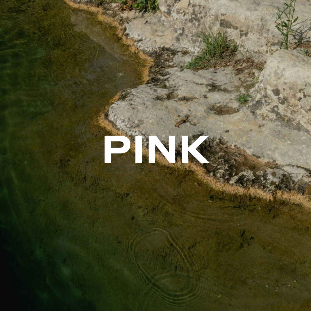
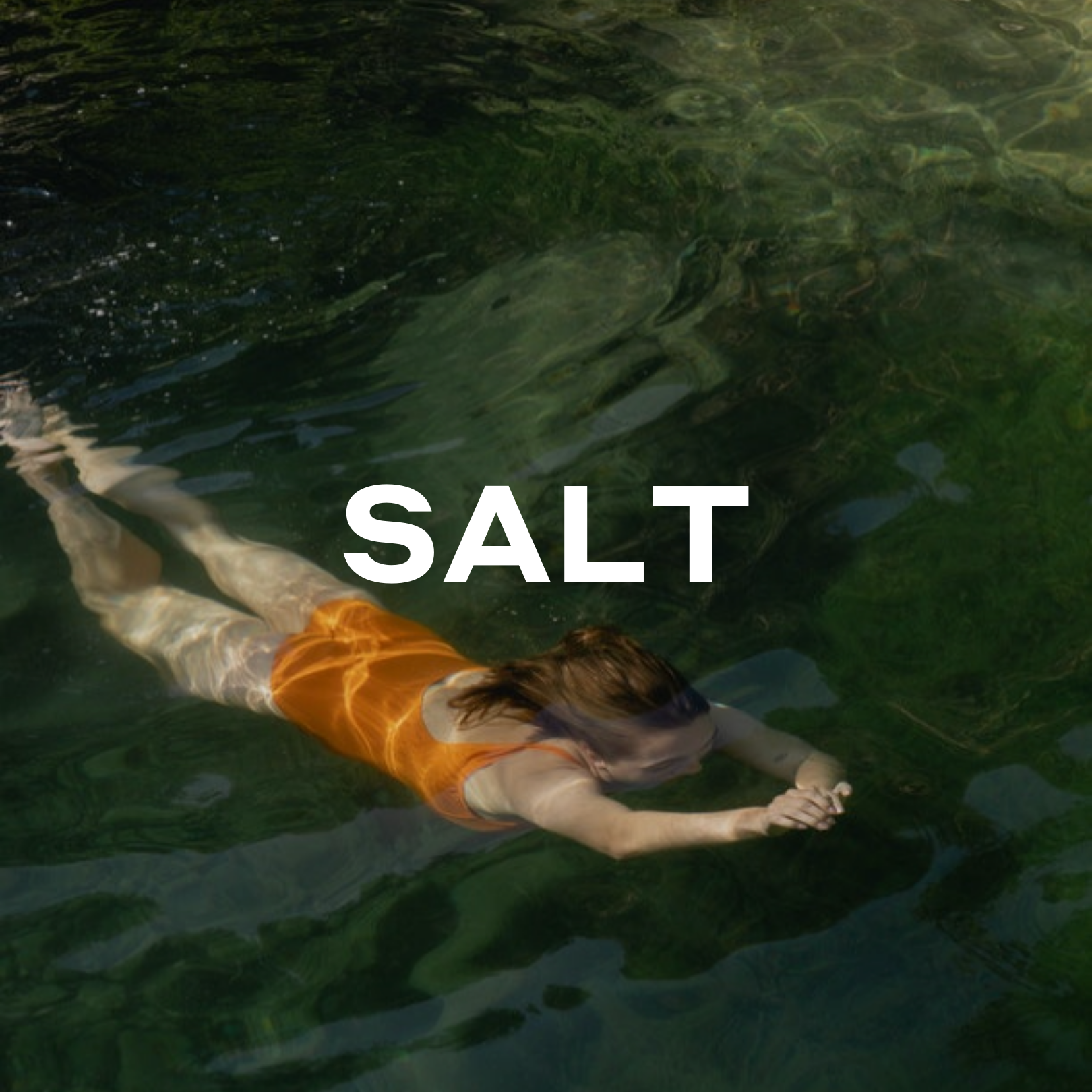
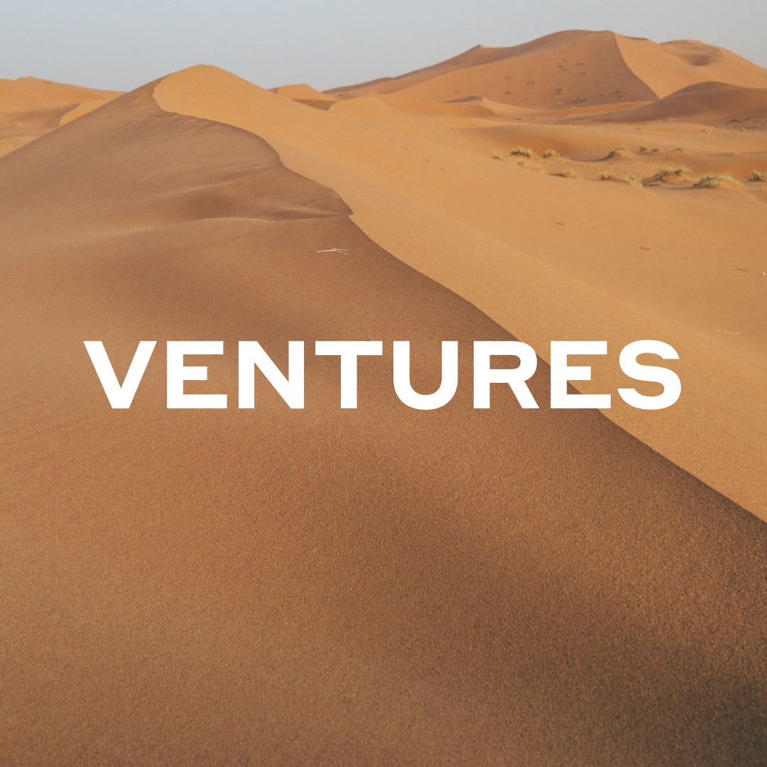
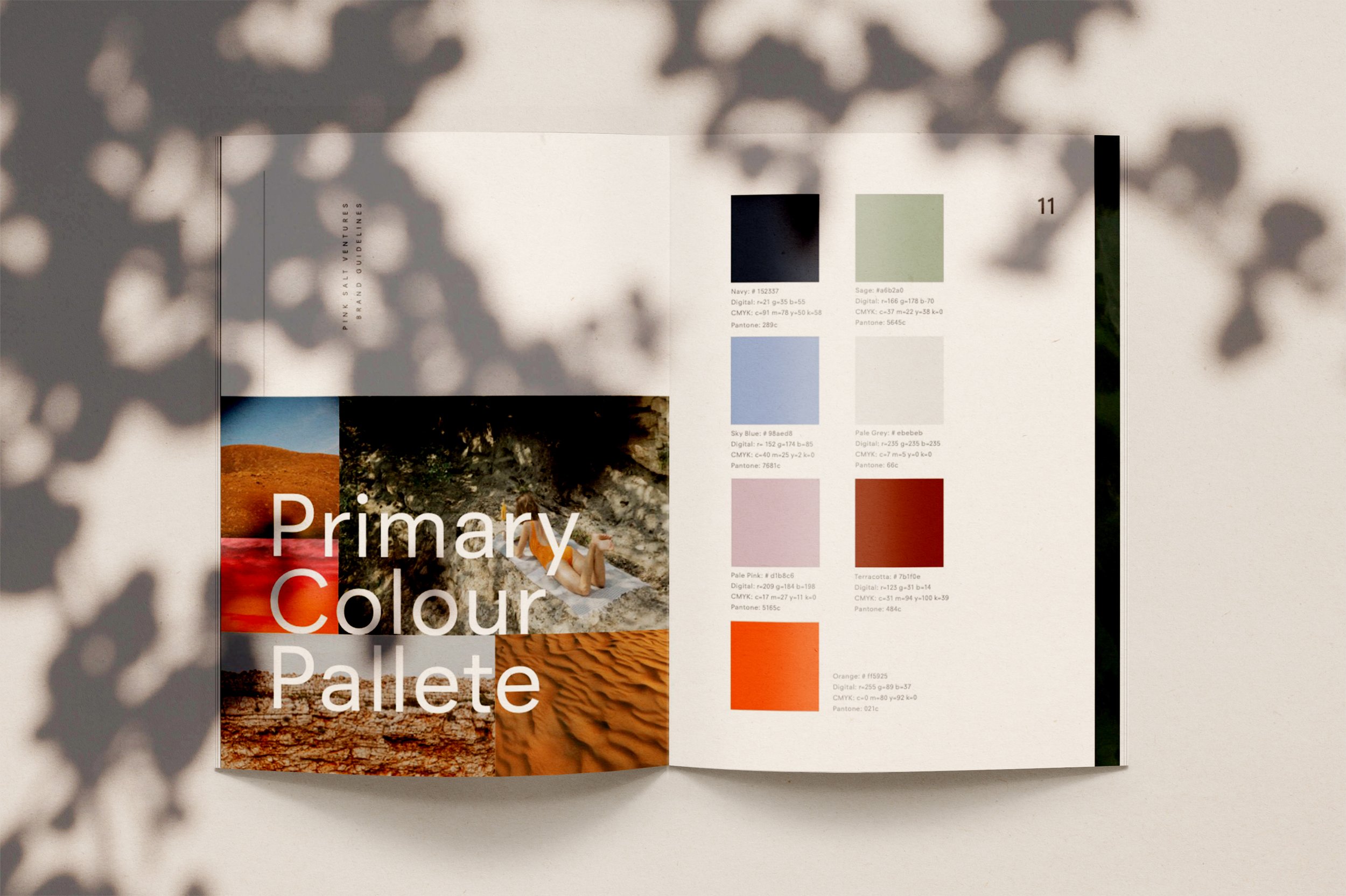
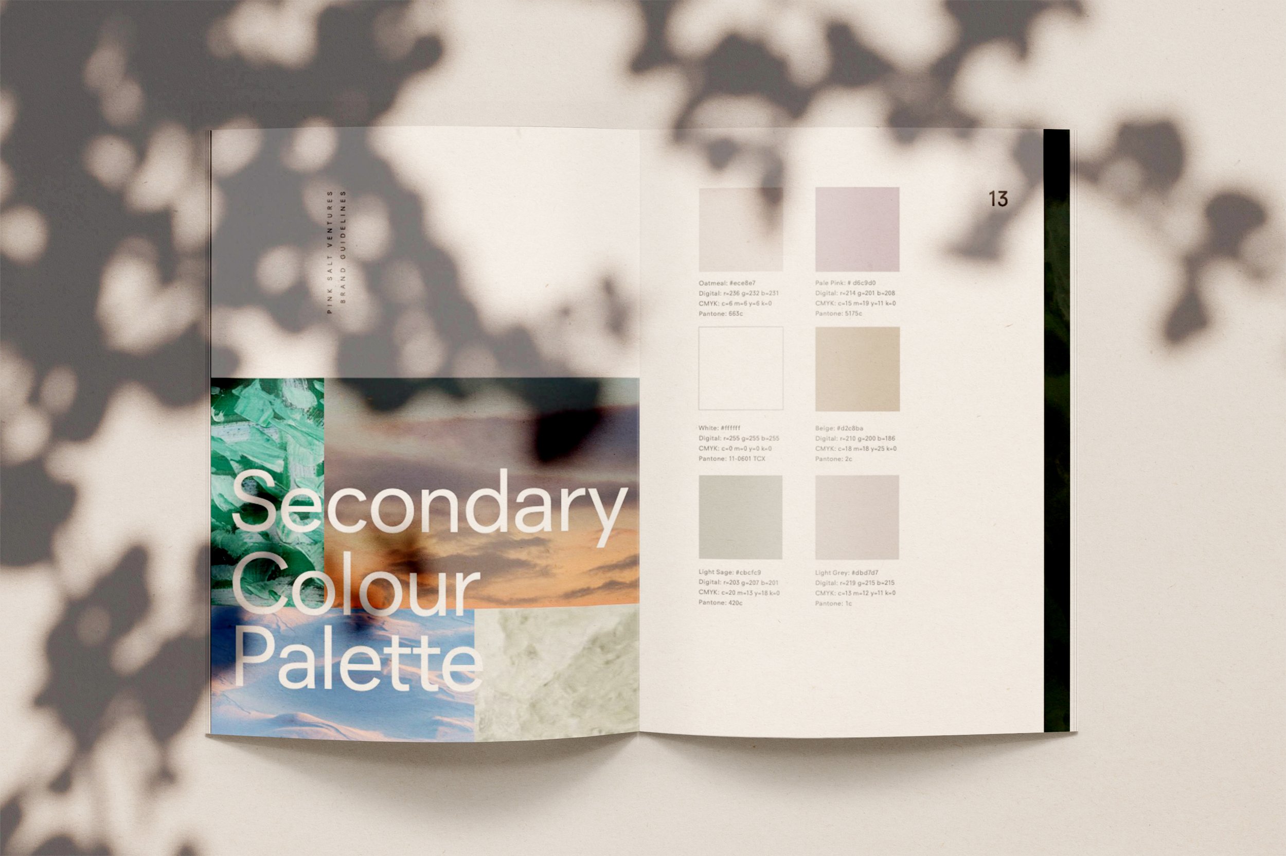
When creating this brand identity, our challenge was to communicate to and with a broad range of people, each with their own set of industry standards, whilst telling a unique and interesting story. We looked for a space between the laws of venture and the desire to tap into new generations’ unbridled energy and make design choices that would balance the brand’s spirit of adventure with a sense of security. We focused on the idea that starting a new business takes courage and adventure. To create an open visual design system that suggested independence, we sourced photographic imagery that captured the definition of “venture” - a risky or daring journey. Magnified images of the natural world become almost abstract to evoke calm and serenity and at the same time communicate the theme of putting oneself in the zone of unfamiliarity. When appropriate, Pink Salt Venture’s primary photographic system can be coupled with secondary imagery that features strong and in–control women; the characteristics found within the founders they support and essential to fuel a successful and profitable business.
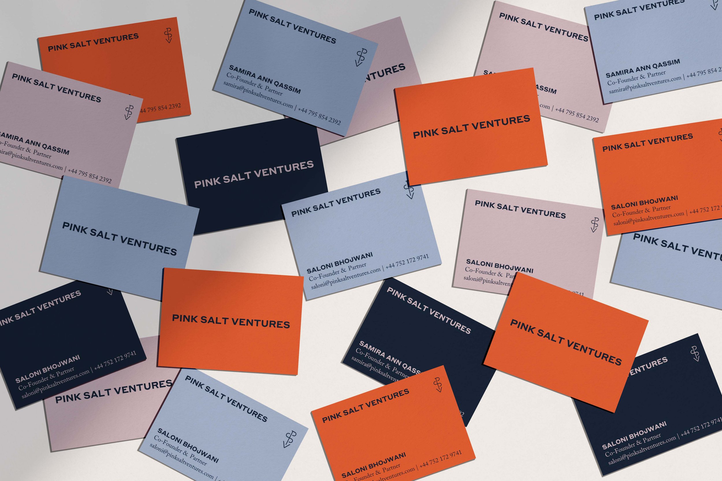
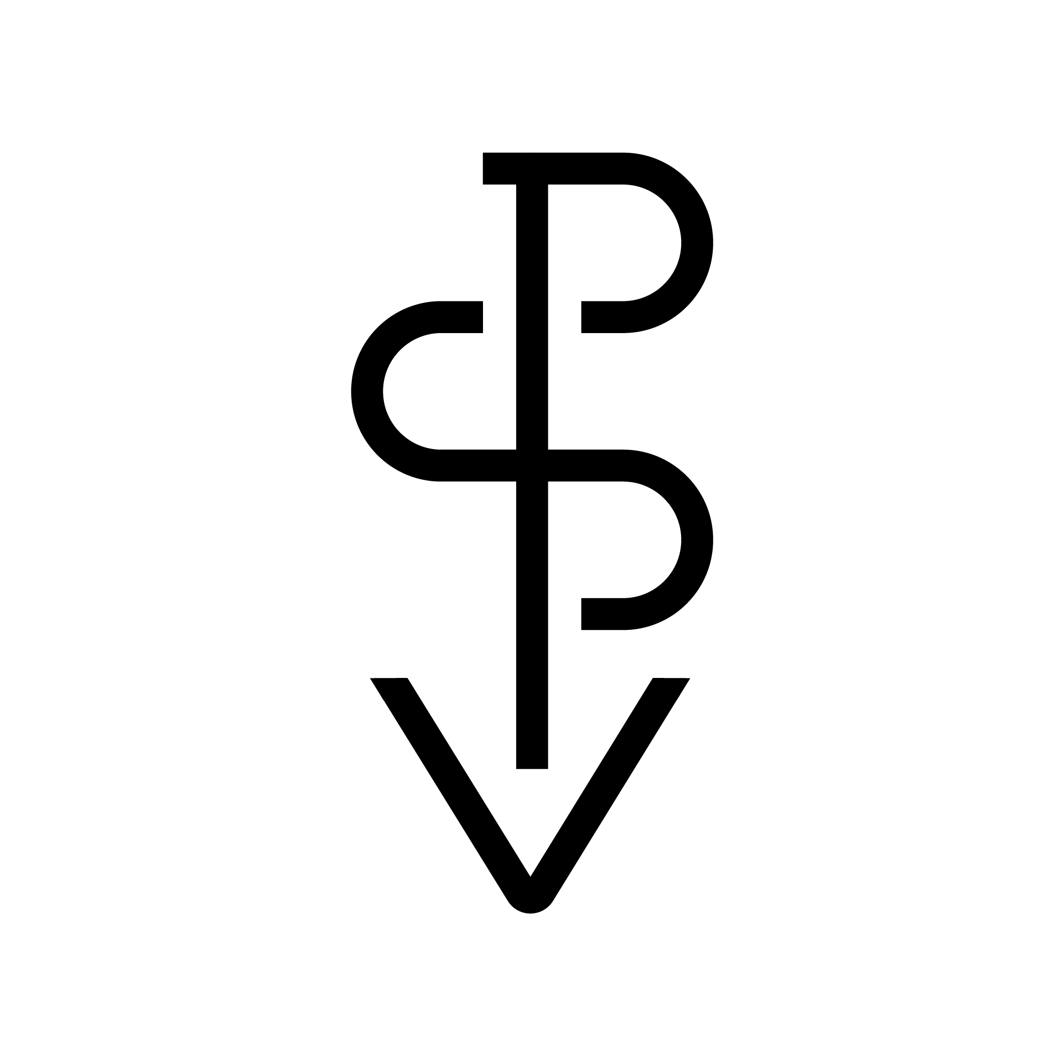
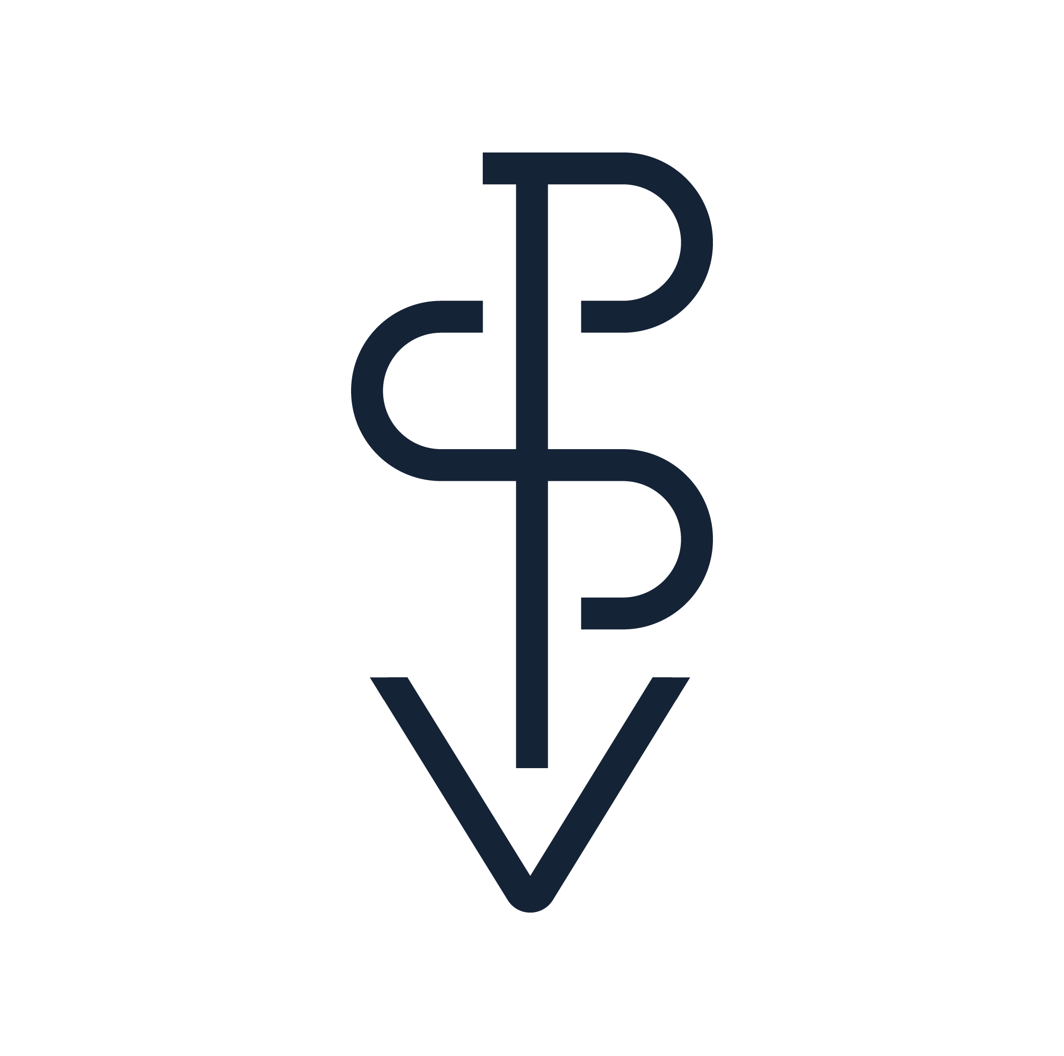
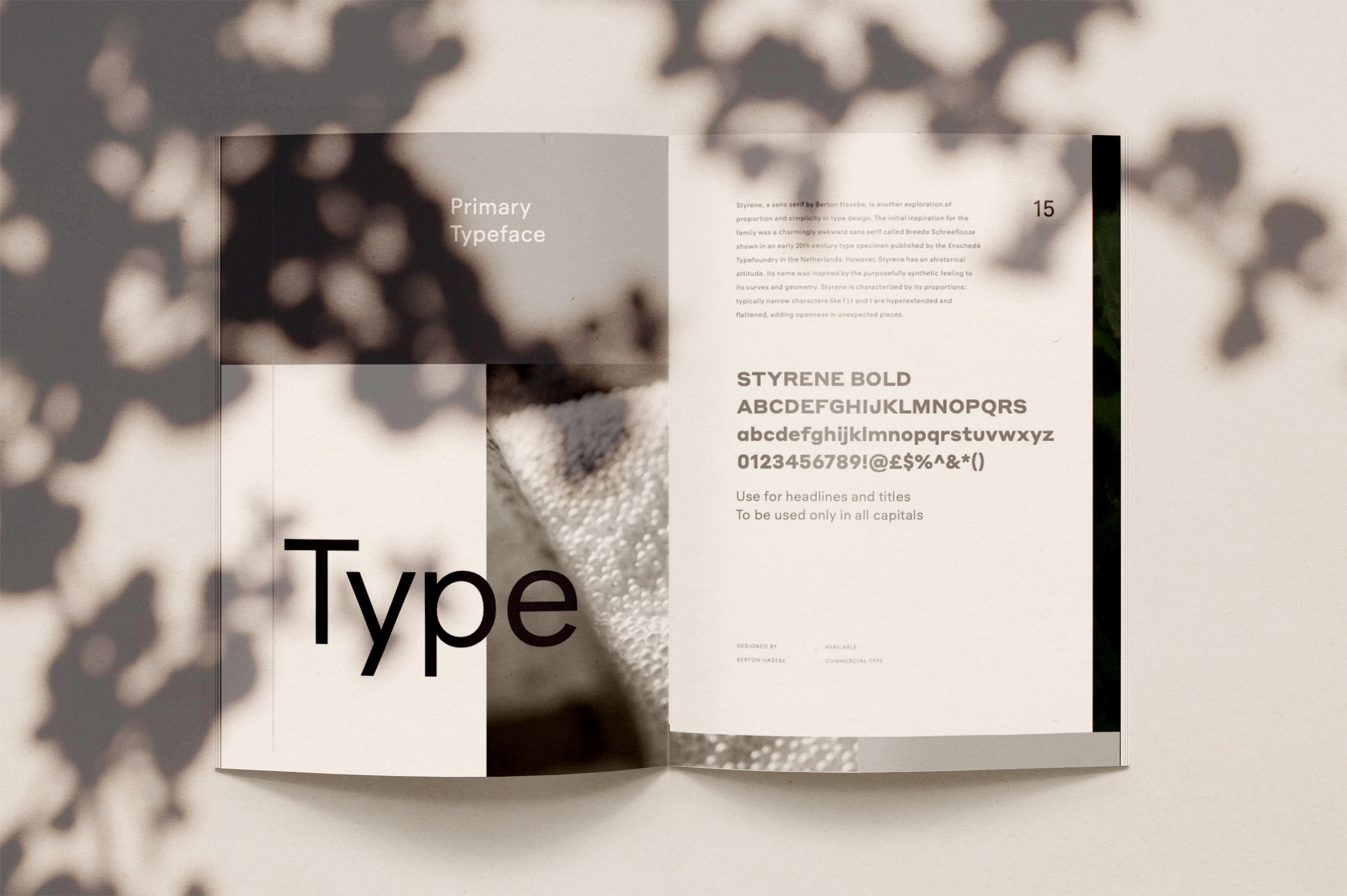
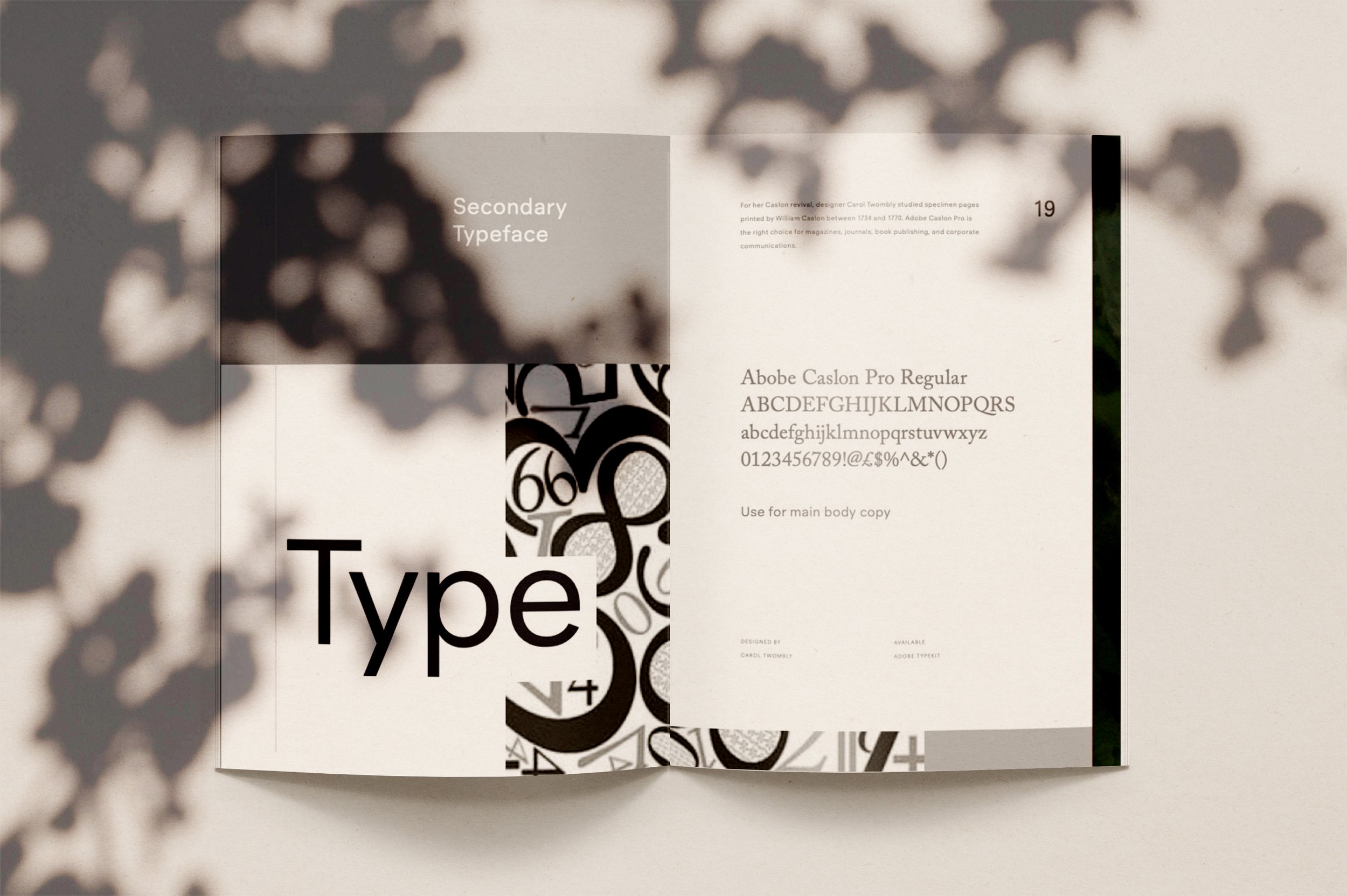
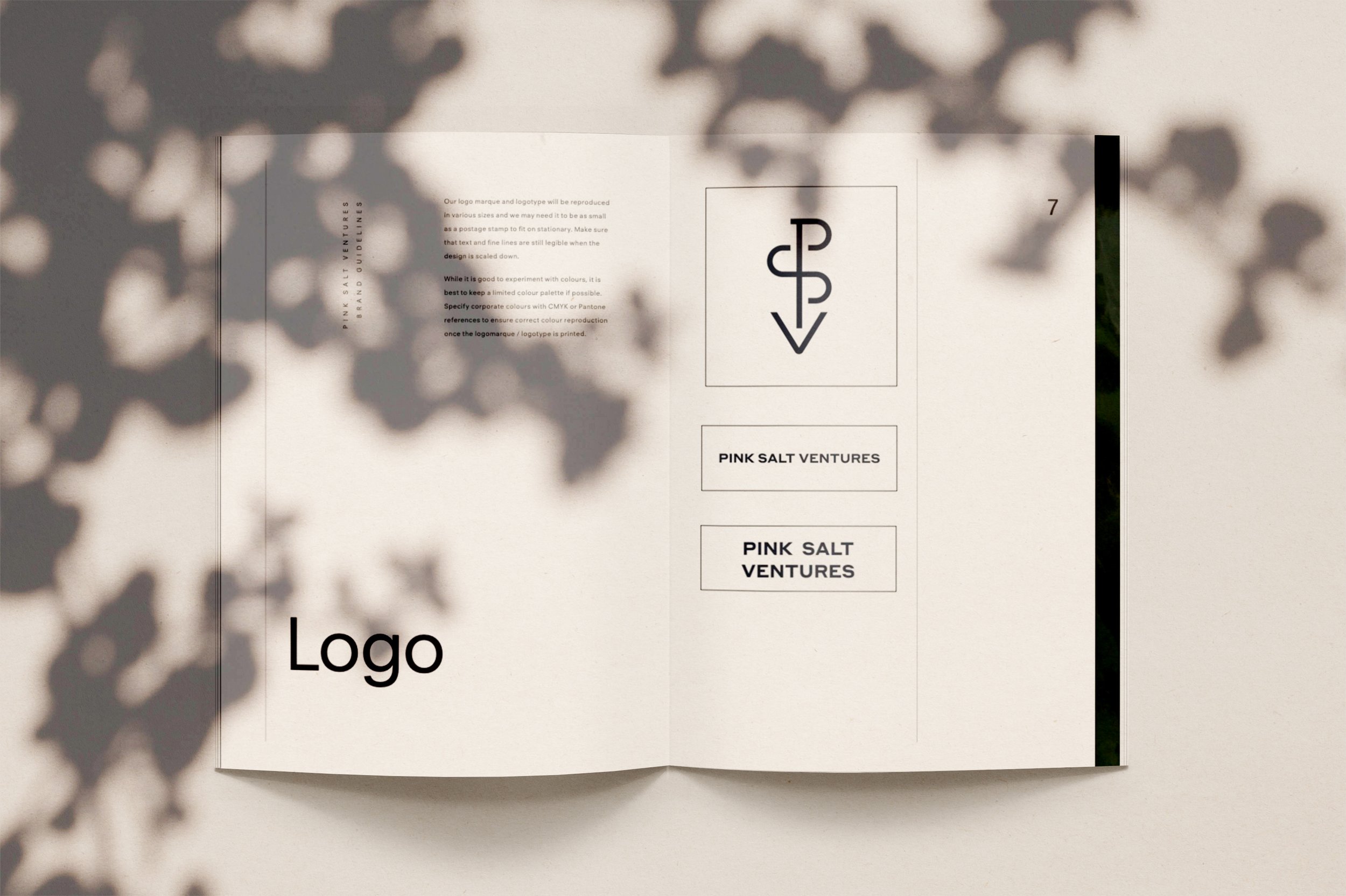
To ensure we communicate how they offer a pair of safe hands, we selected a bold, robust primary typeface to reflect the brand’s pragmatic approach and coupled it with a classical, elegant and sophisticated sans-serif secondary typeface. The new PSV monogram and logotype found balance at the centre of these two ideas.


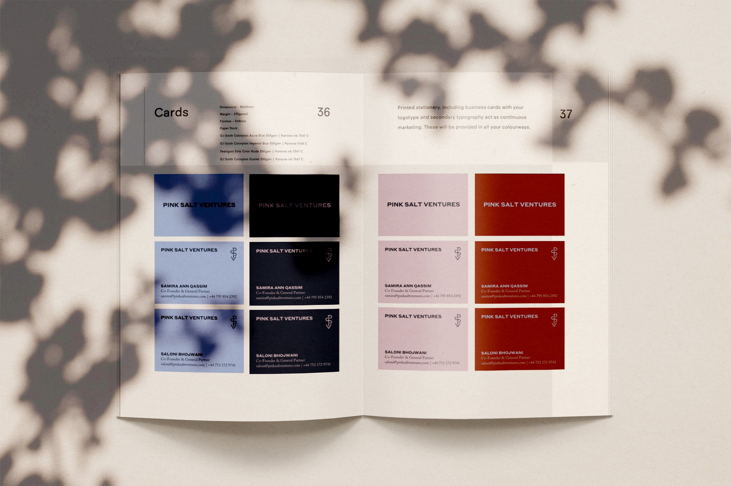
In the creative refinement stage, we explored multiple design iterations, fine-tuning the details to align perfectly with the brand’s ethos. We gathered insights from Pink Salt’s team and market research to refine the designs for maximum impact. Consistency is really important when it comes to building trust in your brand, especially across different platforms. That’s why we make sure to test how your designs look on LinkedIn, social media banners, and other channels. Each platform has its own quirks, so it’s key that your visuals are clear, on-brand, and effective wherever they appear—helping to create a smooth, cohesive brand experience.
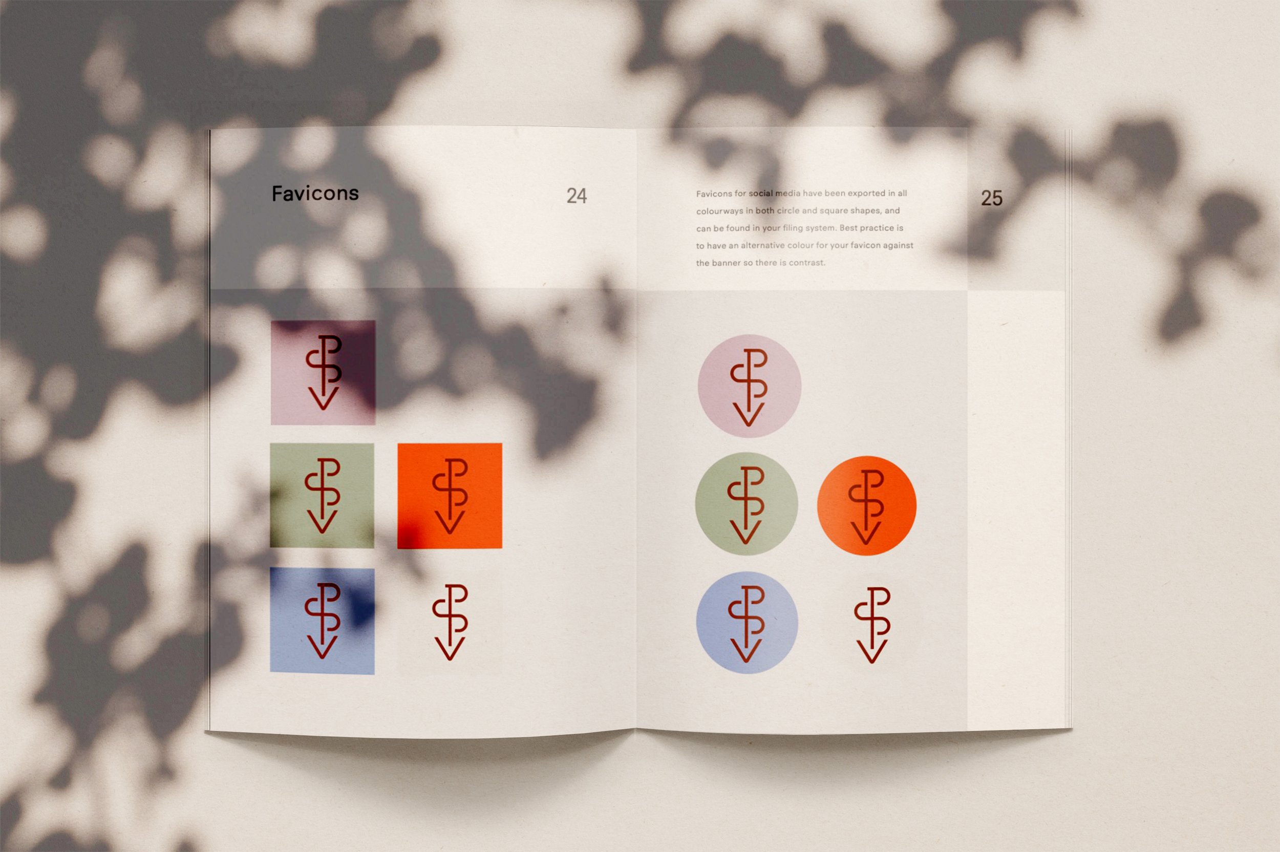
By keeping things like logos, colours, and messaging consistent across LinkedIn profiles, social banners, and posts, we make sure your brand is instantly recognisable and trusted by your audience. This way, you come across as professional and reliable, no matter where people interact with your brand. Within the testing phase we needed to see how the pink and terracotta favicon stood out against both the light and dark settings as opposed to other solutions. Without seeing how it looks IRL how are you able to approve anything?


Asking for mockups from a graphic designer is a great way to see how a design will work in real-life scenarios, whether on a website, social media, or packaging. It helps you visualise how everything comes together and ensures the design is consistent across different platforms.


For the final touches, we polished every detail, creating a cohesive and impactful brand that reflects the ambition and empowerment of female-led innovation. The end result is a striking visual identity that embodies Pink Salt Ventures’ commitment to supporting female founders. To ensure they could maintain consistency, we compiled all brand assets into a clearly labelled filing system. We illustrated how and where to use everything into a brand book, allowing them to create on-brand newsletter templates and marketing materials without incurring additional costs by reaching out to a designer/ marketing team. As with all of our brand projects, we compiled everything into a brand book so that it’s clear where everything is at all times.
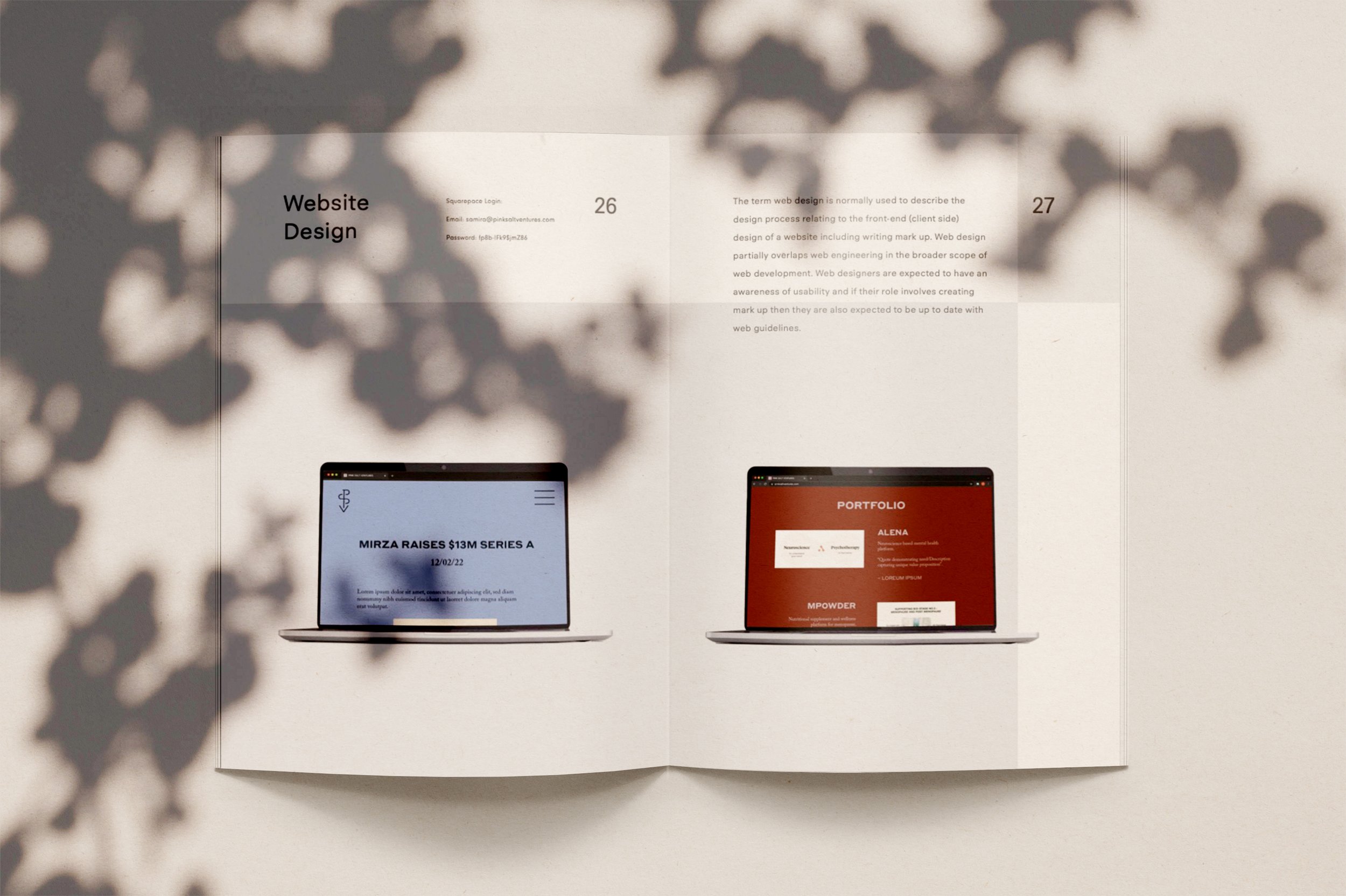
We worked with all existing branding assets to create a website that's easy for users to interact with, update, and for the PSV team to manage. We showed Samira and Saloni how to use all elements and ensured that it would be interactive and easy to navigate. We also included custom CSS to create stand-out features together with a Ukrainian Developer Maia Iva to ensure that their customers enjoy an interactive experience across both mobile and desktop versions.

Take a look at the custom built website and photoshoot that we created for them.