

PARALLEL LONDON
Before their rebrand, Parallel London struggled with outdated branding, misaligned messaging, or an inconsistent identity, limiting its reach and impact. This reflected stagnation, missed opportunities, and negative associations.
before
AFTER

“Just a great experience from start to finish, I was super nervous but they got the ideas in my head on paper and I am so happy with the results. ”
A successful rebrand can spark renewed interest, attract a broader audience, and reignite customer loyalty. The revitalised Parallel London identity, purposefully crafted now resonates with the Parallel London audience. Below, we walk you through what went on behind the creative process of the Parallel London rebrand.
The first stage involved a strategy session covering who we are now speaking to and with, the company's short- and long-term goals, empathy mapping, revisiting the company's 'why' and evaluating the current brand's strengths and weaknesses. We also examined what was happening in the market, chatted with the founder Elma and partners who cared about Parallel London, and closely examined what the brand is already good at and where it could use a little boost.
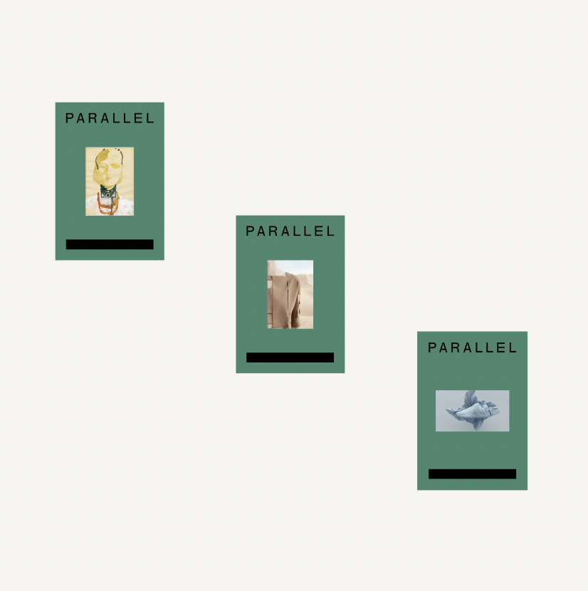
Once we had established what Elma wanted to achieve with the business makeover, we created different logo options, colour palettes and typography ideas to give the brand a new, fresh twist. Everything was created to reflect the quality of Parallel London's services.
HR is all about people and culture; when creating a colour palette, it was crucial to communicate how Parallel London works with diverse groups of people. To do this, we first collated a good image bank that represented the brand well and then created a neutral base palette that could form the foundations of a clear identity. The clarity of the darker tone on an off–white background also illustrates how Parallel London is good at developing pragmatic solutions that support teams, conveying clear messages and making change happen within the workplace.
We then had fun introducing colour, iconography and imagery into the mix to communicate how, like many companies the Parallel London team supports, Parallel's ethos is to create change and drive new narratives forward.
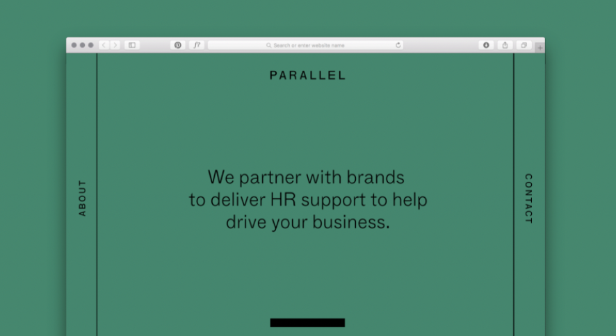
Once we had created a consistent look and feel for the brand, we worked on the direction for the social media platforms to create a fresh and cohesive look, ensuring they harmonised with the brand's new identity. The new refreshed identity now communicates how the business provides HR services for businesses and bodies who operate for and within the creative and technology industries.
A compelling rebrand marks a distinct turning point, illustrating the company's adaptability, innovation, and commitment to staying current. It's a testament to a company's willingness to embrace change and signals a fresh chapter of growth and opportunity. If you’re thinking about investing in a rebrand, take a look at our packages page to see which of our services suits your budget, or get in touch for a bespoke quote today.