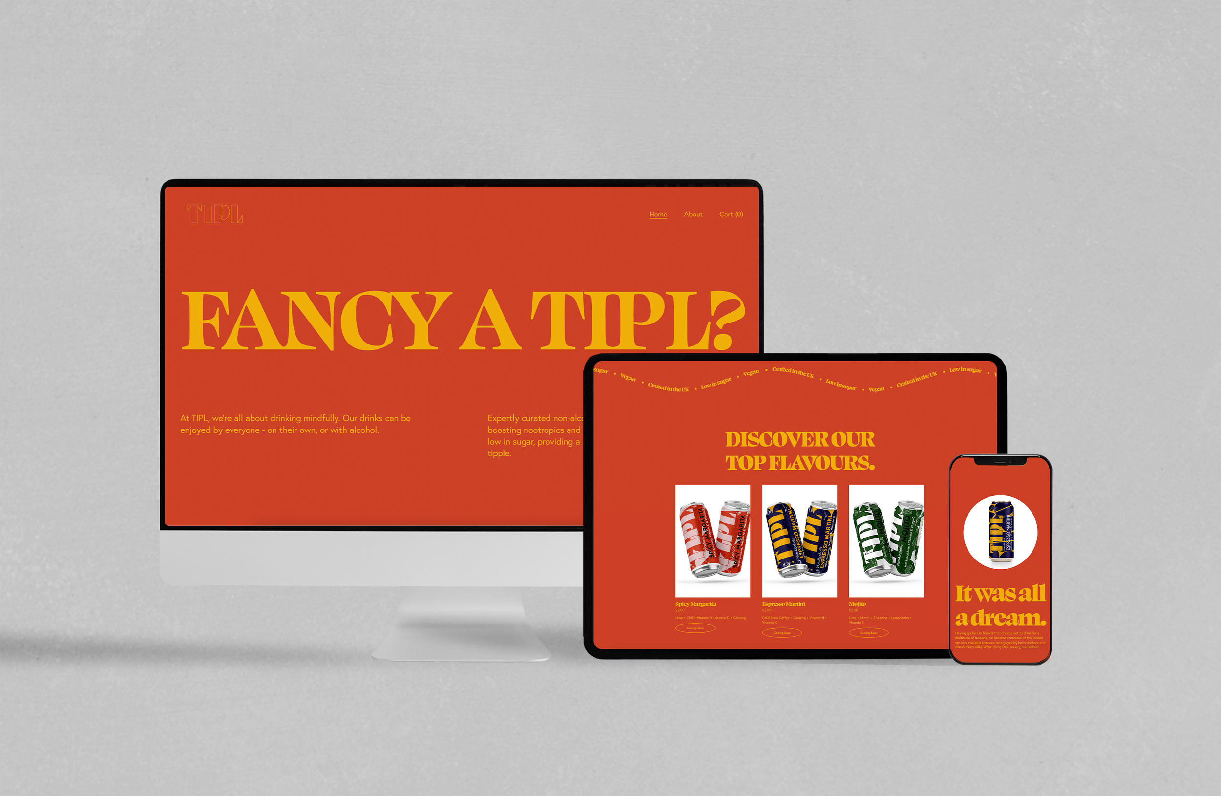
FANCY A TIPL?
When Seedlip first launched, their branding technique was a simple masterclass, capturing the essence of their offering in a single line: "What to drink when you're not drinking." Since then, the market has been filled with no- and low-alcohol substitutes, each targeting a particular drinker.
When you step into a world of flavour profiles, colour, typography, and illustrations have to work in perfect balance to capture the beverage's experience.
Emily, the founder of TIPL, knew this when she approached us last year. TIPL needed to be more than a replacement drink for their customers. And so we built a brand that placed people in a state of mind opened by flavour, creativity and inspiration – not alcohol.
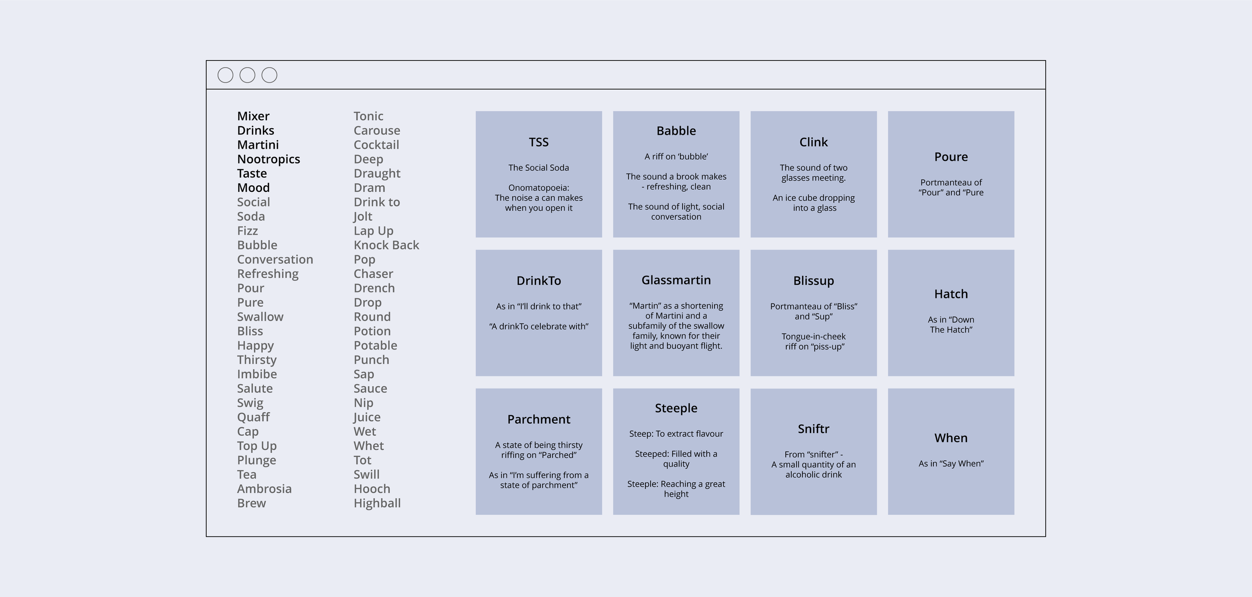
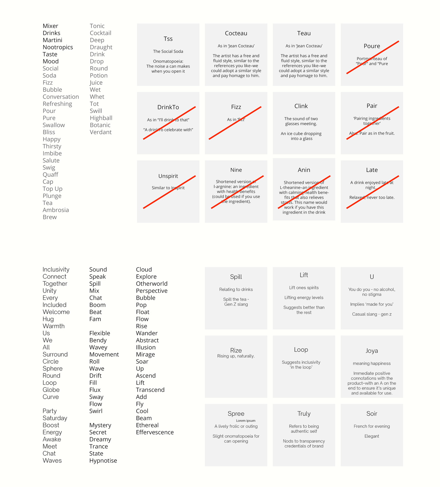
Since Emily came to us at the beginning of her branding journey, we were able to work closely with her at every step of the process, starting with the name. She works in strategy so came to us fully prepared and full of research and ideas. A workshop identified the key values associated with the brand; establishing a position for them in the market. Our copywriters since got to work on some naming concepts based on all the research sent over.
Finding a name for a new brand involves a multi-step process that begins with defining the brand's values, target audience, image and story. Once these elements were established for our unnamed drinks company, we conducted a series of brainstorming sessions to generate a list of potential names that might align with the brand's identity. Options presented ranged from the metaphorical to abstract to descriptive. We whittled down the selection to a shortlist, evaluating each name on various criteria such as uniqueness, relevance, and memorability. The naming process deserves a little more attention, so we conducted additional research with the IPO office, investigating which names would be the most ownable, reducing any issues for our client further down the road.
Trademark searches and domain name availability checks were conducted to ensure that the chosen name was legally available and capable of building a strong online presence. With the client’s guidance, we honed in on the most successful name, and TIPL was born - after registering with the IPO office, we set to work on the visual language that would define the drinks brand and help it fly off the shelves.
In the end, Emily chose the name TIPL without our direct support, but we like to think that the creative process helped!
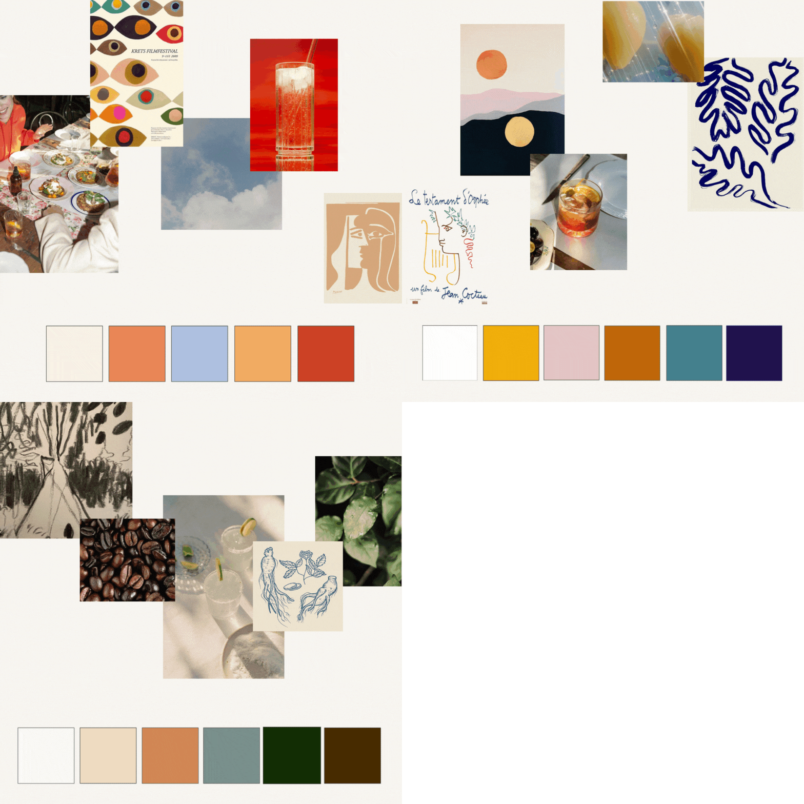
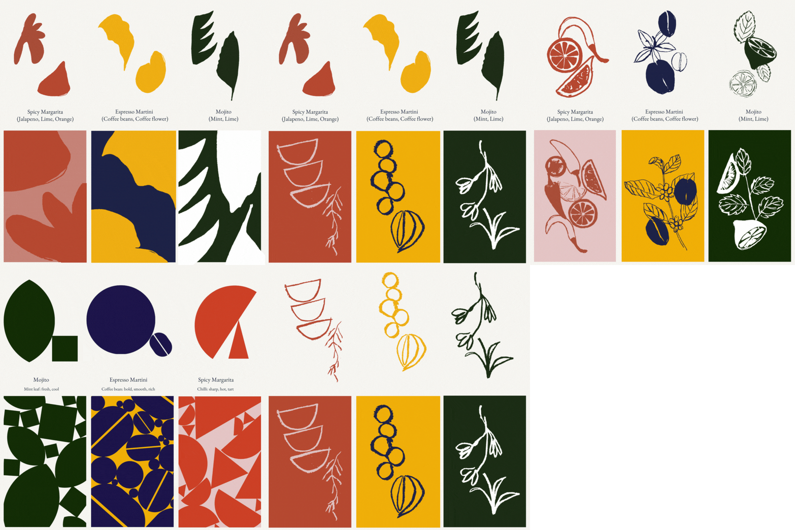
We established a visual language to align with the brand values we discovered in our initial workshop with TIPL. We created moodboards for each flavour TIPL intended to release, and in doing so we found ourselves attaching certain emotions to each flavour. After all, Mojito, Spicy Margarita and Espresso Martini each carry very different energies, and we wanted to make sure we would be able to reflect this in the colours chosen to represent them.
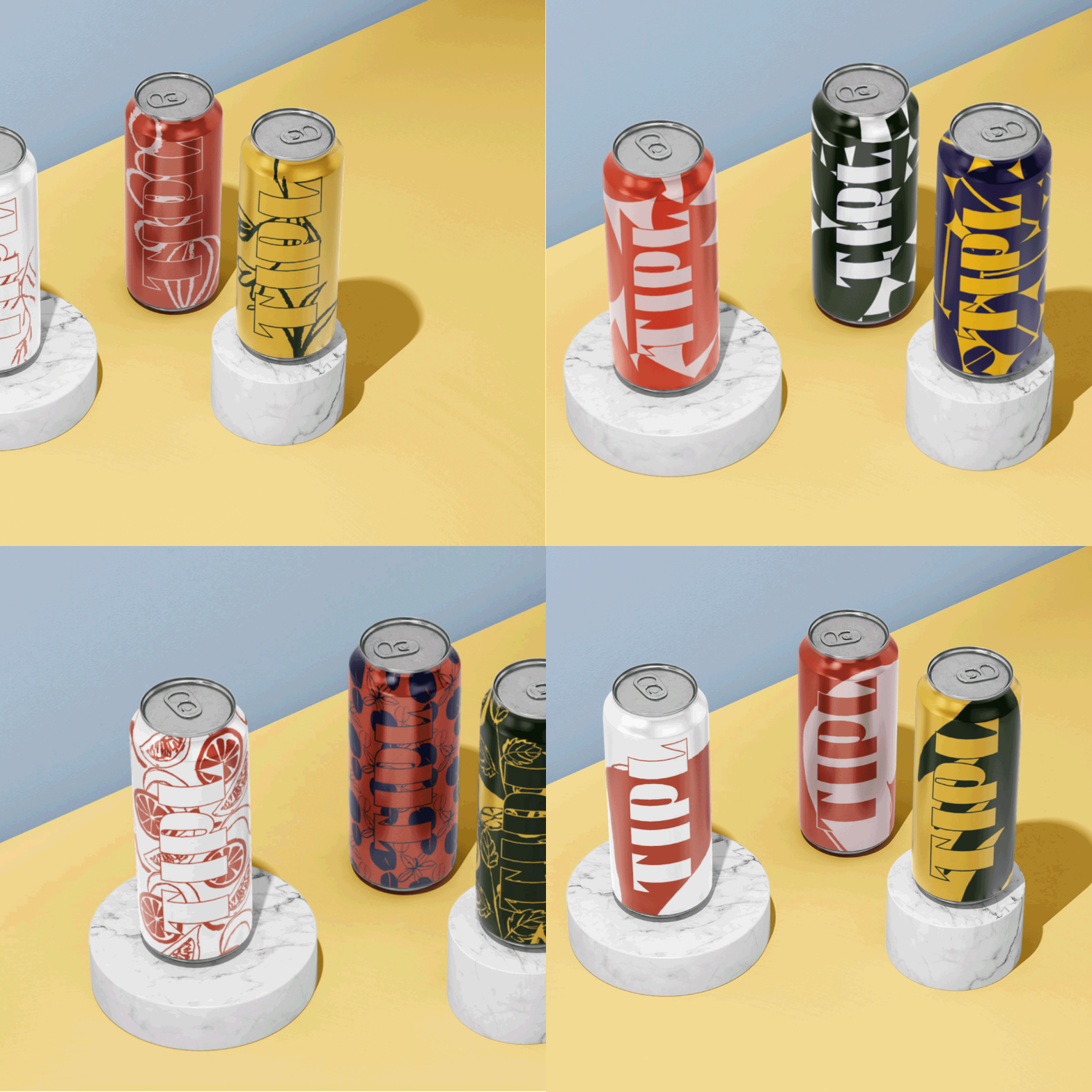
When it came to creating a visual language for TIPL, we were heavily inspired the botanical elements of the flavour profiles, and we generated a wealth of options, from hand-drawn realistic depictions of fruits, herbs and coffee beans, to geometric representations that refined the ingredient illustrations, transforming them into clean bauhaus shapes which could then be stacked on the can designs, ensuring the drinks look and feel effervescent and flavourful.
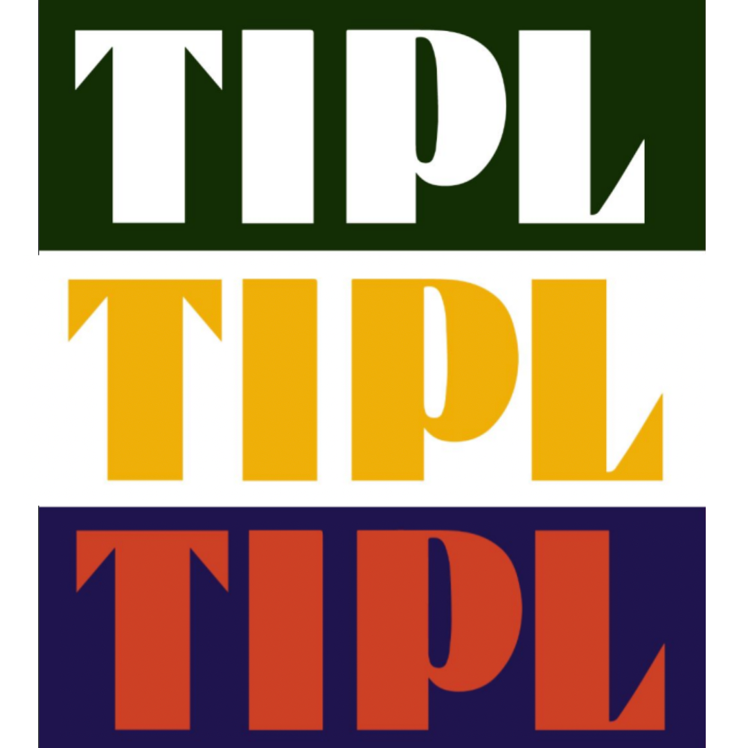
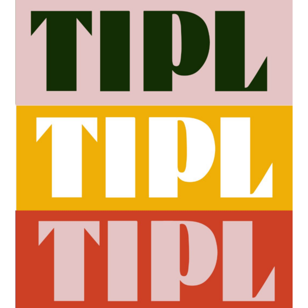
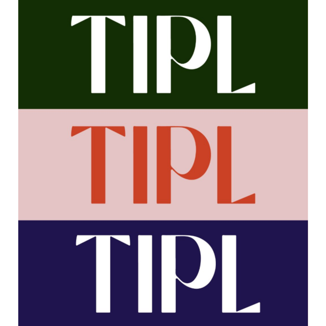
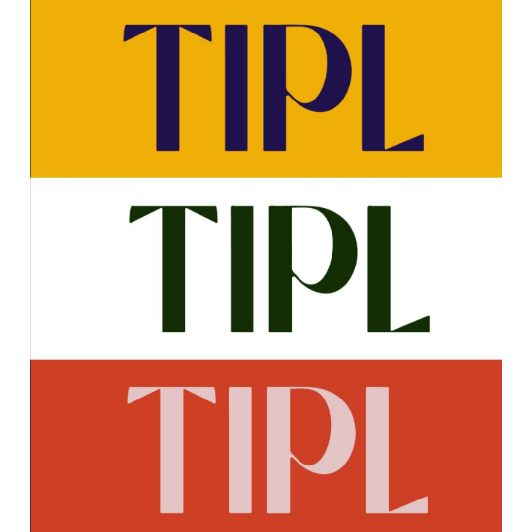
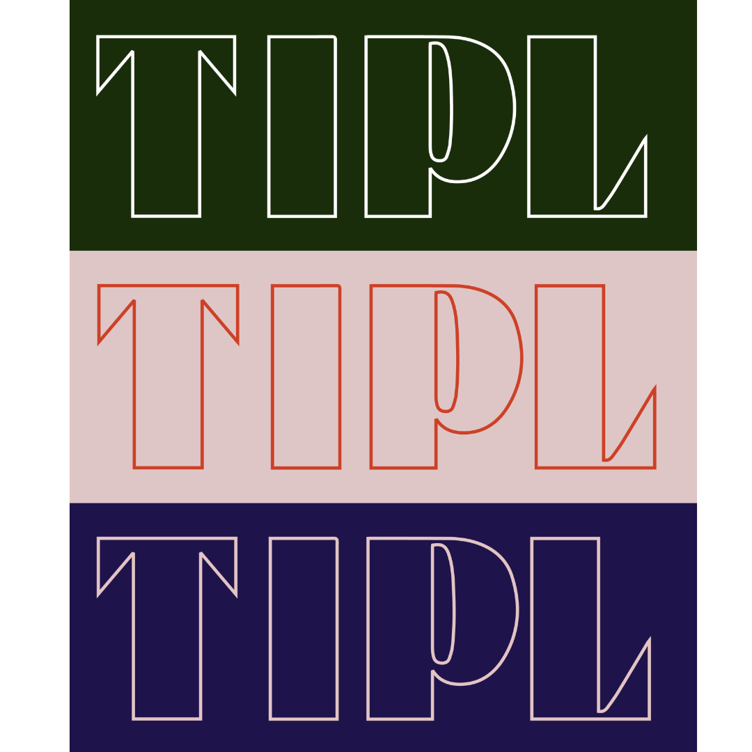
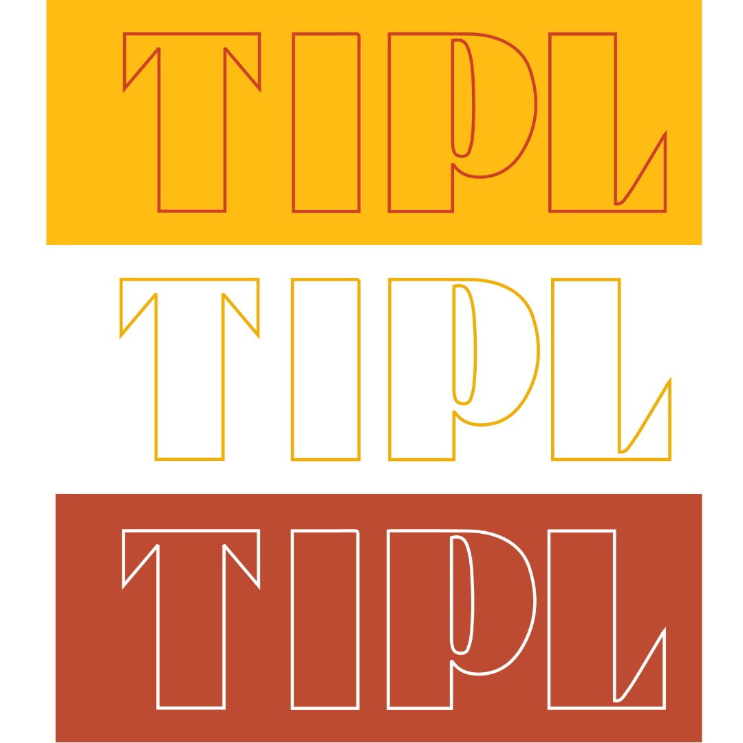
Working with Emily to ensure we were creating assets that would be useful and flexible as she moves forward with her brand, we settled on a logo treatment that would be appropriate for print and digital assets alike, and generated a suite of different colour options for her, aligned with her preferred palette, with a set of rules for use to ensure the logo will always look clean and clear regardless of where it’s used. If you’d like to learn more about her brand, take a look at the website that we’re creating for her, here.
The final logos were delivered to the client along with a brand book to provide guidance in future. We organise our brand kits to ensure every asset - from logo to typeface - is easily accessible, with clear guidance on how to use each aspect of the brand ID. Using the brand book and brand kit in conjunction, TIPL will be able to generate any asset they require in future, in addition to sharing their assets with external parties who wish to feature the logo or colour palette in their promotional materials.
“I have thoroughly enjoyed working with Alexandra and her team to build my brand from scratch. The process was stress-free and an incredible amount of thought and detail went into each stage of the journey. Alexandra went above and beyond and I’m delighted with the outcome. ”


