


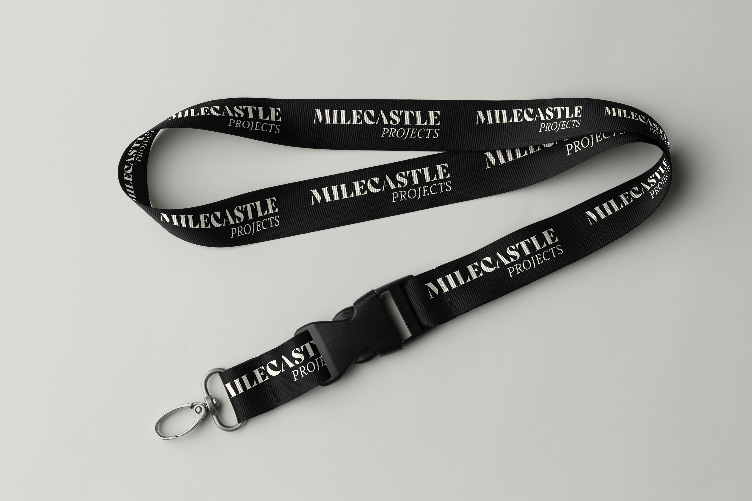
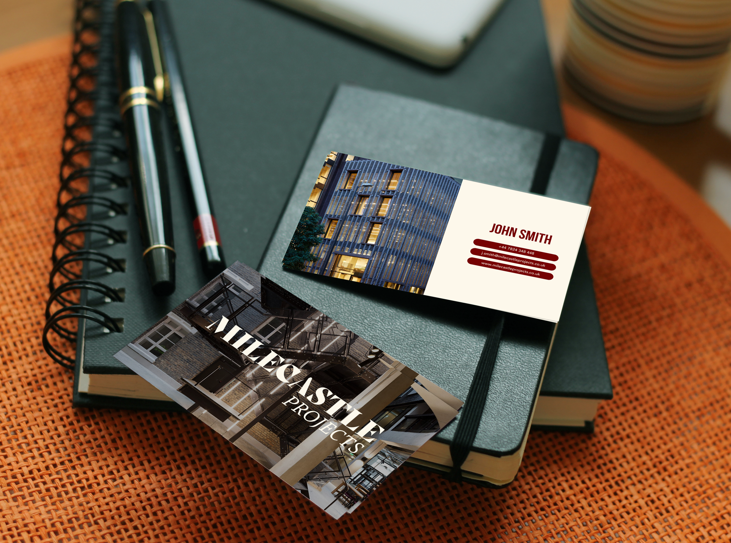
Milecastle projects

Alexandra was recommended to me by a highly experienced Marketing Director with bluechip company experience as being someone capable of supporting branding and design for all sizes of businesses. As a startup, we needed help with distilling our vision into a more focussed brief, to then create a brand and design set around. Alexandra's creativity and process (along with her team) was fantastic. We're delighted with the outcome. She then helped us to improve our self-built website with copywriting and web design - wish we'd used her team to build it from the ground up! Many thanks Alexandra and Co.
–Sam Elliot, Founder
WHY MILECASTLE projects?
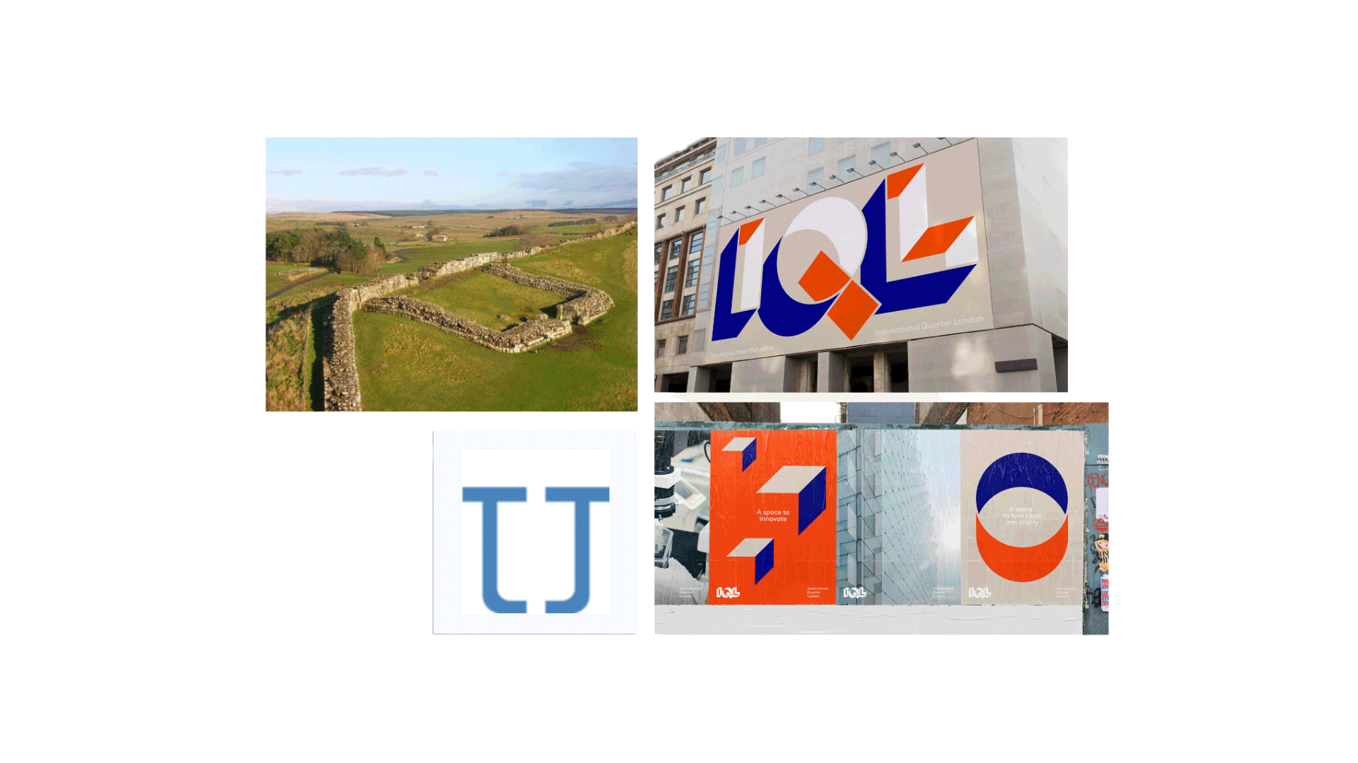
Sam wanted us to draw inspiration from the fortifications along Hadrian’s Wall, the name “Milecastle” was chosen to embody resilience and the reward of achievements - an architectural success that has stood the test of time. These values resonate with the company’s mission, and their commitment to creating spaces designed to satisfy.
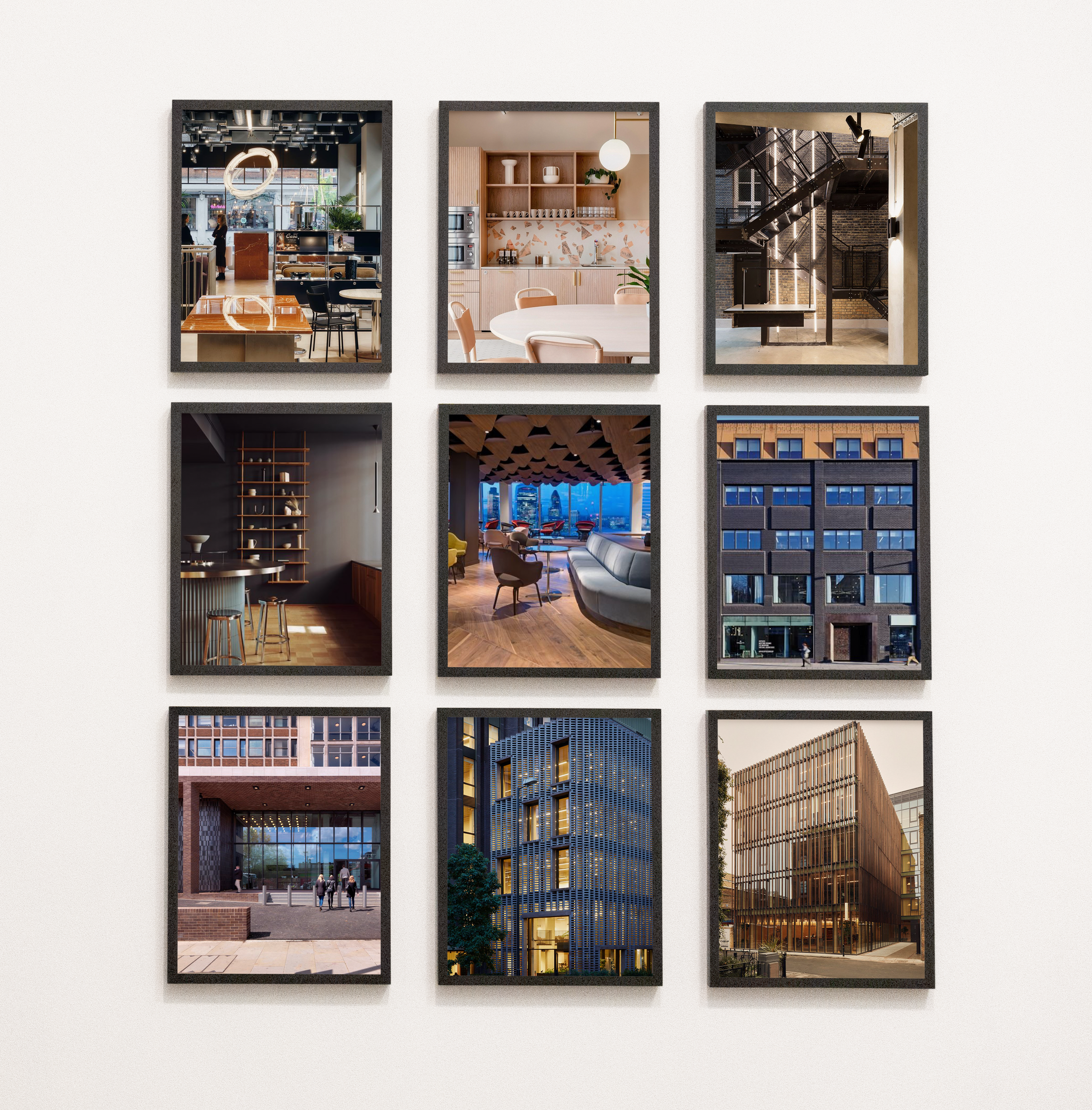
We began the creative process by exploring strong, bold examples of brand identities of businesses that operate within the property industry.
A midnight green selected for a sense of stability and professionalism, combined with a smoky red to introduce a vibrant, energetic quality. As a neutral backdrop, we introduced an off-white hue to ensure the colour palette remained sophisticated and approachable. Colour plays a huge part in brand perception and Sam came prepared to the brand identity project development with a good bank of photography that would co–exist with the palette, so it was an easy process from the start.
Services: Strategy, branding, including logo, website design and copywriting.
Through project development, Milecastle Projects deliver sustainable spaces to manage property and construction projects that not only meet but exceed end-user expectations.
Ex–Development Director of The Office Group, Sam had delivered 40 office projects across the UK and Germany, including London’s tallest mass timber office building.
As he was building these modern landmarks, he was also building a wealth of experience, overseeing projects from feasibility due diligence, to completion, to asset and property management. He came to us this time last year looking for a brand identity that would help him stand apart in a crowded industry, balancing his forward-looking approach to design with a good respect for tradition, appropriate for a company with fifteen years’ strong and solid projects under their belt.
When creating a brand identity it’s essential that we know who we are speaking to and with. Since Milecastle put people at the core of everything they do, we wanted to create a brand ID that would speak to middle–aged, affluent people who value security and planning. We explored a typeface system that would emphasise trust, strong critical thinking and planning.
We worked with the theme of scale that goes above and beyond to solidify our research. To guide the visual language we also worked with key words of control, history, sustainability, nature, confidence, reassurance, confidence, optimism.
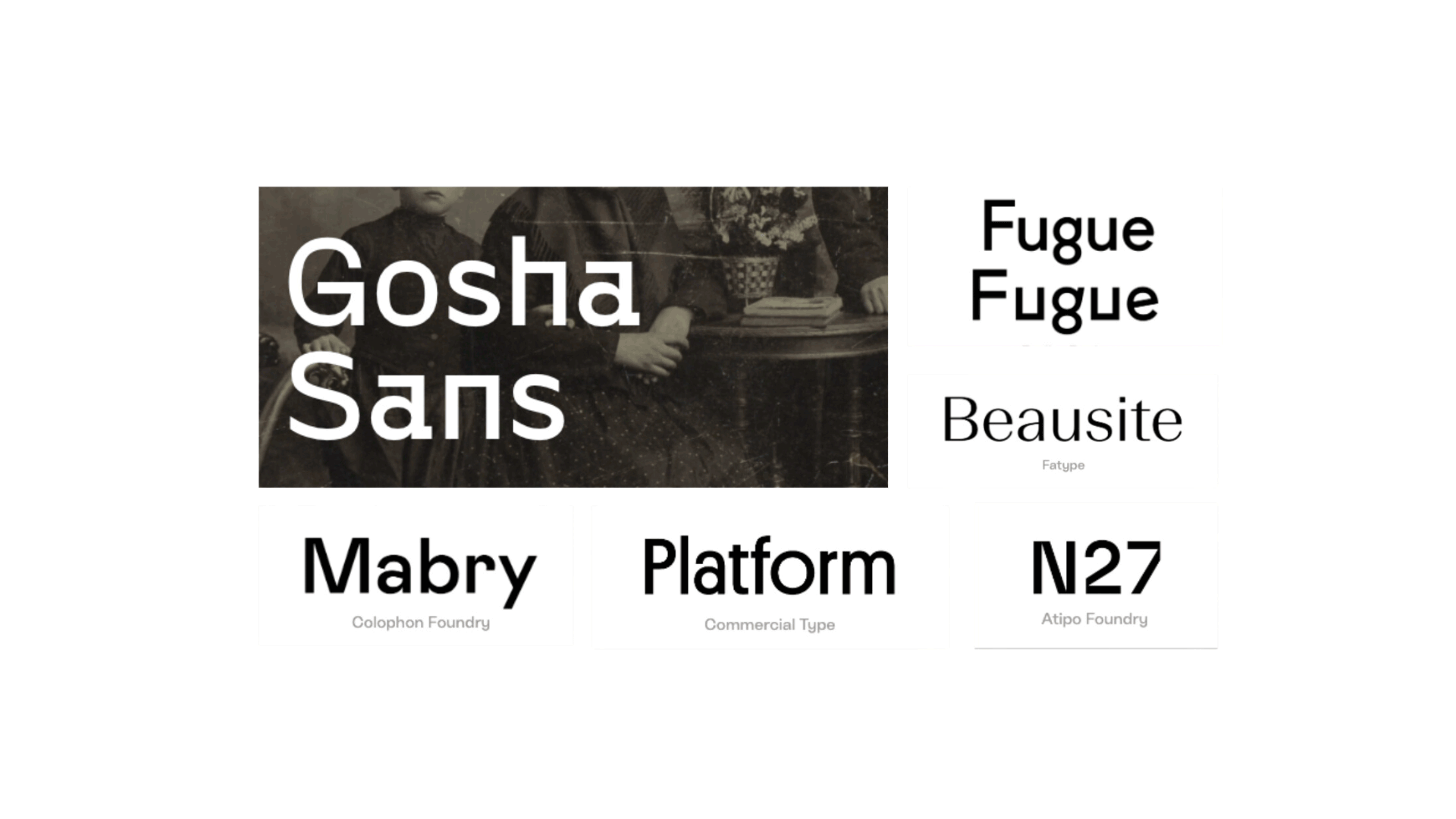
After conducting a thorough type exploration to determine an appropriate typeface for the brand logo, we established a set of typefaces. Bebas Neue was selected for its clean and strong lines for headings and titles, reflecting the firm’s emphasis on solidarity and mirroring the architectural integrity of their projects and namesake. Europa was chosen as a secondary typeface thanks to its refined and contemporary letterforms, capturing Milecastle’s approach to creating spaces. Coupled together, these typefaces do a good job of reflecting Milecastle Projects’ commitment to blending tried and true rules of architecture with a forward-thinking design ethos. Above are some of the options we considered before settling on the final outcome.