

Natalia Sergevna
Natalia Sergevna is a coach and psychoanalyst. She strives to show her clients that they can become an author of their own lives and grow to their full potential.
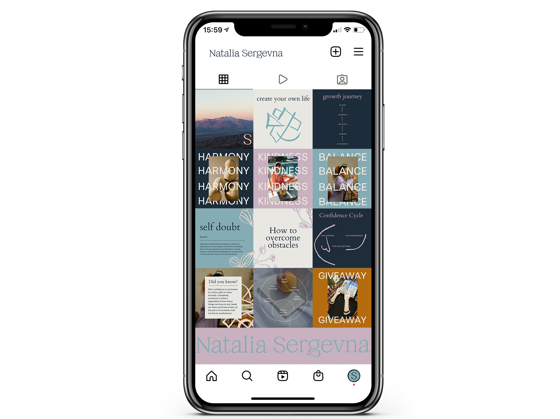
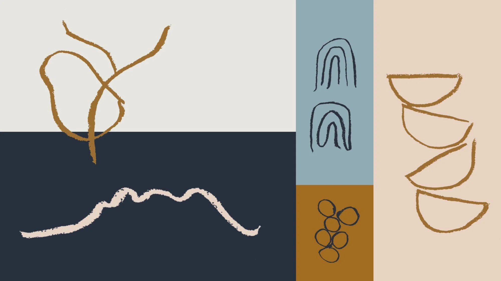
Natalia came to us for a brand refresh as she wanted to stand out from the crowd and get her message across clearly. We began this project by conducting in-depth research on her audience, clients and competitors. After gathering comprehensive research we began our creative process and started developing colour, type and image, as well as the social media and digital strategy. This brand needed to speak the same language as the competitor lifestyle coaches, communicating a strong, mature and clear approach to instil credibility and client trust. To create a strong and meaningful logo we worked with a type designer Jo Malinis who created a unique one-of-a-kind typeface that accurately reflects her brand; focusing on themes of transformation and change, and Holly Moxham who carefully created a system for Natalia’s illustrations.
To ensure we communicated how the brand offers unique and personal services, we selected a bold modern primary typeface, Europa regular, for headlines and titles, which features a characterful roughness which brings a humanistic touch and reflects the brand’s value of embracing newness. For the secondary typeface, the body copy, we decided Cardo regular would work well as the font was designed for the needs of classicists, biblical scholars and linguists, meaning it is a high-quality old-style font that conveys a sense of strength, awareness and confidence.


When creating this brand identity, our challenge was to communicate to a broad range of people, each with their own set of goals and troubles, whilst talking on a direct personal level through the presentation of Natalia’s own story. We focused on the idea that starting therapy and beginning the process of changing negative patterns and ways of living life can be challenging and often overwhelming. Therefore the presentation and feel of Natalia’s brand needed to be one of balance, calm and positivity. Natalia’s site also reflects this; the journey through the pages is a soft and calming experience; working with a copywriter to ensure that information is both easily digestible, welcoming and informative showing Natalia’s strength, confidence and empathy and ability to change people’s mindsets and lives.
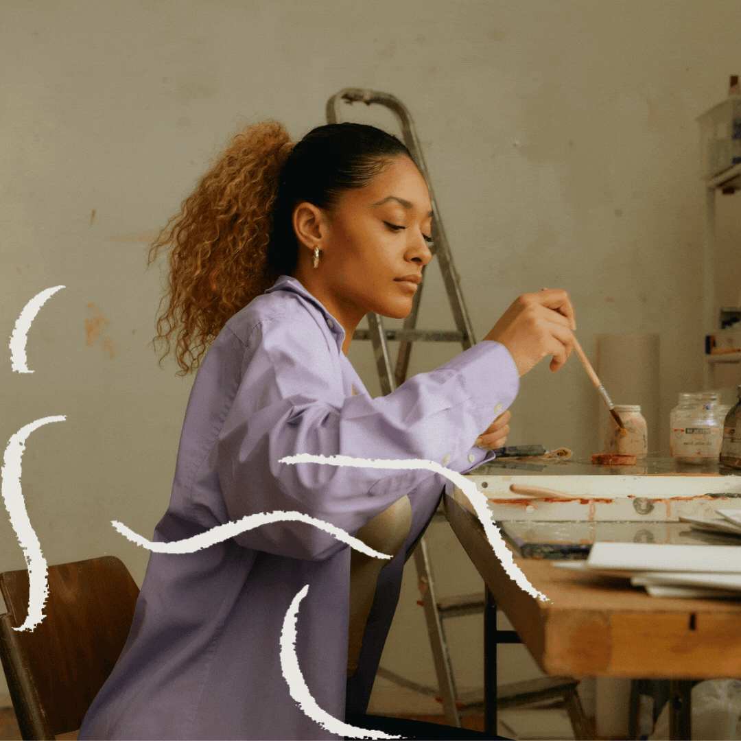
To create an open visual design system that suggest uniqueness, manifestation, and empowerment we have created unique sets of illustrations that convey these themes through constructivism, faces, bodily forms and organic forms. The illustrations are presented in all of the colours within the brands unique colour scheme. The custom colour scheme conveys the brand personality that communicates to a wide range of audiences. We sourced photographic imagery that captured the definition of ‘lifestyle coaching’ - a journey of self-acceptance, development and embracing newness. Images of the natural world communicate the theme of growth and tranquillity. Additionally, we arranged a branding photoshoot with a professional photographer that shot beautiful images of Natalia from our studio. These images are essential in gaining initial client trust through bringing a personal element to the brand and thus adding to the creation of a successful business.


A crucial part of this project’s deliverables included building a website and social media templates that the brand could use and update as they grow and times change. To ensure consistency and a sense of ease, we compiled all brand assets into a clearly labelled filing system. We illustrated how and where to use everything into a brand book, allowing them to create on-brand newsletter templates and marketing materials without incurring additional costs by reaching out to a designer / marketing team. When we work with brands we leave them with the skills and resources to carry on when we are not there, so they can continue to thrive and grow. For example, with every project, we walk our clients through their websites and online templates to ensure they are able to function and manage their features independently once the project closes.
Natalia Sergevna brand illustrations by Alexandra Lunn Studio.
Services: Brand identity, social media strategy, custom type design, illustrations and website design.