

Fitting in or standing out?
Uniqueness is in all areas of our lives. Having a signature style gives us an identity and builds trust. We choose clothes, restaurants, and brands that reflect – or at least that we like to think they reflect – who we are, what we like, and how we want to appear. Paradoxically, in recent years, high–end fashion brands that want to attract such consumers have followed a trend of toning down their unique visual identity with minimal, almost identical aesthetics:
The chic of Chanel or Yves Saint Laurent is lost with such ‘blanding’. However, thanks to investing in a unique identity that reflected their core values throughout their long history, and the successes that comes with good quality products, they've been able to move on from historical references to appear new and modern without losing much brand equity. Similarly, other established brands such as Rimowa and Berluti have also been able to jump on the blanding bandwagon without losing their identities because they're already so well established and their products have stood the test of time.
Having a solid brand identity from the outset ensures a timeless aesthetic amid rapidly evolving trends. However, with so many high–end luxury brands, and tech giants also employing blanding, could creating a minimal aesthetic for your start-up be a good choice for you?
“…branding is your fundamental promise of whom you serve, how you make them feel and what’s different about how you deliver.”
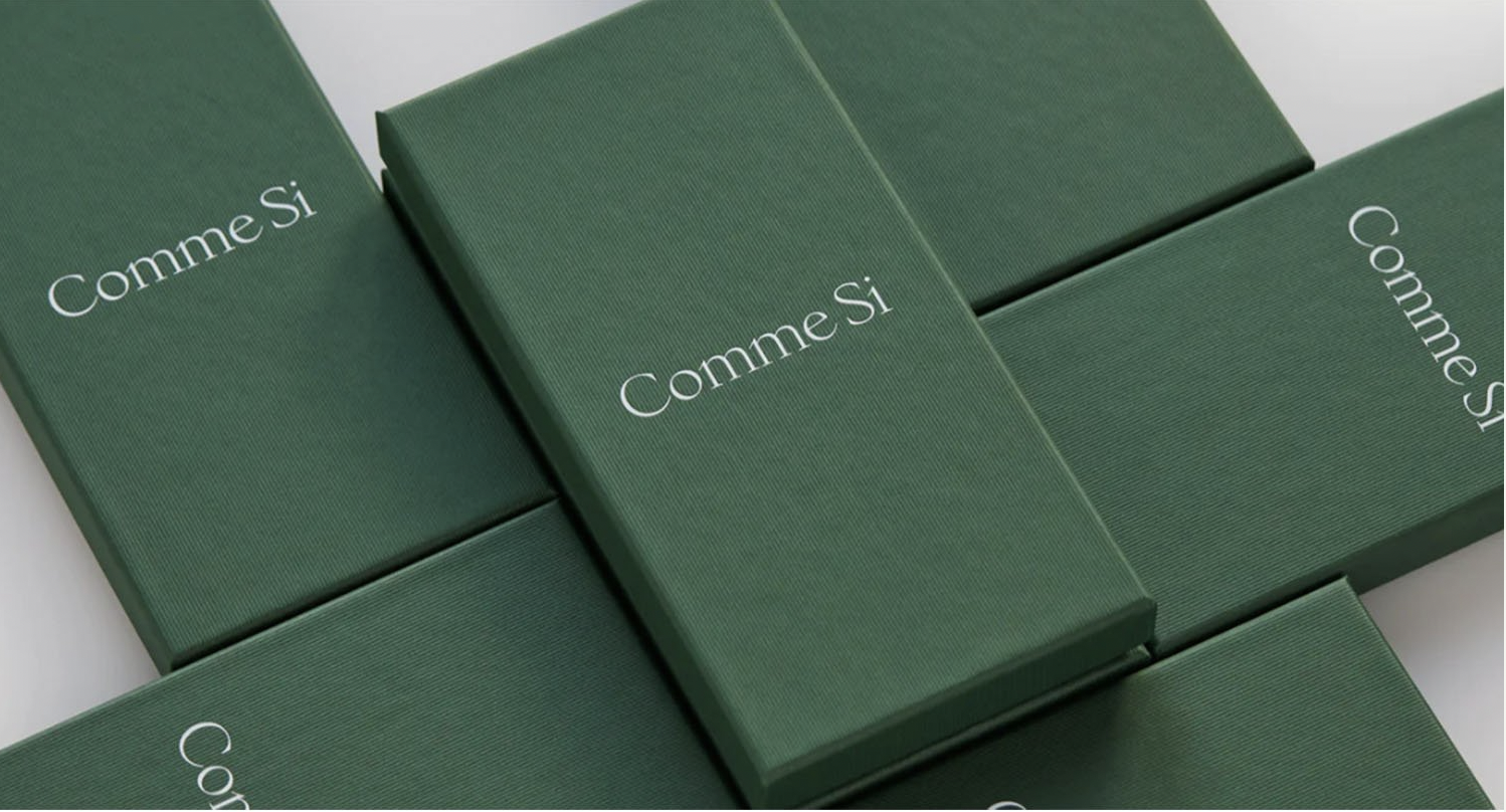
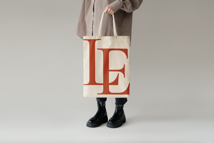
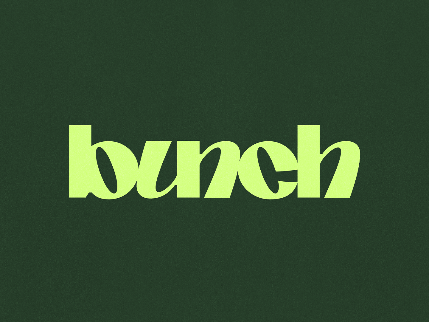
A selection of brands created over the last few years to thoughtfully communicate to an audience by Sunny Park, Studio Nari and Alexandra Lunn Studio
REVERTING BACK?
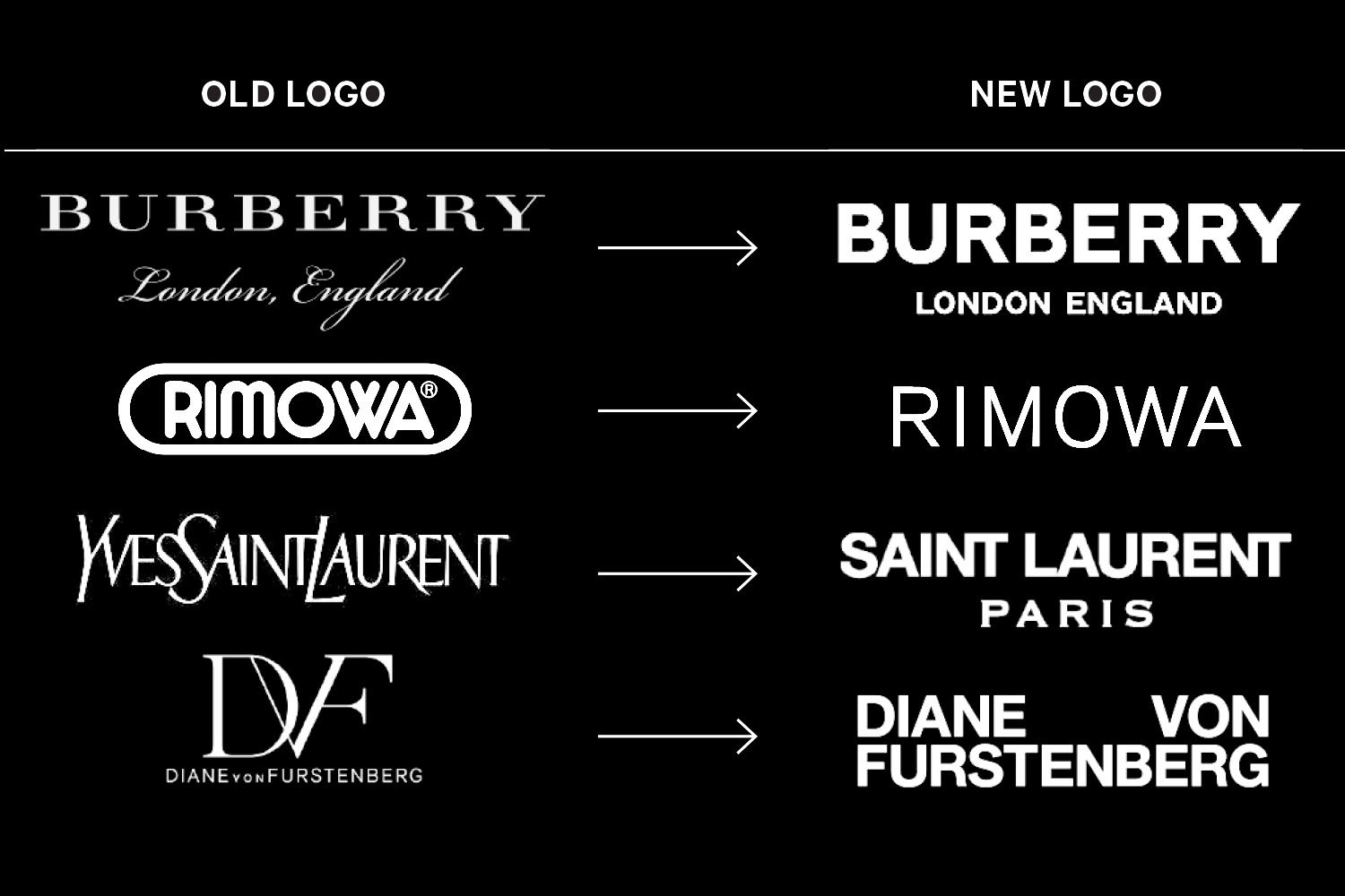
Could the fact that Burberry has recently reverted back to a serif font; break from modern tradition be the start of an exciting design trend?
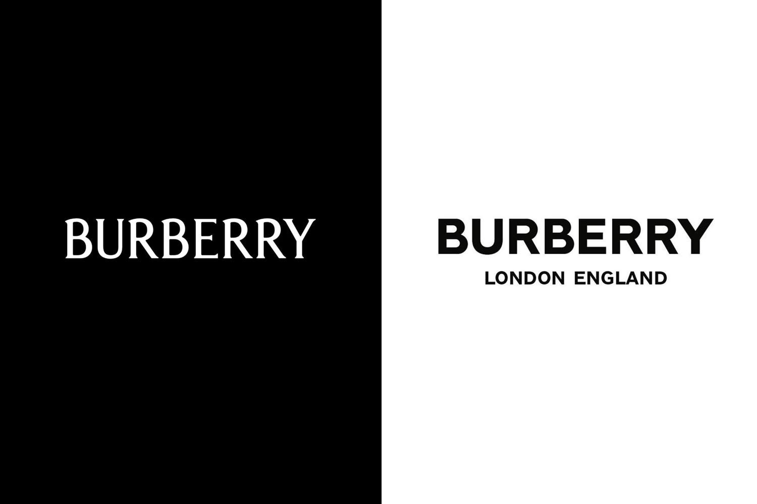
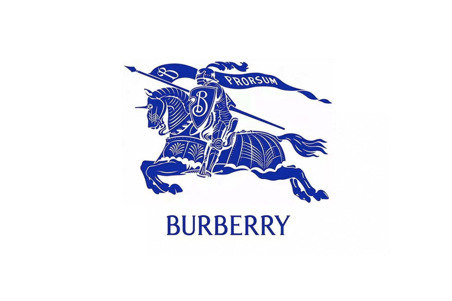
The new Burberry wordmark (far left) vs the 2018 version (middle) – The new Burberry CEO Jonathan Akeroyd has also brought the brand’s equestrian knight ‘Prorsum’ logo – first introduce in 1901; a clear decision to break from recent design trends. (Image credit: Burberry logo)
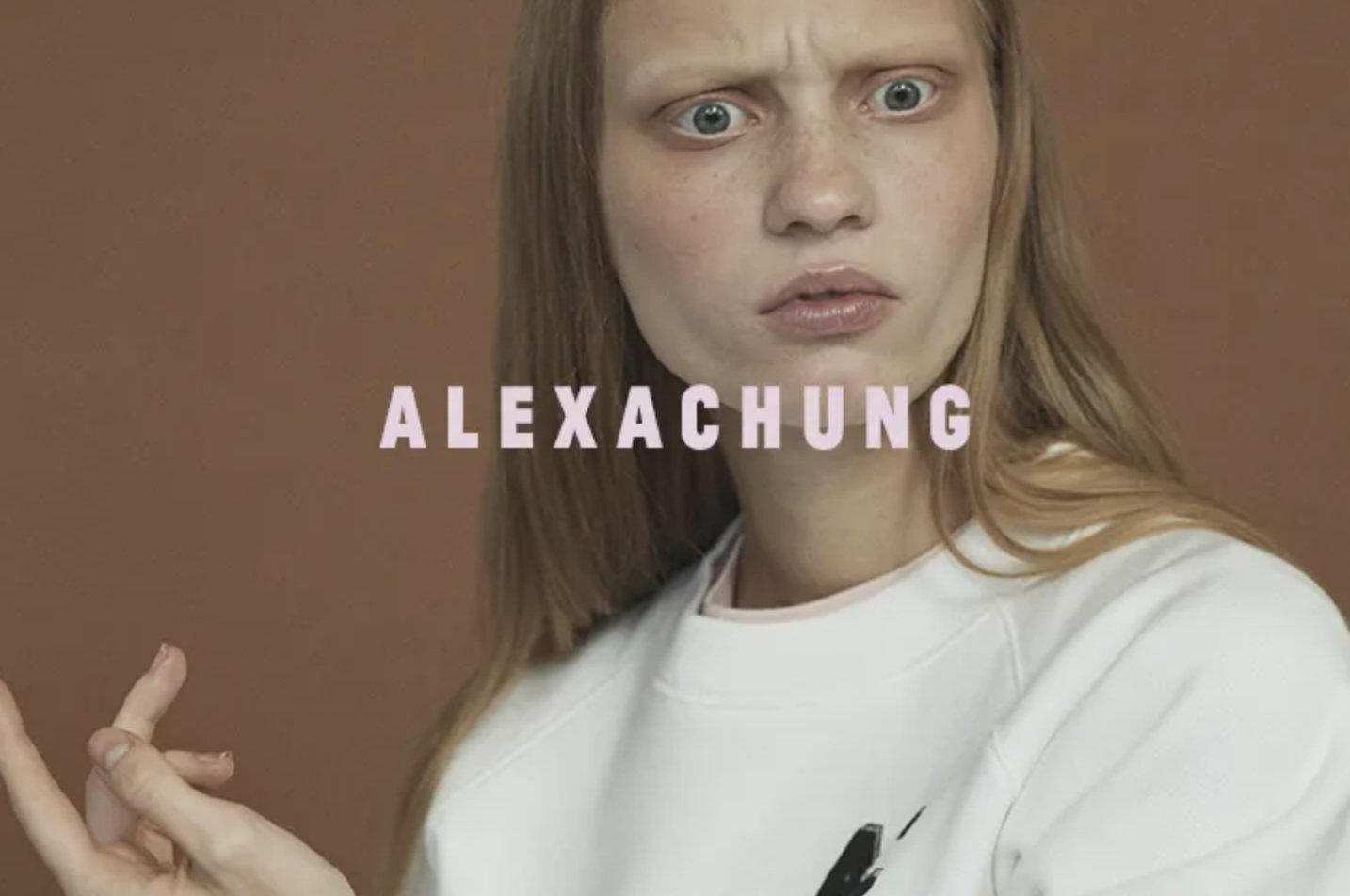
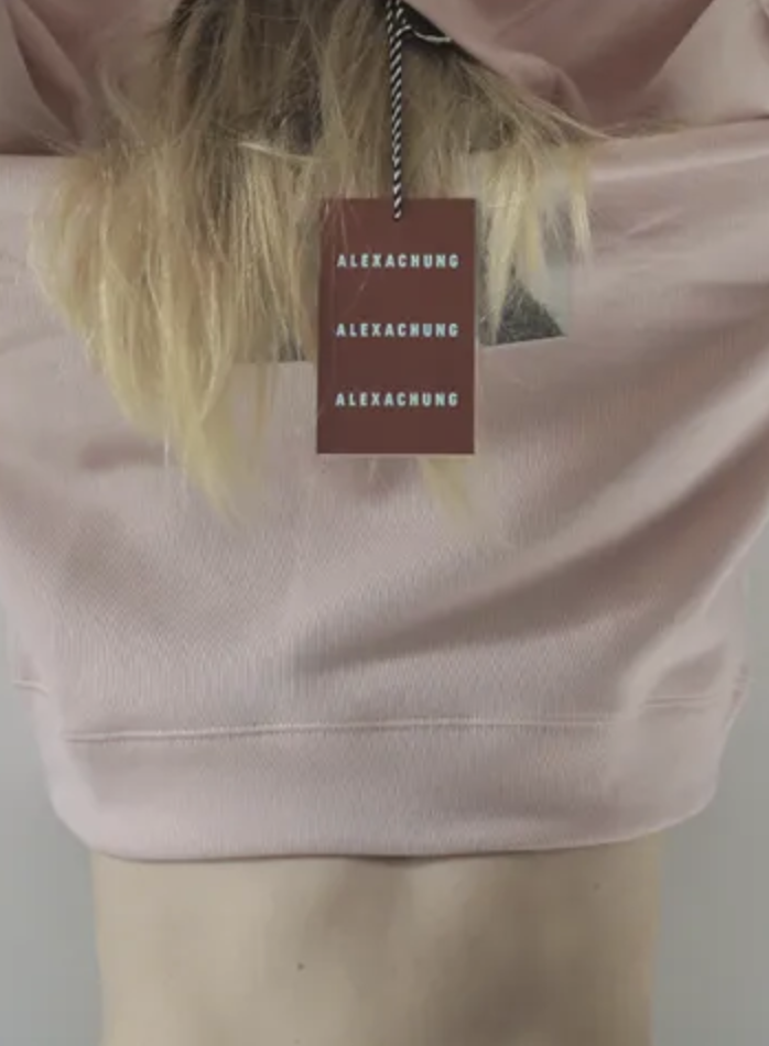
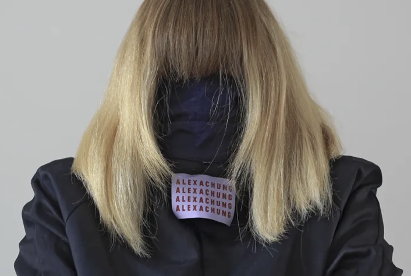
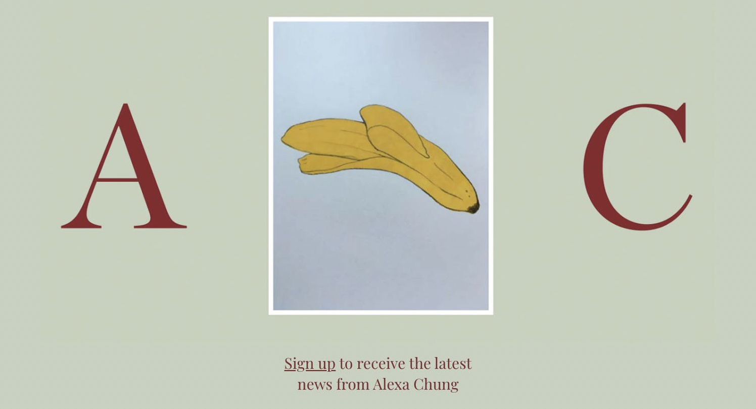
Even established brands appear to be thinking twice about blanding. Alexa Chung has recently updated her website with a new serif style font(below). Original brand identity by Studio Frith (above).
Branding is a way to embellish lives and evoke a feeling you want to elicit in prospective customers. Having a core identity, standing for something and bringing a little spice into people’s lives helps sell your product or service to them.
If a logo allows your brand to stand out, should you steer away from trends such as blanding? We think start-ups should look to humanise their brands by giving it your unique human values, and expression; dare to stand out.
further REading
Read ‘The End of Blanding?’ by The Business of Fashion.
Read more about blanding here, here and here.
This thread, and take a look at this post on Twitter!