

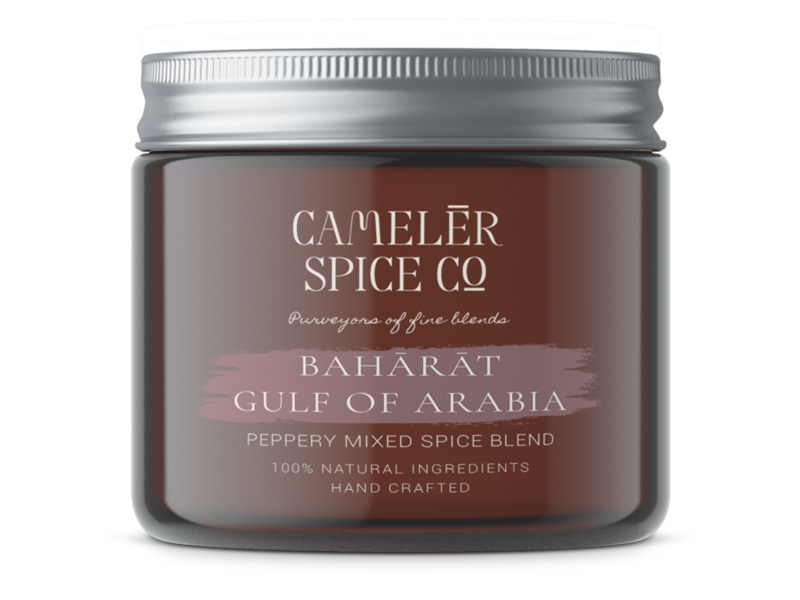
CamelĒr Spice Co

When Halle & Myles - friends and business partners - started working together on a project in 2019, they realised from the offset that their values and interests were aligned. In 2021, they set up Camelēr Spice Cº.
The founders came to us after undertaking research about their brand, bringing with them a vision of where they wanted to go. To complete the strategy phase, we invested more time into understanding who their audience are, what their pain points could be, and what kind of problem Camelēr solved for them.
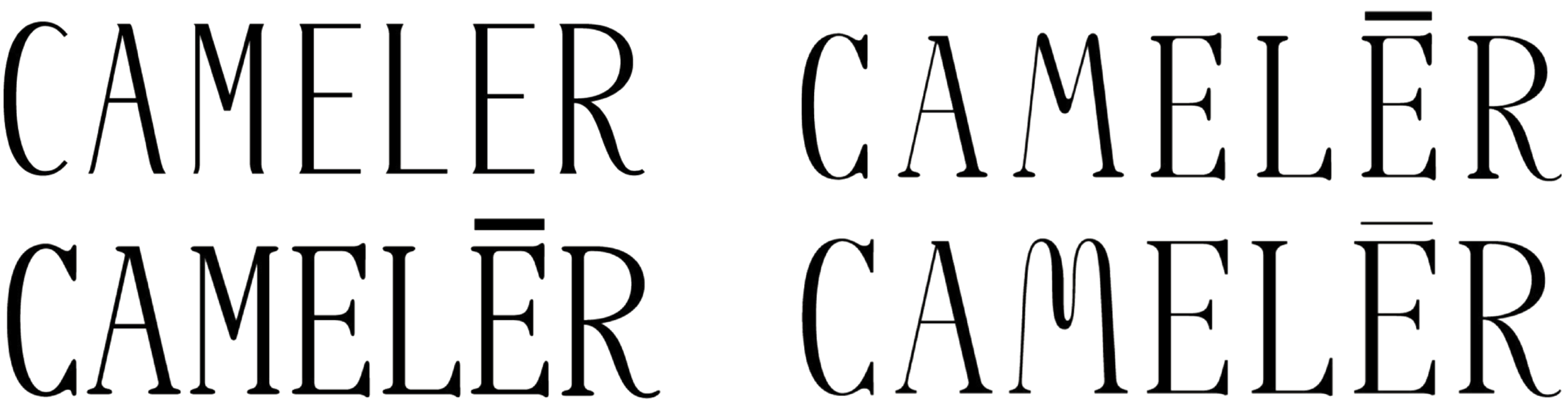
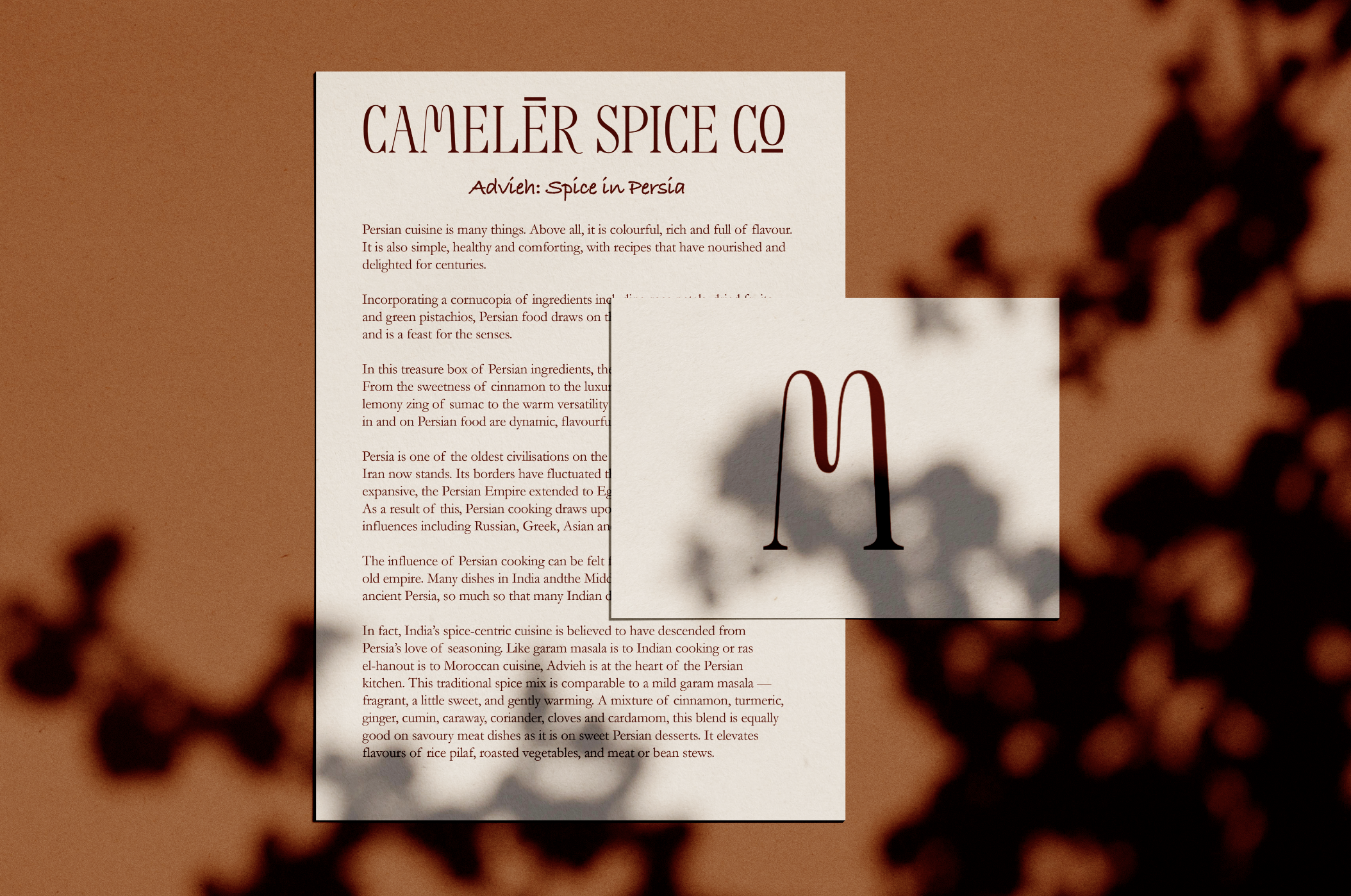
Once the research phase was complete, we appointed a type designer to establish a custom typeface with a classical structure. Typography is the most efficient way to ensure your brand identity is delivered with consistency and personality through all channels, so designing a custom type allowed us to focus on the details relevant to Camelēr’s story with total creative freedom.
Here is the process, which was made possible after providing her with a brand bible-style document:

Study One
The founders of Camelēr are keen to honour the history of their industry, with a respect for heritage forming a core element of their brand identity. Inspired by the journeys embarked upon by the spice merchants of old, our initial direction shone a light on a soothing rhythm of elegantly curved lines crafted to echo sand dunes and waves.

Study Two
Trusted expertise was another key aspect of the brand identity we established for Camelēr. Drawing reference from the contemporary apothecary, we crafted this typeface with barely-there serifs as a subtle nod to vintage storefronts and labels, evoking a feeling of heritage and establishing Camelēr as well-informed experts in their craft.

Study Three
Through our conversations with the founders, we spotlighted the luxurious nature of the product; exploring the concept of rising above, evoking elegance through the curvature and height of these letterforms.
Hybrid Variations
Halle & Myles were torn between the two final concepts, so we then offered to explore the concept to make way for refined hybrid variations that would polish and perfect the characteristics of the majestic 'M', which later went on to form their logotype.
A colour palette was influenced by the spices that form their signature blends, and a typographic hierarchy for both primary and secondary fonts was also influenced by the company's brand values.

©Marie Boulanger

Again, working with findings from the research phase, we developed and distinguished Camelēr’s final logo marque, to be used in any colour combination from our approved colour palette.
Camelēr's principle values are that they embody trust, honesty, and open communication and their aim is to transport you into a world of fine blends, where they can share the benefits of individual spices and herbs, without compromising on taste. They're devoted to sharing the learnings that camelērs picked up on their journeys across the globe. They celebrate community, culture, the places where their spices are sourced, new recipes, and of course, camels. These content pillars form their marketing strategy, social media style guide, and editable templates:
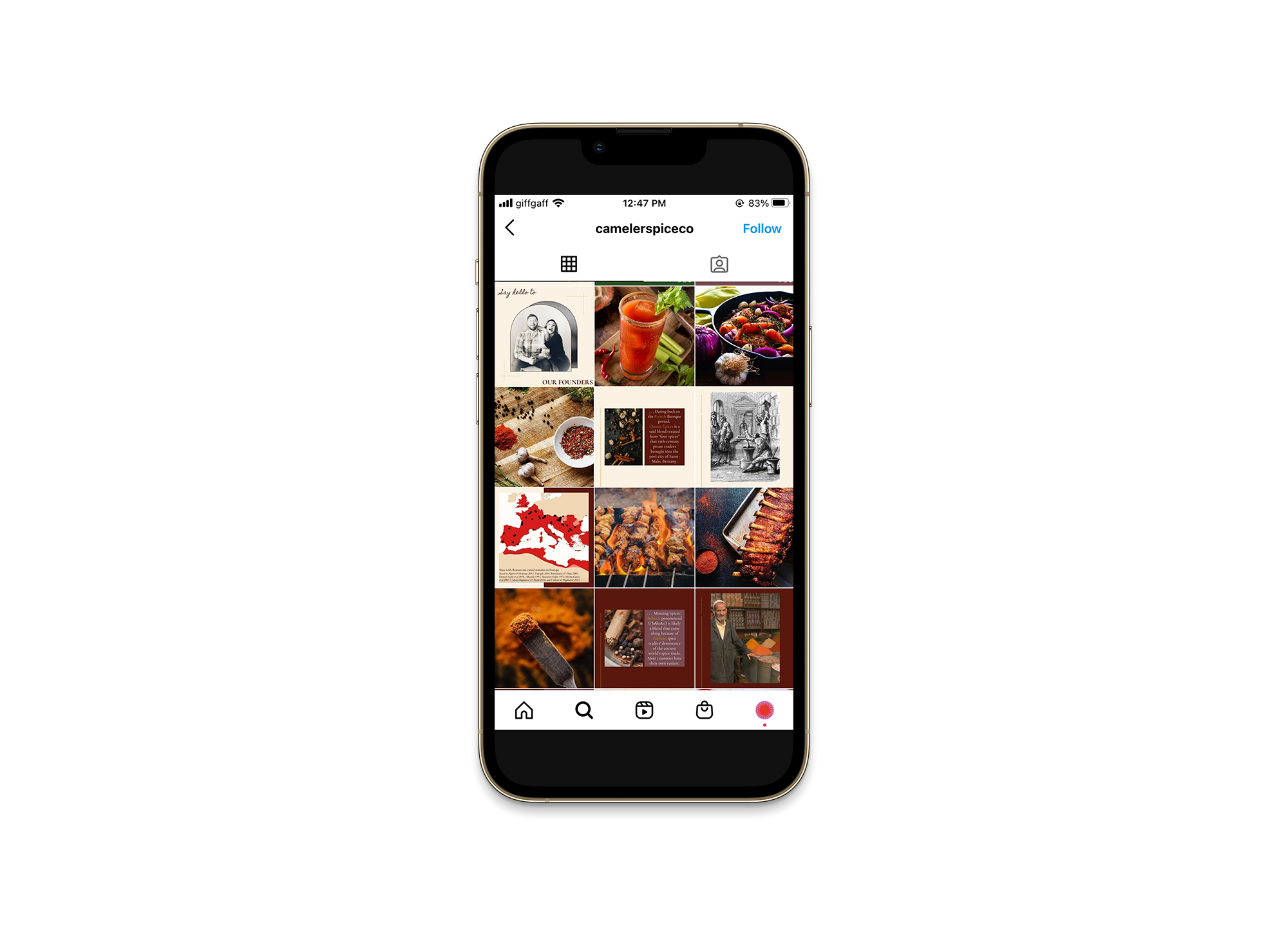
We then displayed how their brand could look on printed materials and provided her with all the artwork for packaging, business cards, and social media templates. We also provided them with ongoing support that enables their brand to remain at its very best, such as guidance on social media channels and their website. Any successful brand requires maintenance and upkeep, so a second pair of eyes can be helpful to spot things that you might otherwise be missed - which makes our collaborative process crucial for success.
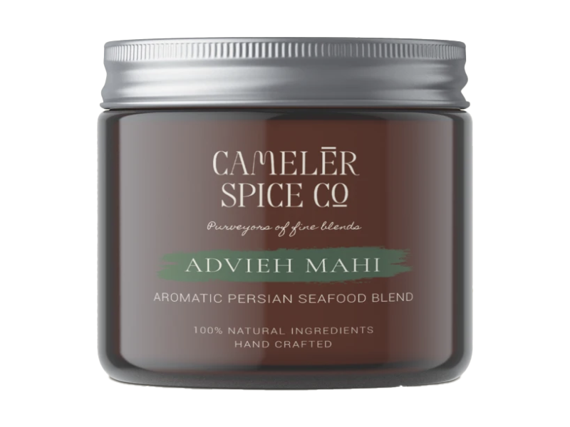
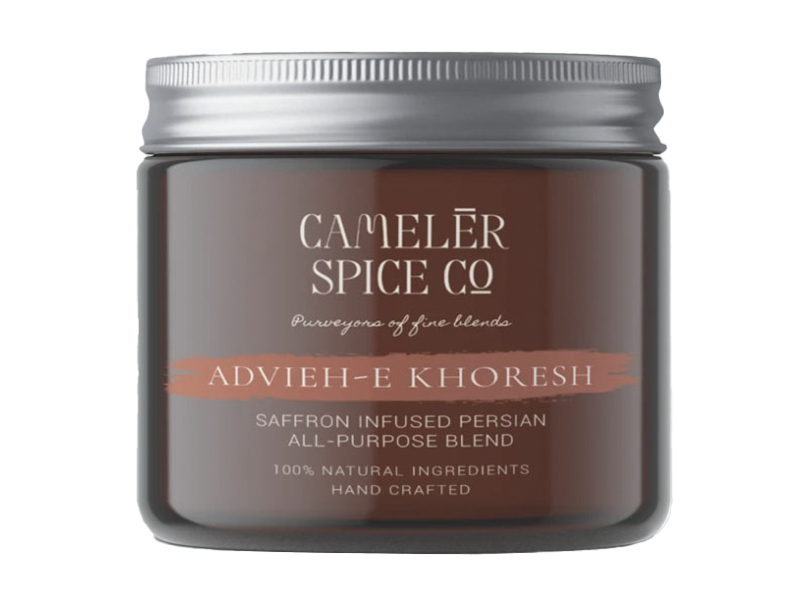
In addition to creating all visual materials, our expertise in copywriting allowed us to work with Camelēr to create a system for their spice blend cards. We collaborated with Hannah to ensure that the flavours, tones, and notes were all expressed throughout each spice blend, in a clear and concise manner.

Web development by The Good Agency.
A good brand strategy should be an organised plan of action, one that aligns your brand, goals, and audience to make sure every aspect is moving the brand towards its fullest potential. A strategy is a map that marks the spot where the heart of your business overlaps with your goals and the needs of your audience.
‘Alexandra and her team were able to capture our brand ethos and represent our values and mission encapsulated in a way that we were blown away by. The bespoke nature of the service gave our brand the inspired authenticity we wanted to represent with our product offering of fine spice blends. The result is a brand we are exceptionally proud of and eager to showcase’
– Halle & Myles - Co-founders, Camelēr Spice Co.