

The Role of Colour Psychology in Developing Your Brand
Colour has the power to set a tone, evoke emotions, and capture a brand’s essence in a way written words sometimes can’t. When creating or enhancing your brand, understanding colour psychology is crucial.
So, why is colour so important, how does it affect our everyday lives, and how does it effect brand perception? Within this article I explore the language of colour and look at how colour affects our everyday decision making.

Georgia O'Keeffe, Crab's Claw Ginger Hawaii, 1939.
“I found I could say things with colours that I couldn’t say any other way – things that I had no words for.”
Nature’s Palette
Nature has always inspired how we perceive and use colour. Subconscious reactions to hues often stem from natural elements, such as the danger signalled by black and yellow in wasps or warning signs. Colour harmony frequently originates in nature, influencing design and the portrayal of values.
Colour also serves as a powerful communication tool in the natural world. For example, Charles Darwin observed that the vibrant colours of male birds of paradise attract mates, with brightness indicating health and vitality. Interestingly, these vivid, "neon-like" colours, though now associated with man-made items like glow sticks, have existed in nature long before industrial design embraced them. Nature’s colours continue to inform and inspire visual storytelling and design.
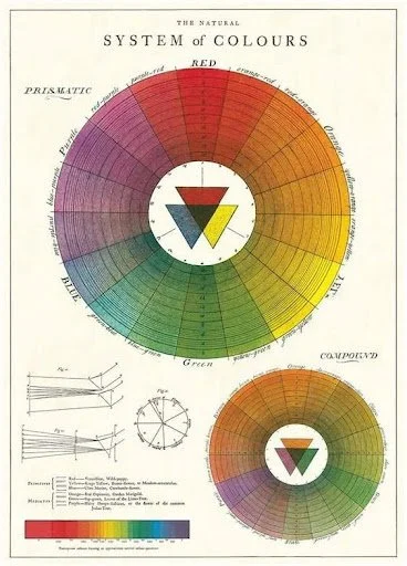
Calvallini Colour Wheel
Visual Identity Design
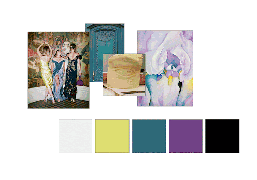
Part of our job is to express the personality of a brand through colour, we use mood boards to understand the client’s needs and begin building the story. Mood boards are also a great way to describe colours and help distinguish subtle differences between colours. Strong colour palettes can help you connect with your customers and enhance brand loyalty; this is often done by reminding your customers of memorable moments, and nostalgia and touching on shared experiences.
When designing a palette at Alexandra Lunn Studio Ltd., it’s usually based on a mixture of brand values, emotive words, and client preferences. It's also where we start to see the brand’s personality come to life. For example, the mood board gif above is taken from the work we created for Leisure Enterprise, who wanted a luxurious look and feel to communicate to an affluent audience.
What we find fascinating about it is how just a slight change in colour or tone from one hex code to another can completely changes the overall palette. There's a knack to it!
How Colour Meanings Vary Around the World & Accessibility
Colour plays a vital role in conveying information and evoking emotions, making it essential in portraying brand values. It influences how logos attract target audiences and align with the personality of a company’s products or services. Cultural perceptions of colour vary widely—for example, red signifies mourning in South Africa, good luck in China, and love or danger in Western cultures. When building or refreshing a brand identity, it’s crucial to select colours that resonate with the intended audience and evoke the desired emotional response.
The perception and significance of colour is a very personal one and it’s safe to say that we all experience colour differently even if they are subtle. When creating a global brand, it’s important to work with experts in semiotics to avoid missteps and take into account those who are colour-blind or those who have special needs. Test your colour memory with our fun, interactive quiz.
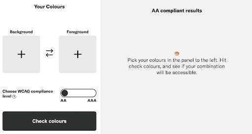
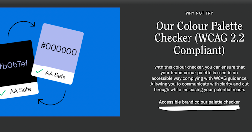
Those with colour blindness and types of synesthesia will experience colour vastly differently from those who are neurotypical. The Accessible Brand Colour Palette Checker ensures your colour combinations meet WCAG 2.2 accessibility standards. It evaluates contrast ratios for text and backgrounds, analyses entire palettes, and provides downloadable results. This tool promotes inclusivity, improves user experience, and ensures your brand is accessible to all, including those with visual impairments.

Use Emotion
“I’ve learned that people will forget what you said, people will forget what you did, but people will never forget how you made them feel.”
The fact that colour has unique qualities in evoking emotions helps to evoke our long-term memory. For example, a short and sweet tagline used with a strong colour palette will create a more recognisable and memorable brand. For example, the world’s largest fast food restaurant chain, McDonalds, is one of the best-known brand names with its strong palette of red and yellow with the tagline “I’m lovin’ it”.

The initial colour palette for FINERFINER – using emotive words on the left-hand column really helps in developing a palette according to the emotions that you wish to evoke within your audience.
As a rule, warm colours, such as oranges and reds, evoke feelings such as love, passion and anger. In contrast, cool colours, such as blues and greens, are more stoic and associated with reliability, strength, calmness, and sadness. Blue is seen as a trusting colour, so we use it when designing for businesses and bodies that operate for and within the financial industries. Take a look at the brand identity we created for T–Bridge. An eclectic mix of contrasting colours can also help to provoke feelings of playfulness and hint at times gone by.

Van Gogh, Café Terrace at Night, 1888.
Vincent Van Gogh was an expert at evoking emotions through the use of colour and their underlying emotional connotations.
“Instead of trying to reproduce exactly what I see before me, I make more arbitrary use of colour to express myself more forcefully.”
The Natural - Artificial Debate
Colours shape how your audience perceives and connects with your brand, communicating trust, excitement, or creativity. From the reliability of blue to the energy of red and the sophistication of neutral tones, the right palette enhances recognition, builds loyalty, and drives engagement.
Book a free 15-minute colour consultation with me to ensure your brand’s palette aligns with your values and resonates with your audience: Calendly Link.