


Milton House
Milton House Research and Advisory Service offer their clients expertise. With oodles of experience, director Thibaud needed a more established brand identity.
Thaibaud needed to reassure his clients that Milton House is a trusted source of financial advice. To build trust and rapport, we helped them to establish a new visual language that could help to create a niche amongst their competitors. As usual, we started with a consultation, where we gained deeper insight into his business, and what it offers. Once we felt we had a good foundation of understanding on which to build, we began with in-depth research into Milton House’s target demographic and a competitor review to capture the current industry standards.
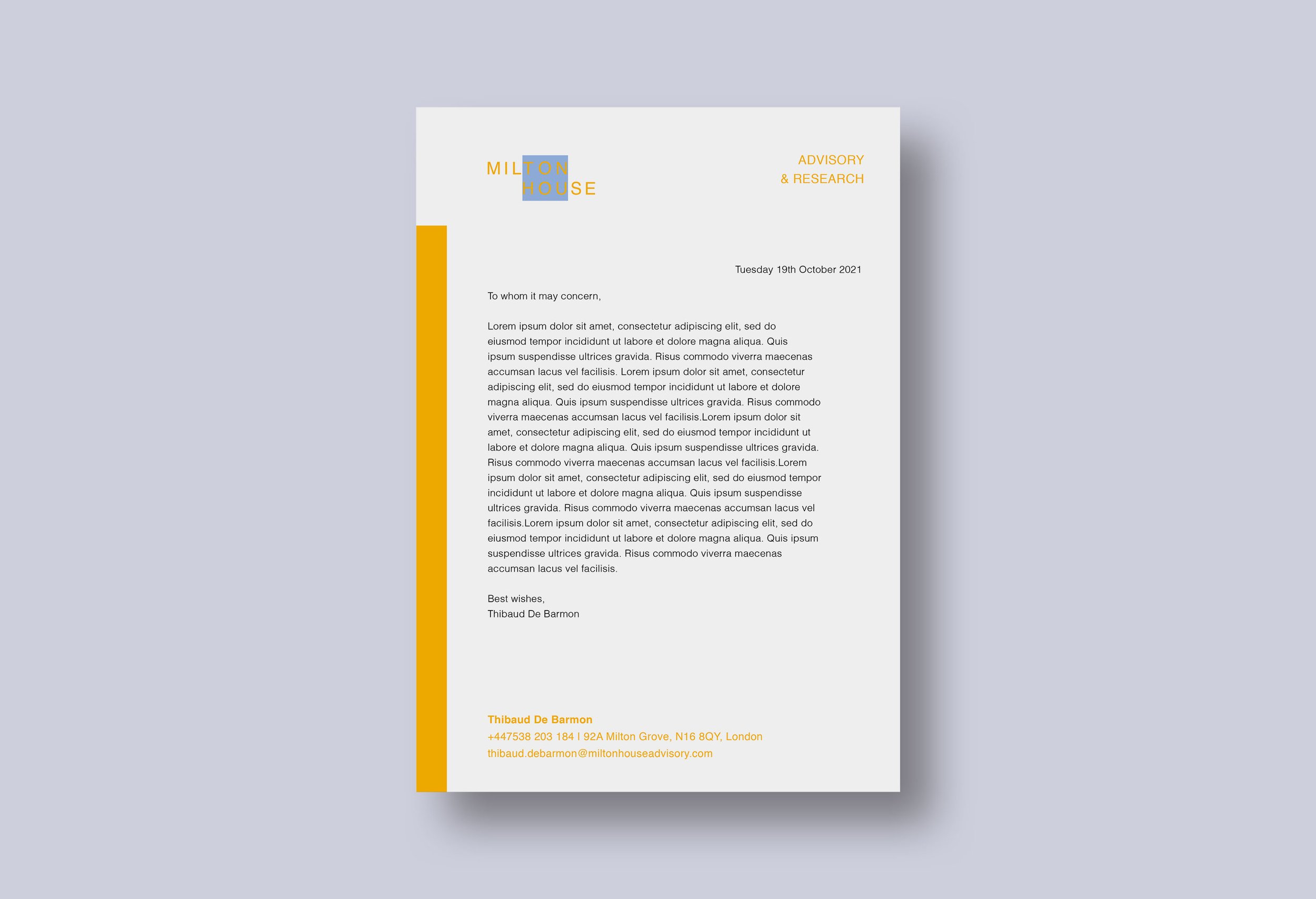
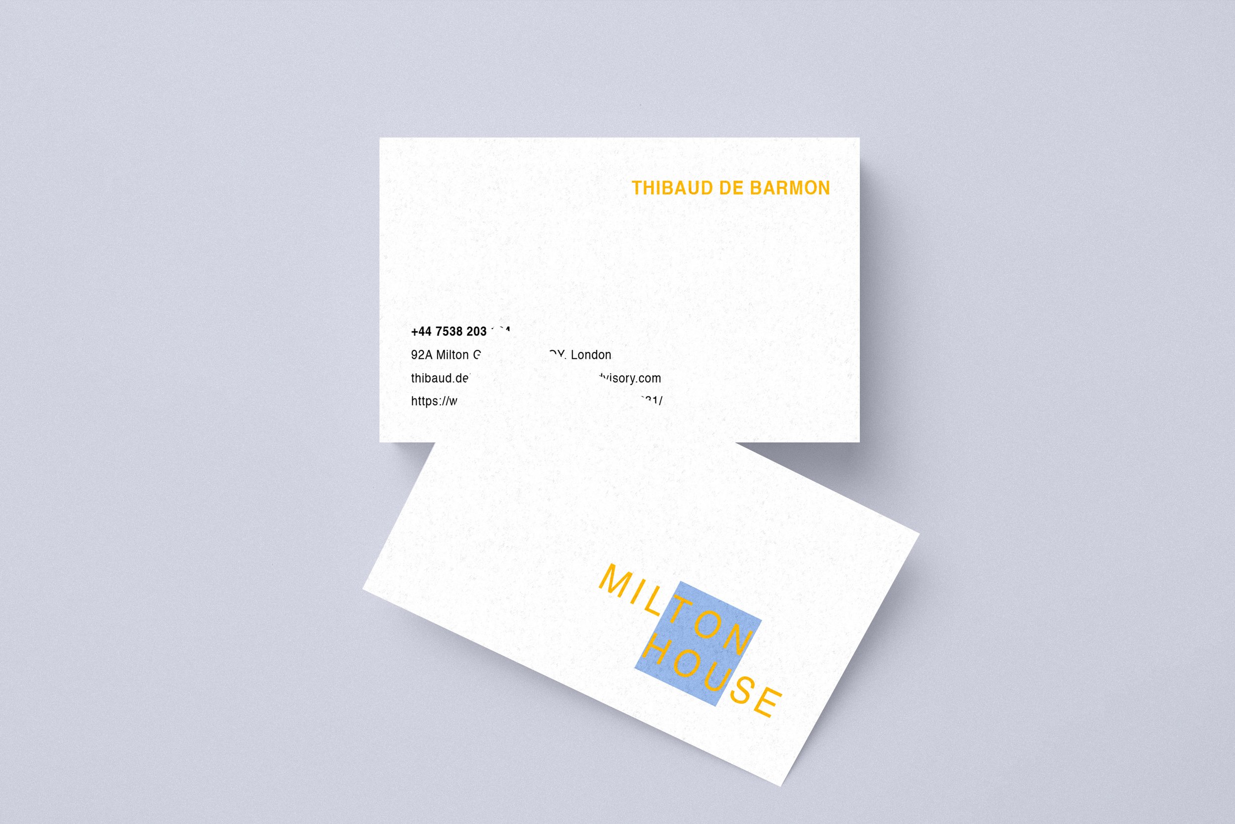
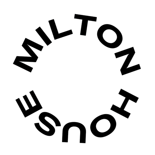
We conducted light strategy work to determine the correct feel for the brand. We decided to lead with minimal, contemporary design to reassure clients that Milton House could be a trusted source of financial advice. Wary of blending in with competitors, we sought new ways to bend the industry standards without breaking the rules altogether. Experimenting with logo designs that walked the line between gravitas and liveliness, we discovered the solution in the form of a minimal typographic logo and a geometric frame to ground it, rendered in striking pastel hues. To reflect Milton House’s outside-the-box approach to financial services, we extended the logotype to allow it to break the boundaries of the geometric frame.

“At the end of the first lockdown, I decided to become an independent consultant and start my own advisory practice. My thoughts and aspirations were pretty much like the world at the time, nebulous. Nevertheless, Alexandra managed to capture the ethos and the style I wanted to convey and proposed a very effective and versatile design for my key materials. Despite the constraints of remote collaborations, the process was very smooth, interactive and had a very quick turnaround. This project was certainly successful and greatly helped to get started on much more assured footing.”
— Thibaud de Barmon, Milton House Research and Advisory
Services: Brand identity and social media style guide. Read more on the package that Milton House invested in.