

MY TOP DESIGN RESOURCES


My curated collection of design resources has been shaped by over a decade of working in-house, leading international studios, and teaching graphic design and branding. In this article, I take you through the subtle tools that shape how people perceive and connect with your brand: type, colour and image–and importantly where you can find them.
For example, typography isn’t just about arranging letters; it’s a powerful way to express personality, set tone, and influence behaviour. Likewise, colour and photography are powerful tools you can sue to evoke emotion and connect with your audience. So let’s explore how the right font, colour palette, and imagery can elevate your message and transform your brand identity.

TO START – know who you are!
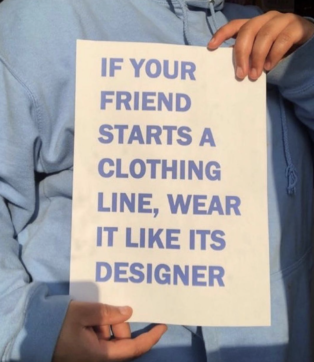
Get clear on who your brand is–if it were a person, what would they wear? How would they sound? What would they be into? Every font has a personality, so imagine your brand is a person and then find a font that they would ‘wear’. Selecting fonts that reflect the tone, style, and identity of your brand will help you to communicate to who you want to invest in your product or service. For example, a luxury brand that wants to evoke feelings of trust could favour an elegant serif font, while a modern tech brand might choose clean sans-serif fonts.
The first step you want to take is to RESEARCH. Fonts are everywhere. While it can be tempting to follow font trends, choosing something timeless ensures your design remains relevant longer. A balance between modernity and longevity will help your project stay fresh over time. Instead of just heading to Pinterest head to the streets. Take photographs of your surroundings and document anything you love––this will help you form a bespoke library/inspiration resource point.


GETTING TECHNICAL
Some fonts are free for personal use but require a licence for professional work. Google Fonts (above) offer a lot of licence free typeface options. This means Google have paid the type designer so people like you can use even for commercial purposes––royalty free. If you work with a typeface that’s on a website platform such as Squarespace, it usually means the company has paid the typographer for rights for their customers to use the font. Alternatively, Open Souce Publishing is a collection of libre fonts created by OSP, available for use and modification without licensing fees.
Fonts in Use is offers insights into how typefaces can convey tone, achieve readability and create impact, making it a rich source of inspiration. With background information and analysis on each example, it helps designers understand typographic choices in context, discover new fonts and learn effective font pairings, enhancing creative exploration and practical application. By seeing how a font sits within the context of other fonts and situations, it’s also a good way to imagine whether a font would work well for your brand.
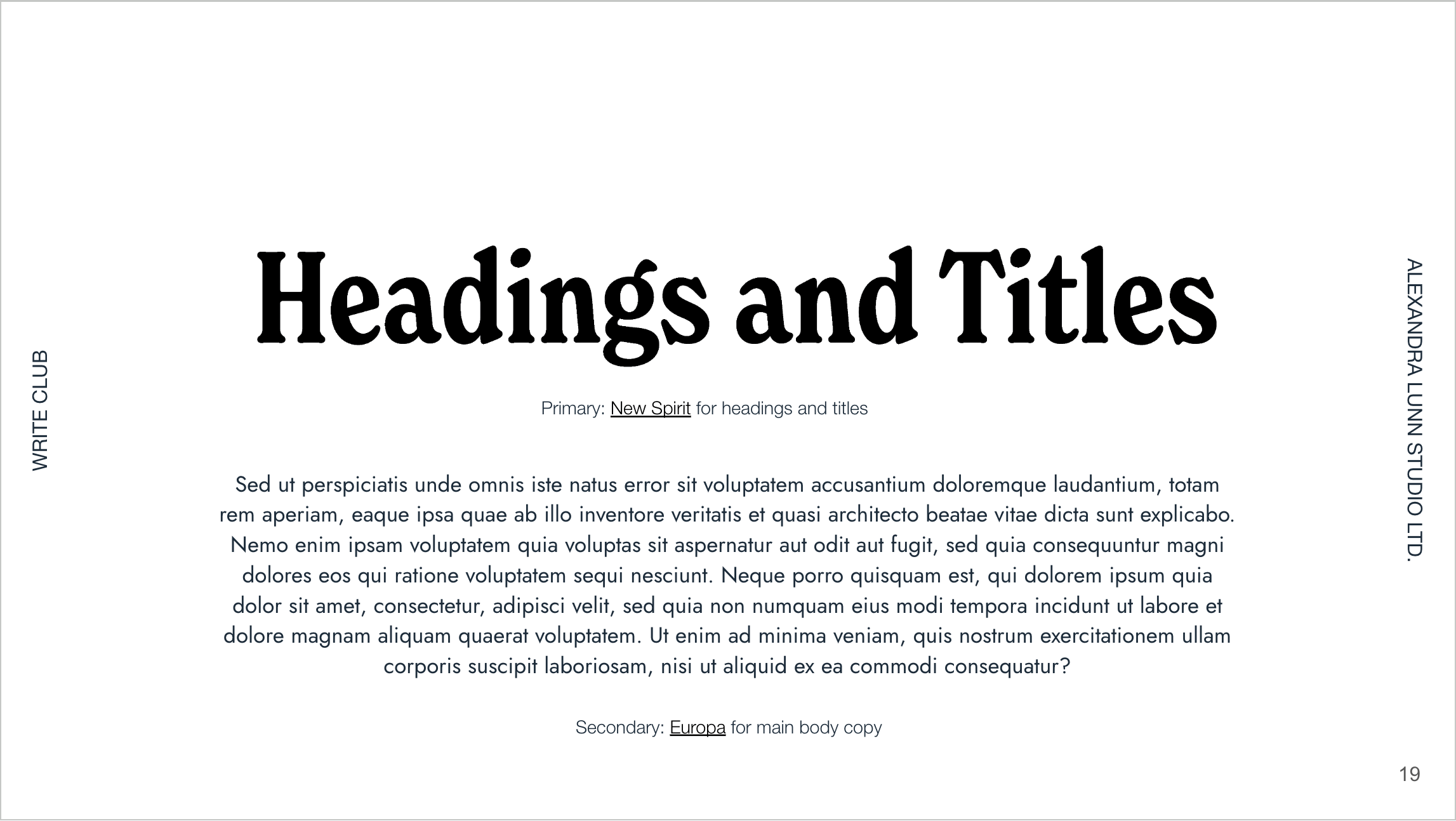
In terms of font hierarchy, my best advice is to use 2-3 complementary fonts for visual harmony: a primary font for headings, a secondary for body text, and an optional accent for special elements. Bold, attention-grabbing fonts work well for headlines, while subtle fonts suit subheadings and body copy. For balanced design, try pairing contrasting fonts, like serif with sans-serif, and maintain high contrast for accessibility. Bold, eye-catching fonts for headlines paired with more subtle fonts for subheadings and body text help guide the reader’s attention through the content. Simple, clear fonts are best for longer content, while more decorative fonts can be used sparingly for headings or accents. Pairing contrasting fonts can create visual interest without overwhelming the audience. Ensure the fonts work across different formats:
Some Options for Write Club‘s brand ID.
a curated list of independent type foundries offering crafted fonts from talented designers that CAN’T BE FOUND on Google or Adobe.
Please note: these are for testing: if you fancy any of these for your project, purchase it as the type designer(s) have worked hard on them!
Virus Fonts, Jonathan Barnbrook’s font foundry, was established in 1997 and is globally recognised for its original and custom fonts. It offers bespoke fonts for projects and customised versions of existing ones. Notable fonts Exocet and Mason are available via Emigre. The typefaces that this studio create are often used within film titles, and so much more.
Typeverything: Founded in 2011 by Andrei Robu, this foundry brings together a collective of independent type designers focused on creating fonts for diverse projects. Typeverything has earned the trust of leading studios and renowned brands worldwide, providing fonts ideal for branding, advertising, and digital media.
Brandon Nickerson’s site is popular for its high-quality font collection and user-friendly design. A standout feature is their weekly free font offering—subscribers to the newsletter receive a new font every week, allowing designers to expand their font libraries at no extra cost. This approach keeps users engaged and builds a community around Nickerson's work.
Dinamo team up with names like Burberry, Nike, Spotify, and even Alicia Keys. With every project, Dinamo finds creative ways to make type work for each client’s vibe, whether it's a big brand or a cultural space. They’ve spoken at places like the Forward Festival in Berlin, Strelka Institute in Moscow, and the Royal Academy of Fine Arts in Antwerp.
DJR.com
Tropical Type
Bretange Type Foundry
BESPOKE TYPE DESIGN
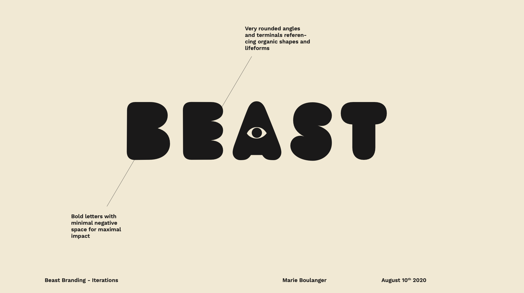
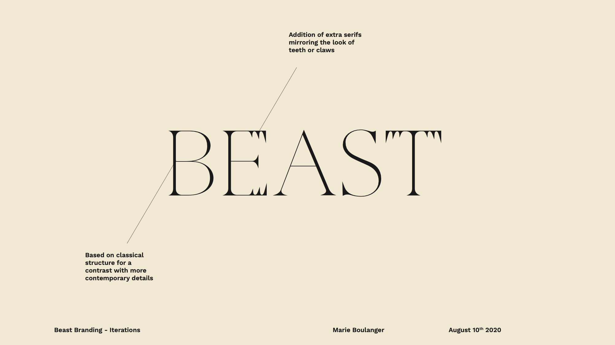
Investing in a custom-made font with a designer like Jo Malinis (Süss Cake Studio) or Marie Boulanger (Wizz&Co, Camelēr Spice Co., BEAST Casting) offers brands a tailored visual language that enhances recognition and creates a deeper connection with their audience. This personalised approach to typography elevates the brand's aesthetic but also reinforces its individuality and authenticity. Marie (now at Monotype) came up with when creating the visual language for BEAST Casting; a collaboration with us back in 2020. N.B. if your project has a global audience, ensure the font supports language characters and respects cultural differences; fonts have different connotations in various regions. A type designer can help you understand the intricacies.

Colour, PHOTOGRAPHY AND moodboards
“I found I could say things with colours that I couldn’t say any other way – things that I had no words for.”
The perception and significance of colour is a very personal one. We all experience colour differently even if they are subtle. When creating a brand, it’s important to consider how others perceive colour to avoid missteps and take into account those who are colour-blind or those who have special needs. Test your colour memory with our fun, interactive quiz.
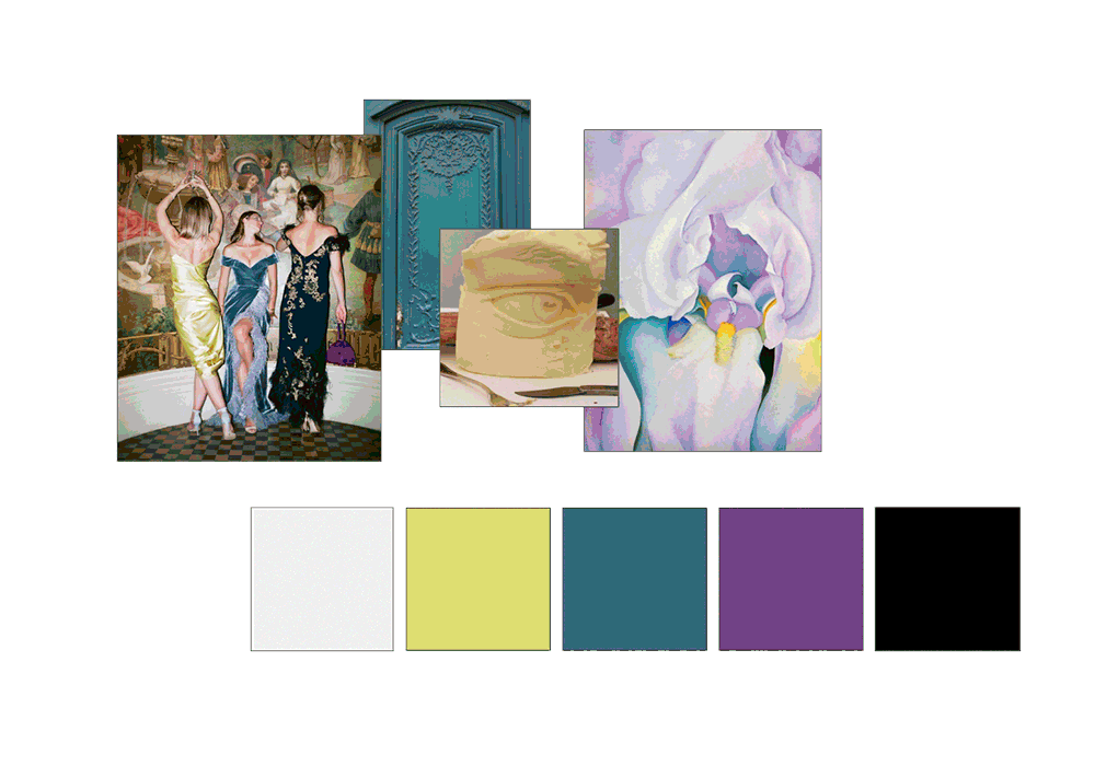
That said, ultimately there is a global consensus on what works with colour. To communicate the personality of a brand through colour we use mood boards to begin building a story. Mood boards are a good way to help distinguish subtle differences in colour. We often do this using Pinterest. These boards are compiled dased on a mixture of brand values, emotive words, and client preferences. It's also where we start to see the brand’s personality come to life – or just share ideas. For example, the mood board gif below is from the work we created for Leisure Enterprise who wanted a luxurious look and feel to communicate to an affluent audience. We searched first of all for images on Pinterest but what made this project really easy was that one of the founders Yulia is a talented photographer. We chose a colour palette, based on the images to reflect the overall vibe of the brand. What we find fascinating about it is how just a slight change in colour or tone from one hex code to another can completely changes the overall palette. There's a knack to it!
When it comes to colour, as a rule, warm colours, such as oranges and reds, evoke feelings such as love, passion and anger. In contrast, cool colours, such as blues and greens, are more stoic and associated with reliability, strength, calmness, and sadness. Blue is seen as a trusting colour, so we use it when designing for businesses and bodies that operate for and within the financial industries. Tools like ColourLovers, Coolors and BrandColors let you search by theme, emotion, or even a brand vibe, making it easy to generate palettes that feel intentional and on-brand.
Those with colour blindness and types of synesthesia will experience colour vastly differently from those who are neurotypical. The Accessible Brand Colour Palette Checker ensures your colour combinations meet WCAG 2.2 accessibility standards. It evaluates contrast ratios for text and backgrounds, analyses entire palettes, and provides downloadable results. This tool promotes inclusivity, improves user experience, and ensures your brand is accessible to all, including those with visual impairments.
Strong visuals speak before your brand ever says a word. So finding the right photography and colour references matters—the tone, energy, and emotional resonance of your brand often starts with a single image or hue. Whether you're building a moodboard, pitching a concept, or refining a visual identity, these tools help you shape an atmosphere and tell a story:
thank you for reading!
And for when you just need that spark—or layout inspiration—here’s a collection of design blogs, showcases and platforms that celebrate thoughtful, standout work. These are the places I keep coming back to because sometimes, the best ideas start with a reference:
It’s Nice That is a London-based creative platform dedicated to inspiring the global creative community. Founded in 2007, it showcases original projects, champions diverse talent, offers industry insights, and nurtures creative growth across various disciplines, including graphic design, photography, illustration, and more.
Creative Boom’s article Top 50 Fonts in 2025 highlights diverse typefaces that will shape the design landscape in 2025. This collection includes elegant serifs optimised for digital readability, bold sans-serifs for branding, and unique handwritten and display fonts with distinct personalities. Each font is chosen for its versatility, extensive language support, and adaptability across various design applications––serving as inspiration for designers seeking fresh and functional typography.
Creative Boom’s November 2024 font roundup highlights include RT Dromo’s Swiss-inspired style, Season’s variable sans-serif hybrid, and PP Neue Corp for branding. Innovator Grotesk, Rockfall, and Lightshift offer bold, retro-inspired options, while Kristolit merges tech and classic Scotch Roman influences, suitable for both editorial and digital projects.
More here – when I get a moment I’ll summarise but here are the links:
http://designeverywhere.tumblr.com/
https://www.designclever.co.uk/
http://wrapmagazine.tumblr.com/
https://create.adobe.com/graphic-design.html
https://www.underconsideration.com/brandnew/